There's always a simpler way to do things. I firmly believe in working smarter, not harder. We turn to custom brushes to help us get down redundant elements like foliage or scales with half the effort. We buy or create stencils so we can get down more accurate shapes without burning out our already precarious energy. Following this logic, this second acrylic painting went by a little quicker than the first due to me already having some paints mixed up from the last one, as well as the thumbnails being done in advance. The composition is similar to the first painting, to boot, and it all whittled an hour or two out of the process. I like it. This is an aspect of the creation process I'm keeping in mind for future work. What are ways I can snip out a little of the grind? How can I reuse past thumbnails or similar ideas for new projects? I've got more .psd files than I'd like to admit stuffed to the brim with spontaneous painting concepts, which I...really should organize into their own folder. That's so much fertilizer for new work. If you've got some old, unfinished art lying around, consider pulling them back out again and giving them a review. You could just have a hidden gem languishing away unseen. If you haven't read my first post for the first acrylic painting, check it out here. This character belongs to Khailed, a fellow illustrator who is currently open for icon and portrait commissions. Without further ado! To the left are a few of the thumbnails I did while working on the first acrylic painting. I was already solidly in the groove and felt like trying my hand at their original character as I let the other thumbs simmer. I adored their character's rosy ombre hair and little heart sweater (already similar to my own fashion sense). If you can't already tell, they have a knack for simple-and-striking designs. I've noticed how they tend to embody two or three poppy colors and a dominant fashion focal point, like a hat or a top. Really, they hearken to some of the best platformer characters of the 90's.
0 Comments
I haven't traditionally painted in almost a year. You heard that right. Despite what you may hear in snooty art circles, it's not necessary to draw or paint every day to keep a skill alive. In fact, taking a break can be just as beneficial as hard practice. As it stands, 2020 burnt me out pretty hard. Not only was I running out of steam juggling several gigs throughout a stressful year, I pulled a muscle in my neck and upper shoulder in the middle of a hefty project and found myself bedridden for a week. I was popping Tylenol every six hours, struggling to walk further than my kitchen and, at one point, found myself dissolving into tears of frustration. That injury also happened right when my period started! Yeah. That was a fun week. It's worth noting that digital painting and traditional painting are similar enough as it is, so I technically never fell out of practice. Still, it was refreshing to revisit my old supplies and dip into a well-worn skill. A friend of mine sent me a wonderful custom postcard not too long afterwards, which made my whole month. They're a fantastic illustrator and designer looking to try their hand at packaging design soon (and you can find their portfolio here). What better way to say thank you than with some art of my own? Their (gorgeous!) postcard is to the left, while their fursona is to the right. It's a very minimalist and striking design, which is just perfect considering the color scheme I want to use. I gathered up some references, warmed up with some doodles, then got started on a slew of thumbs and roughs.
You just have to speak things into existence. I was contacted by Zero Issue Beer not too long ago -- a Canadian craft brewery -- and was asked if I was interested in doing an illustration for their new seasonal beer line-up. What a coincidence 2020 was the year I wanted to get into packaging design and illustration, particularly for beverages! Even better, the proceeds are going to Sankofa Arts & Music Foundation for black Canadian youth. As you can likely imagine, I was sold twenty times over. I have a short interview that will be appearing on their site here. For now? I'm going to share the creative process behind this piece, from the rough beginning stages to the inspiration behind it all. I'll share some tips I've learned about packaging design, too, for any of you who want to branch out your portfolio. Spoiler: there are harpies. My references are put together in collage format. Just an ongoing slapdash of visual inspiration and technical reference. While I adore my harpies and sphinxes, I still considered exploring some lesser-known hybrids like winged nagas, manticores and anggitay (a unicorn centaur from Filipino folklore). These references are far from a one-use-only deal. They can give birth to several different pieces by themselves, all with the benefit of saving me some work searching Google Images' royalty-free sections. Work smarter, not harder. Zero Issue Beer is very upfront about their love for nerddom: videogames, anime, D&D, you name it. I considered it all as I was designing my buzzed creatures: a giant mountain sphinx, a hoppy harpy, a deer bard and an owl gryphon. I had actually considered doing a lo-fi retro anime-styled design, but that was a case of too many cooks spoiling the proverbial broth. Limitation can actually be your best friend when a piece needs to be finished by a certain date, and considering I had a lot of creative freedom, I knew I needed to dial it back or I'd go crazy. See, I'm on the other side of the artistic extreme. Some artists struggle to come up with anything, while I come up with a ton and can get overwhelmed. The only specification for this art, aside from being CMYK, is the little stick figure. This character is a reoccurring element in all of Zero Issue Beer's logo design. A Where's Waldo hopped up on hops, if you will. First tip: learn the difference between RGB and CMYK. I frequently get both of these requested, with the preference changing depending on the type of commission (printed cover, digital promotion, product). Creative Pro has a useful breakdown on how these printing types affect printed work and web display. That unfinished block to the right is around where the beer can begins to wrap. It was interesting having to keep in mind the 3D nature of the can and what the viewer should more or less be seeing and touching in-person. It's one of the many things I love about packaging: it engages even more of your artistic senses than usual. I was torn between having the little stick figure be a wandering traveler in the hills or having him look like an abstract flower in the harpy's flower crown. I settled on the latter because I loved how the silhouette made me look twice. Afterwards, figuring out what to do with the little sparks of light eventually pushed me toward a sun-like design. Now for the final sketch. I had to redo those leaves a few times because they weren't quite popping out like I wanted. Throughout this process I constantly zoomed out to a rough size of the beer can on my monitor screen. Rich detail is certainly beautiful, but you can end up working far too hard on something that won't even show up when printed. Second tip: when in doubt? Zoom out. A lot of what you think is meticulous detail in a painting is actually texture and contrast suggesting more than what's actually there. Not only does it save you time, it looks much more natural. Unless you have the eyes of a red-tailed hawk, you can't actually pick out every last leaf or blade of grass in the distance. My color overlays took a little more doing, as I was torn on how much warm and cool contrast I wanted in the final version. Zero Issue Beer ended up leaning more toward the green, which I very much agreed with. Even a dominant color can still be made distinctive through shade, saturation and focal point. I mixed in some darker, cooler green with bright, warmer ones for contrast. I then tossed in a blue sky and a pop of yellow to keep everything from being too uniform. Third tip: color is much more complex than you likely give it credit for, so get comfortable with vocabulary like hue, shade, saturation, warm, cool and reflected lighting. If you need to return to the basics, check out Color And Light by James Gurney. This book has been on my to-buy list for a while and I can't wait to read it. This was one of my most relaxing paintings of the year. Honestly? I really needed that. Not only is it for a project that I'm deeply invested in, it was a return to indulgence that has run off with me somewhat. Something I'll always be keen on sharing are the bumps on the art-making road. 2020 has been a series of blows to emotional, mental and physical health for many. Contrary to the popular myth of the endlessly inspired struggling artist, many professionals, myself included, have struggled to create lately. When we're not tired, we're demoralized. When we're not demoralized, we're spreading ourselves too thin. To be able to enjoy a painting so thoroughly from beginning to end was the kind of artistic refresher I sorely needed. I was asked to offer up a series of names with hopeful connotations, and we eventually settled on 'Reverie'. It's a nostalgic, sweet sentiment, one I'm working on falling into more in lieu of doomsday thoughts that leave me drained. The character here is meant to be a return to joy. A moment of green and comfort, set to a fizzy buzz. Here's roughly what the final can will look like, with brand logo, drink name and drink type. Last art tip? Draw what you love.
Been a while since I've done one of these! Indulgent art has always held a high priority for me. Why bother painting or drawing things I'm not invested in? Not to mention I need to show what I want to get hired for, so...kill two birds with one stone. This piece, however, was peak indulgence. Like, a dollop of whipped cream on top of whipped cream indulgence. You have a harpy. You have flowers. You have a ton of colors. Hell, there are even the mildest of vaporwave vibes (pink + blue surrealism) that snuck in without me realizing. Expect to see more of that. This year has been an absolute trainwreck and it's barely halfway over. Soaking in the subjects and styles I love to the nth degree is as self-care as it gets. As a side-note, I'm going to be keeping these progress posts a little brief from now on so I don't repeat myself. I mean, you know I love color. The part where I start phasing out the sketch and start rendering is orgasmic. Yadda yadda. I'll focus more on the unique challenges of each piece and what, exactly, was going on in my mind when making it. It's time to get indulgent. Cobbled together quite a few references for this one, on top of looking into the mirror to get the hands looking right. Let me tell you, it is damn hard finding a photo of a bird from the belly up with its wings folded. That little ballpoint pen doodle was done on an envelope in-between research and drafting. It's often when I'm thinking the least the best compositions come to me. There's a lesson to be learned here. I was really feeling the color composition here, but wasn't quite sure how to break up the space a little more. I added a pile of heads in the second one (which also did more to tell a story), but there still wasn't enough contrast. A little too much pink and...not enough everything else. In the far right I added more blue flourishes to get the eye traveling more easily, as well as more plants, and eventually found my happy balance.
There was a lot of gradually tweaking small details in the middle of painting. Wings looked uneven, tail crooked, needing more plants. I wasn't going for perfect symmetry here, but I still needed it to look somewhat straightened out. I was constantly debating that floating blood splatter above the harpy's head, too. In the end, I couldn't get rid of it. It was just too interesting a detail to leave out. For all that I kept straightening out certain elements, I left that crooked kettle handle in for a while. Ugh! Fixed it up the day before posting because it was driving me nuts. Next time? I'm using a stencil. This is the ideal combination of artistic influences. You may not like it, but this is what peak indulgence looks like. I've got pieces simmering on my computer (and more old envelopes-) with yet more mythical creatures, surreal imagery and vague future nostalgia touches. Environment art and concept art is a big focus of mine this year, though, and I am eager to dip into packaging design. Thiiink mock-ups for coffee bags and wine bottles. It's a lot to keep in mind and I'm taking everything one day at a time. In the meantime, I really, really want to start a new sketchbook. I even had a dream about browsing a bookstore and wanting to buy one last night. I have a box of unused ones sitting in the corner of my room! The only problem is...which one to pick. Here's to indulgence. What qualifies as really indulgent art for you? How do you incorporate multiple favorite subjects or styles into a single piece?
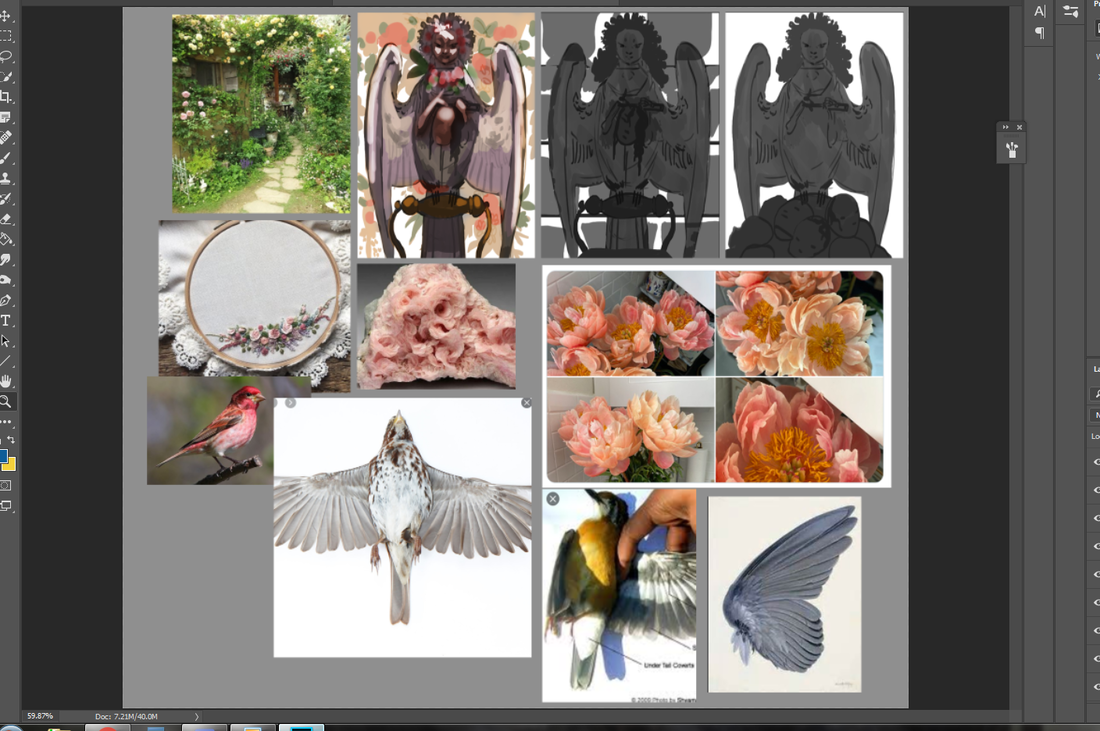
Which artists deserve credit and which one's don't? Trick question! All of them do. So, I came across a job posting for an illustration gig the other day that had my higher brain functions in a bit of a fit. I won't go into the specifics, but it's one that interested me on several levels. I ended up not just skipping the application, but walked away with inspiration for one very annoyed, very specific blog post. I'll start this off with a nice, easy fact: artists deserve credit for their work. At the risk of sounding blase, there would be no work without the artist. This seems like a simple nugget of wisdom, yet, unfortunately, we live on the planet Earth. Here we have Twitter users reposting other people's work without credit (or giving credit in the second, less-viewed comment), shady online sellers making profit off of stolen designs and potential clients haggling down professionals. The job application I came across was more insidious, appearing perfectly professional on the surface with its highly specific rundown of the job and all that it would entail. That is, until it came to the pesky subject of due credit: this would be a work-for-hire position that would see all copyright going to the owner. As a working professional with over five years of experience, this is nothing new to me. ...Until I got to the following stipulation: the artist may get credit...as long as they are high-profile. Ha ha. Yikes. It gets worse. It proceeded to state that a high-profile artist would still have to provide a compelling reason why they should be credited, alongside the usual portfolio-and-resume fill-out. Even the popularity contest had an asterisk attached! I've never come across an illustration gig that required a certain level of nebulous prestige, then a subsequent debate for a line of credit. What gets me is just how vague 'high-profile' is. Does the artist need a certain amount of followers on Twitter? Do they need to rub elbows with mid-tier art celebrities at fantasy conventions? A minimum of ten book covers published or no dice? Then it begs the biggest question of all...wouldn't a high-profile artist know better than to fall for a scam like this? Let's not get it twisted, here. There's no hidden meaning to suss out. This is a garden variety power play, pure and simple. The mere existence of a job application means this business needs a professional to create a product, yet won't do the most basic courtesy of admitting it cannot do the thing. Artists, to this day, are not a respected class. Despite this, we remain highly sought after in a world swaying on its ever-towering pile of misery. Music, illustration, filmmaking, game design, literature...we make life worth living, and this cognitive dissonance manifests in crappy applications that tell you to jump, dance and backflip for your withered carrot. There are a lot of jobs out there. If you see any variation of this bullshit? Make like a banana and split. The only time you should accept a work-for-hire agreement is if you're getting paid out the damn nose. I'm talking triple what you would normally charge. Even then? You may still not find it worth it, and that's perfectly valid. A line of credit and piece in your portfolio can provide you more worth than a lump sum paycheck that gets torn to shreds sooner than you'd like. Work-for-hire doesn't interest me, because the ones asking don't provide the money needed to make up for the void that comes with surrendering a creative property in its entirety. Let's reiterate the basics:
As a working professional, you're going to come across variations of 'jump for your withered carrot' a lot. These applications or emails will use different words, shift the goalposts around a little, but your answer will always lie in what you do or don't get at the end of the job. Will this work give you enough money to pay rent and your income tax? Will you able to showcase this work in your portfolio for similar work down the line? I won't sit here and pretend these answers are always easy -- not when capitalism is designed as a losing battle -- but you do have options. To any and all working professionals: use your options. Sign up for Indeed's keyword alert to get notified of relevant jobs the minute they're posted. Keep your Twitter, Instagram and Facebook pages updated regularly. Directly pitch your portfolio to relevant publishers, studios and companies that will, at the very least, pay you and credit you. Get yourself the Graphic Artists Guild Handbook: Pricing & Ethical Guidelines so you're caught up on fair pricing in your skillset and niche. Seriously. It's my Bible. To the businesses and individuals who pull stuff like this? Go to hell! Yeah, I have nothing profound for this part. You're just sleazeballs who make snake oil salesmen look dignified. If you need a little more help to get your head on straight, check out my previous post where I shared my favorite (low cost or free!) business, copywriting and illustration resources. I also have a feature on Wordwonders exploring a wonderful commission I completed in 2019 that continues to raise the bar for my career.
No Freelancer Is An Island: Five Free Or Low-Cost Freelance Resources That Have Helped Me Greatly1/21/2020 Being a freelancer is rough. Thing is? It doesn't have to be. Take it from someone whose instinct is to try and do everything on her own: don't. Not only will you run the risk of burning yourself out prematurely, you can set yourself up for failure by missing important legal details or drastically underpricing. There are free and affordable resources out there that can take the sting out of the freelancing process. Pricing, marketing, state law, copyright, portfolio direction, you name it. You can't create a piece of art without tools, right? The same goes for running a successful business. Below are five resources I use on a weekly -- sometimes daily -- basis, useful for both experienced freelancers and budding professionals starting to dip their toes into the working world. Without further ado: Graphic Artists Guild Handbook: Pricing And Ethical Guidelines Screw saving the best for last: this is a book you need on your shelf if you want to make good money on your art. This is the commercial art Bible to end all commercial art Bibles. I was first introduced to this book a few years ago by an art peer/client (you know who you are!) and was instantly floored by how comprehensive it is. No detail is too small, no topic too specific. Graphic novelists, commercial illustrators, fashion designers, concept artists, animators...I don't have enough room to go into all the working artists that could benefit from this tome. If you're intimidated by its page count, rest easy knowing the Graphic Artists Guild Handbook steers clear from being a stuffy compendium and keeps its language -- whether discussing fair pricing or exploring kill fees in a contract -- very accessible. The whole book feels like a patient teacher sitting by your side and walking you through a hurdle. It doubles as a self-care book, to boot. You can't turn a page without being reminded of your value as a working artist. The Graphic Artists Guild Handbook: Pricing And Ethical Guidelines is consistent and organized in its layout, providing useful pricing spreadsheets that are separated based on experience, page percentage, geographical sales, etc. With a shelf life that'll last as long as your career does, give or take a few technological advances, there's no reason not to get it. The $45 price point on the home site can be a little steep, but you can find used and new copies on Amazon starting at under $25. Beware of shady sellers, as some reviewers have reported getting copies with missing pages. I got my book in pristine condition, I'm happy to say, and this is now one of my greatest treasures. Hell, I even read it for fun. Freelancers Union To repeat: you can't do everything by yourself. This means both in the quiet of your home office and in your day-to-day interactions with peers or prospects. Freelancing isn't straightforward, and that's by design. I won't speak for artists in other countries, but the United States is a workaholic culture that wants workers dependent on employers as much as possible. Right down to when you take a shit and when you can recover from a cold. As such, becoming your own business (or even just making a little side-income) can be an uphill battle. Should you do the 1040-ES or the 1090? Do you need a state license to sell physical goods? What about writing out an effective contract? The Freelancers Union gives you knowledge in bite-sized pieces to ensure you're up-to-date on law changes, ethical business practices and health insurance. I'm a big fan of the Freelancers Union newsletter and have been subscribed for over a year, which uses appealing templates and straightforward copy to give you important information at a glance. They also discuss self-care, share opinion articles written by experienced freelancers and offer much-needed words of encouragement. It's a full package. Sign-up is free and their newsletter crops up several times per month. Check out their blog to get a taste of what you can learn. Ed Gandia (High-Income Business Writing) There are a lot of advice coaches out there. How do you sort out the pragmatic teachers from the out-of-touch gurus? I checked this guy out based on an anecdote of the fourth recommendation on this list and wasn't disappointed: Ed Gandia is a copywriter with years of experience in business writing, with a fantastic site dedicated to helping today's freelance writers make more money. He runs a blog, podcast and newsletter filled with useful advice to help freelancers avoid what he calls the 'feast-or-famine cycle'. He's no snake oil salesman, either, and never promises to get you knocking out six-figures overnight. His demeanor is practical without being cold, and his sense of humor goes a long way in helping absorb new information. Even if you're not a business writer: you can still learn a lot about self-promotion and smart financial habits for your illustration or design career here. I always enjoy sitting down to one of his podcasts in the morning. His free newsletter is weekly and is chock full of tips he's gathered over the years, offering practical approaches on everything from daily self-promotion habits to overcoming self-doubt when contacting a prospect for the first time. Just one example: his method of dividing daily tasks into high-priority, medium-priority and low-priority (with estimated timeframes) has done a lot to chip away at my anxiety. I use this method every day (except for days off, of course) and finish 80% of my list on average. That's not bad from someone who used to be a serial procrastinator! BlackFreelance Attention, any and all black freelancers: there's a resource just for you. Getting specific with your hurdles is how you find answers. The one-size-fits-all approach does nothing but a disservice to your unique challenges and just ends up wasting your time. If you work with a chronic illness, then you need to find resources that tackle the intersection between class and accessibility. If you are trying to find work in a certain country as an expat, then you need to find resources that supplement that experience. Blackfreelance provides a plethora of concise, practical blog posts, resource lists and a newsletter to help you navigate building yourself as a freelance black professional. Black burnout, maintaining professional boundaries, defining a niche...you name it, it's been discussed. The advice provided here easily applies to several skillsets, since much of it focuses on a groundwork of shifting your mindset toward your work. Another example: I can happily thank Blackfreelance for convincing me to choose a niche, as I went the longest time convinced I had to be a jack-of-all-trades. In fact, the creator of the site was the one to recommend Ed Gandia up above! I'm still part of this community and am endlessly grateful for all I've learned. If I have a frustrating question or need a little feedback on an idea, I know where to turn. Recent estimates are expecting to see freelancers making up the majority of the workforce in less than a decade, so now's the time to consider some side-income if you haven't already. You can find BlackFreelance over on Twitter or the website here. Super Condensed Informational Zine: Portfolios, Websites, Pitching And Agents If all of this is feeling a little overwhelming, particularly for those just starting out, look no further than this short-and-sweet zine by graphic novelist Shannon Wright. This is a nine-page .pdf that hashes out the basics of getting your work together and sending it out to the right people. Nice and easy! While most of this (very on-point) advice on portfolios and websites is familiar to me, I still got some helpful tips on working with agents (a partnership I'm looking to expand to in either in 2021 or 2022). When it comes to the whirlwind deluge of freelancing, those little nudges in the right direction are everything. You get to choose the price of the zine, as well, so pay it forward and support an artist who wants to support you! Also, her portfolio is gorgeous. Take a gander and get inspired. There you have it. Five freelance resources that have helped me -- or are helping me -- and could very well be an anchor in your sea of chaos. If you've got any resources that have helped you out, please leave a comment and share the goodness!
Sometimes you need to start over fresh. There's no shame in it. Why waste effort picking away at something you could just re-do in half the time? Other times, though, you'll need to bite the bullet and push through. Knowing which one of these to commit to is part of being a productive artist. I've talked about it before and I'll repeat until I'm blue in the face. It's a gamechanger. Now that that's out of the way...let me start this by saying I wanted to drop this piece like a cheap vase. Even worse? This was one of my favorite sketches in my sketch batch. Talk about artistic whiplash. It didn't help I was winging the color scheme and many of the supporting details (a habit I've developed since color theory is one of my strongest skills). I had a vague idea I wanted blue and gold, that I wanted everything fancy and dream-like...and that was about it. For once, my guesswork backfired and made me fudge around more than normal. This doesn't happen often -- I've winged crazier pieces than this -- but it cost me several hours that could've been saved if I fleshed out the draft stages better. This was a good reminder of how badly a piece can backfire if you don't have the basics down. I thought of throwing my hands up in the air and outright moving on to another sketch, but something about this one told me to keep going. 'Make it work' is a phrase made famous from Project Runway and one I've adopted. It's a saying that tells you to work with your mistakes and find a way out of the hedgemaze you've built for yourself. I might just have to do a post on all my personal quotes one of these days. (If you're curious about other pieces I've done, check out my recent post on the progress of 'Yasar'.) As you can see, I did the work of thumbnailing out these outlandish outfits. Just, well...didn't actually think about everything else! From now on I think I'll hash out a quick color scheme in Photoshop -- a cluster of dots ordered from most dominant to least -- before committing. A few minutes to save me a few hours. Same with the big block of starry space. Yeeeah, I added that in during the last stages, too. I was extremely happy with how this sketch turned out. Both the pose and silhouette were the right amount of elegant and playful. I also used a reference of a kid playing the flute to make sure the hands looked right. This character's fashion is inspired heavily by classic JRPGs, magical girl anime and various architectural designs. While many of my characters have a certain theme, this one is intentionally all over the place. All the colors, all the silhouettes, all the patterns! The only rule is a visual smorgasbord: they're a lion child with a wild imagination that, fittingly, helps my imagination run wild. As such, I don't care too much about logistics when it comes to their outfits (beyond differentiating texture and a reasonable fit). I've been drawing this character for years and enjoying every fanciful, floofy, extravagant clusterfuck they end up in. It just hit me that gold tends to be a dominant hue or focal point, an entirely subconscious detail. These were done back in 2015, all made up on the spot and something I still don't recommend you doing, ha ha. I can't believe winging it used to be my default. Reconnecting with my youthful spontaneity is a goal I still want to nurture moving forward. It won't replace the reliable structure of thumbnail-draft-sketch, but rather, support it. In came the first problem: what even the hell color scheme? At the very least, I made sure to adhere to the basics. If you have a lot of cool colors, add a pop of something warm. If a certain color dominates up top, see what can contrast it below. It's like a math equation if math sucked less. Even though I ended up veering away from the olive backdrop, I still like how it contrasted against everything else. Might have a green-and-gold centered piece later. Speaking of which, check out 'Green And Gold' by Lianne La Havas. Gorgeous song. There may be a lot of working parts in this piece, but the face has the most pressure to be done well. It's what we tend to gravitate to as human beings, after all, and flubbing the expression/eyes/etc is like ruining the broth in a soup. The science behind the face is a fascinating topic for me and a big reason why I do so many portraits. Oh, the gold decorations around the scepter ball drove me crazy. I kept fudging with them in the hopes they'd look better and eventually went, "Fuck this." Yes, you can give up and keep pushing in the same illustration. I was given some very helpful feedback in one of the Discord communities I'm part of, particularly concerning the fish. While outside eyes thought they looked fine, this element just rubbed me the wrong way. They were too cluttered, and yet, not enough. These magical betta didn't provide enough contrast and took up so much space the eye didn't know where to travel. I didn't want to eliminate them entirely, though... ...so I went for the 'less is more' approach. The piece immediately felt more breathable. The eye traveled more naturally, too, from the shooting star down to the fish down to the face. I made sure to keep the shade close to the scepter, too, to tie together the color scheme. A little .gif for those that missed my Twitter post. I'm loving making these so much I might start playing with simple animations in 2020. At the last second I decided to go for a light lavender backdrop, mostly because there was already a lot of blue in the piece. This piece was another lesson in 'just because you can, doesn't mean you should'. Just because I usually am able to wing my designs doesn't mean I should go into a piece flying by the seat of my pants. All in all? I'm glad I stuck with it. I'm going to celebrate what I did well and learn from what could've been better. It's a New Year, ripe with potential, and I'm going to stick to growing my good habits. I've talked before about how I don't make lofty New Year's declarations, instead preferring to focus on the smaller baby steps that lead up to goals. Now, that's not to say I don't have some idea on what I want. I'm going to continue to test my skills and build my portfolio. I want to create breathtaking illustrations that tell captivating stories, with emphasis on character interaction and complex backgrounds. I want to design all sorts of unforgettable characters and creatures. I want to expand a little and branch out into concept art, 3D modeling and fashion design. Here are some small goals I'll be doing over the next few months:
Reaching goals, big or small, means lots of thumbnailing, lots of rough drafts and lots of baby steps. Stay tuned!
Tl;dr: fashion is life. Long version: sometimes it's hard to believe I went from a gangly kid who religiously wore the same grey hoodie, old sneakers and side-braid to a woman who experiments with nearly every look. It's like a Pokemon evolution, only a lot slower. When I really think about it, though? It makes perfect sense. I had my time to be awkward (and sometimes outright disdainful) of how I look. I had the space to explore what I liked, what I didn't like and what I didn't quite feel ready to try out. It's the same logic around any unpleasant or disappointing experience: as Ava DuVernay likes to say, "It's not happening to you, it's happening for you." That hurdle of mine is well over and done with. Life is just too short to not celebrate your appearance. In the future I might just do a fashion retrospect, with each drawing representing where I was at major turning points (young child, teenager, young adult). For now... I compose my looks not unlike how I compose my paintings. I take into account the theme, such as cute casual or 80's nostalgia. I make sure colors and patterns are balanced. Got a lot of warm? Contrast it with something cool. Got a patterned top or leggings? Pair it with something simpler. It's hard to even come up with a name for my style, because I love to dabble in everything. Magical chic? Contemporary nostalgia? Flowery fatale? These are starting to sound like music genres. I'm not complaining. the term boho can go to hell, though. even though many of my looks would technically fall under that category in fashion SEO, I hate that term with a fiery passion 
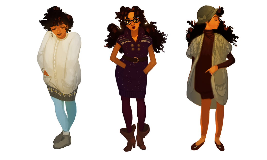
Why did it take me this long to embrace the utter power of the tunic dress? Seriously, come to my TED Talk. Let me tell you about how easy it is to mix and match these wonderful things, with the big fat bonus of skipping a step (shirt + pants). I had a tunic dress or two back in high school, but had no idea how to wear them. I'd actually tuck the damn things into my jeans so I wouldn't look 'weird'. There goes the point!!! The gray sweaterdress on the left with the white and yellow decorations is an old staple I still love. It was actually given to me by a high school friend and, a decade later, still fits me like a dream. Had to get rid of those cute boots, though. Listen to me. Pinched toes aren't worth it. Long tops and tunic dresses are two sides of the same coin. When in doubt? Stretch it out. I got the pink knitted tunic on the left back in Boston during my attendance as Arisia's guest of honor. I got the shoes and the rose gold headband at the same store to round out the purchase. The only thing more fun than traveling is picking up a fresh new look while you're there. Bonus points if you look like you walked out of a JRPG. These are my spring and summer looks: just layered enough to feed my obsession, still cool enough to hold up to the weather. I had a really cute encounter while wearing the middle outfit, where two shoppers at a grocery store walked by me in the parking lot and said, "Okay! I see you, salmon jeans!" Made my day. Then I gained twenty pounds and couldn't fit into my purple pair. Womp. I had another cute encounter at another grocery store with the middle outfit, where a guy complimented my hat: when I told him I got it for $2, he excitedly congratulated me. What can I say. Thrift shops really are that girl. Who said fashion is pain, anyway? So many of these outfits aren't just comfortable, they're insanely so. Something else I've been enchanted by lately are unique layers, like the outfit on the right. Regal, unusual drapery you don't see a lot in the day-to-day, like long sleeves peeking out of short sleeves or thigh-high boots with a peek of thigh-high socks. Just...careful details like that make my soul sing. I want to get crafty with my crafting. Finally bust out my gold cat ear headband (that I also got in Boston, by the by). At this point you're no doubt seeing a few clothing items reused, like the red ankle boots and the jewelry. When you like to switch things up, it helps not feeling the need to reinvent the wheel every single time. Sometimes you have a piece that's been collecting dust for months and deserves a moment in the spotlight. Hell, I can come up with a dozen great looks for a single dress. Again: get crafty. I went from being unable to find a pair of flats that fit me for months to suddenly finding all the pairs...right when it started getting cold. Go figure! Another favorite contrast of mine is bulky + slimming, like the left and the middle outfits. Cozy and stylish, in equal parts. My closet's pretty damn stuffed, but that doesn't stop me from reusing the same outfits. Yes, sometimes even I want to take a break from putting together a look. I wore the striped tunic dress on the left quite a bit during the summer. It's the perfect cute casual top, with just a little extra charm to make it pop (like the gaps in the elbows). The middle dress I wore to a concert: Beck and Cage The Elephant, two bands I've loved for years and who delivered one hell of a performance. Oh, the weather was perfect. So warm and breezy I could've been outside all night and not minded. and the beer was $15 per can, jesus christ- Looking back on all these different outfits, I feel proud. I like how I look. Nay, I love how I look, and I've never felt more honest with my appearance than the last five or six years. I'm not slicking my hair down with gel anymore to try and make it look straighter. I'm not wearing copious amounts of grey and black because I'm too shy to embrace my love for color. I'm not afraid to dabble in styles on-the-fly, try new things, let myself reinvent when needed and get lazy when desired. Keep in mind it's none of my business what anyone else chooses to wear: this is what works for me. There are still fashion languages I'm learning to speak. I want to add a little more green to my wardrobe, first off, which is hilarious because I actually love green. I just so happen to have a knee-jerk instinct to divebomb for anything maroon, lavender or gold. Currently my eyes are set on buying some thigh-high socks, hats that actually fit my fat head and, of course, more jewelry. Maybe one or two of those fancy claw rings. A tattoo will be in the works someday, but for now... ...anyone thinking of shaking up their looks in 2020? I have some new character art coming out this week, which also means more lengthy behind-the-scenes posts. Stay tuned!
I figure now's a good time to talk about why I've learned not to make New Year's Resolutions. I understand the appeal. The desire to just...rinse off all the bad, keep the good and glide into the future with a lighter spirit. The socially acceptable ritual of drinking like crazy and waking up with a New Year hangover? I certainly feel the urge in my bones, and it's not even Thanksgiving yet! I won't be doing it, though. I haven't for several years, in fact! I've learned New Year's resolutions tend to be, at best, dramatic declarations with little (if any) long-term payoff. They feel great in the moment, but once it comes down to keeping pace with your ambitions? Resolutions are a recipe for failure that shows in every deadline missed, personal promise delayed and mediocre result gained. So I skip it...and instead focus on building good habits instead. This is a subtle, yet hugely life-changing mentality that I've picked up from B2B writing/content marketing spaces. It makes sense, since the nature of that skillset is about crafting progress in bite-sized increments. Whether or not you're a freelancer, I highly recommend checking out Ed Gandia and BlackFreelance. They have several wonderful pieces that explore the benefits of shifting your mentality with smaller gestures, rather than going for a 'cold turkey' approach that has you falling back on old habits. Good habits are just as hard to break as bad ones. For example, I brush, floss and rinse every single night, and missing just one night? It has me all out of sorts. I extend this same minimalist logic to other things, working backwards from the goal. Instead of just saying I want to lose a certain amount of pounds, I instead signed up at a local gym with my roommate for two sessions per week (as well as fewer sweets). Instead of just saying I want to wake up earlier, I instead push myself to go to bed an hour sooner. When it comes to art? Well, I want to improve my production, quality and outreach. But what do I have to do to get there...and will it be small enough to incorporate into my everyday life without a drastic overhaul? For now...I'm focusing on traditional sketches. They're the foundation of most of the work I do and take the most effort from me. All those big goals of a shinier portfolio and fleshed-out projects? Those come later. I'll be delving into my polished sketching process in further posts (which involves some jumping back and forth between Photoshop). For now, here's a peek at some of the character art I'll be painting over the coming weeks. I've also got some illustration sketches (not pictured) and recently started pieces. It's more than I've been doing for a while now and I'm pretty proud of myself, to be honest! I've got so many characters clamoring for attention, too, and it feels so good to get some* of them out onto the page. A few don't have names still, despite having fleshed-out backstories, personalities, powers...I'll have to start cooking some up instead of relying on codenames. Like Lion Head and Goat Girl. Tch! *some being the key word lmao I don't like losing my groove when I've got portfolio pieces to upload and commissions to finish. Keeping the ball rolling is one of the easiest ways to produce strong work with little effort. Need a breather? Switch over to another piece. Too tired to sketch? Just scan in a drawing and paint. This sketch buffer kills several birds with one stone. Never underestimate the groove. I've mentioned before how much I just love to scan in traditional sketches and go to town with digital paint. I'm honestly vibrating with excitement over this sketch buffer, because that means just color color color color color. Oh, it's the best form of therapy! I've been using references for poses and outfits, finding that happy balance between learning as I go and making do with what I know. I recently checked out Noah Bradley's free figure drawing compendium for some ideas, when my full-body mirror ran short. These are pencil and copy paper: nice and simple to keep my mind from twisting itself into knots (fancier materials can do that). That said, I will sketch on cardstock or bristol board from time-to-time if I want to preserve the drawing in the long-term. It's something I'll be considering when selling original sketches. I'll likely be touching on this topic again as the holiday season unfolds. For now...I've got sketches to finish. Stay tuned!
Experimentation isn't always going to be social media ready. It shouldn't be, actually. How does an artist learn through mistakes...while being too afraid to make them? One of my favorite painting processes is just throwing whatever at the wall -- or canvas -- and seeing what sticks. Even that dynamic foundation can be shaken up a little. While playing around in Photoshop the other night I slapped down some complimentary colors and fooled around with the smudge tool. Didn't have anything in particular in my head. In doing so, I discovered something I've never seen before: an iridescent finish caused by the smudge tool's blurring effect. Frankly? It looks fucking awesome. The painting itself is...meh. That's fine! I learned a fun new way of creating a foundation in my speedpaintings and discovered some neat tricks to add more depth to my work. All with just a few smudges. That's more than enough success for an hour of fudging. One or two smudges and bam. Instant depth-of-field. A fuzzy, iridescent aftereffect. It's just lovely. For all the digital brushes that are created to simulate oil paints, this is the closest I've gotten to replicating the look in Photoshop. My mind is already bursting with new possibilities. I may try laying out a basic sketch, setting it to multiply, then creating a separate layer to fill it up with these smudgy, rainbow colors. Maybe do some environment studies by setting down basic silhouettes, then smudging everything together. I actually like these ones the best. The surreal, almost broken appearance is very...dreamlike, in a way. I love half-finished art (big reason I upload my progress shots so much) because you can follow the artist's logic on a visual level. Video, .gif, progress sheet, doesn't matter! If finished paintings are self-expression, half-finished work have to be the stream-of-consciousness. Aaaaaaaaaaaaaaaaaand it's a merfolk. Why would it be anything else? Experimentation isn't always pretty. It's not always neatly packaged and ready to be consumed, compressed into a bite-sized video for a thousand strangers' casual browsing experience. Hell, the only reason I remembered to take such consistent screencaps this time is because I'm trying not to break a good habit! The thing with social media is...it's just a tool. It needs to be treated as such. When you start limiting your artistic output not for your growth, but for some nebulous 'clout'...you're missing out on some truly formative moments. Besides. All the messy in-between work? Is honestly some of my favorites. I'm sick to death of being afraid of 'ugly' sketches or unimpressive speedpaintings. That's the bulk of my work, it's how I get to my impressive art, and I'm going to embrace it all. Definitely going to be utilizing this technique in future speedpaints. Got plenty more goodness on the way, including some last-second Paintobers. Stay tuned!
|
AuthorHere I post WIPs, sketches, speedpaints, thumbnails and anything else thrown into the veritable stew of artistic process. Archives
January 2021
Categories
All
|