|
There's always a simpler way to do things. I firmly believe in working smarter, not harder. We turn to custom brushes to help us get down redundant elements like foliage or scales with half the effort. We buy or create stencils so we can get down more accurate shapes without burning out our already precarious energy. Following this logic, this second acrylic painting went by a little quicker than the first due to me already having some paints mixed up from the last one, as well as the thumbnails being done in advance. The composition is similar to the first painting, to boot, and it all whittled an hour or two out of the process. I like it. This is an aspect of the creation process I'm keeping in mind for future work. What are ways I can snip out a little of the grind? How can I reuse past thumbnails or similar ideas for new projects? I've got more .psd files than I'd like to admit stuffed to the brim with spontaneous painting concepts, which I...really should organize into their own folder. That's so much fertilizer for new work. If you've got some old, unfinished art lying around, consider pulling them back out again and giving them a review. You could just have a hidden gem languishing away unseen. If you haven't read my first post for the first acrylic painting, check it out here. This character belongs to Khailed, a fellow illustrator who is currently open for icon and portrait commissions. Without further ado!
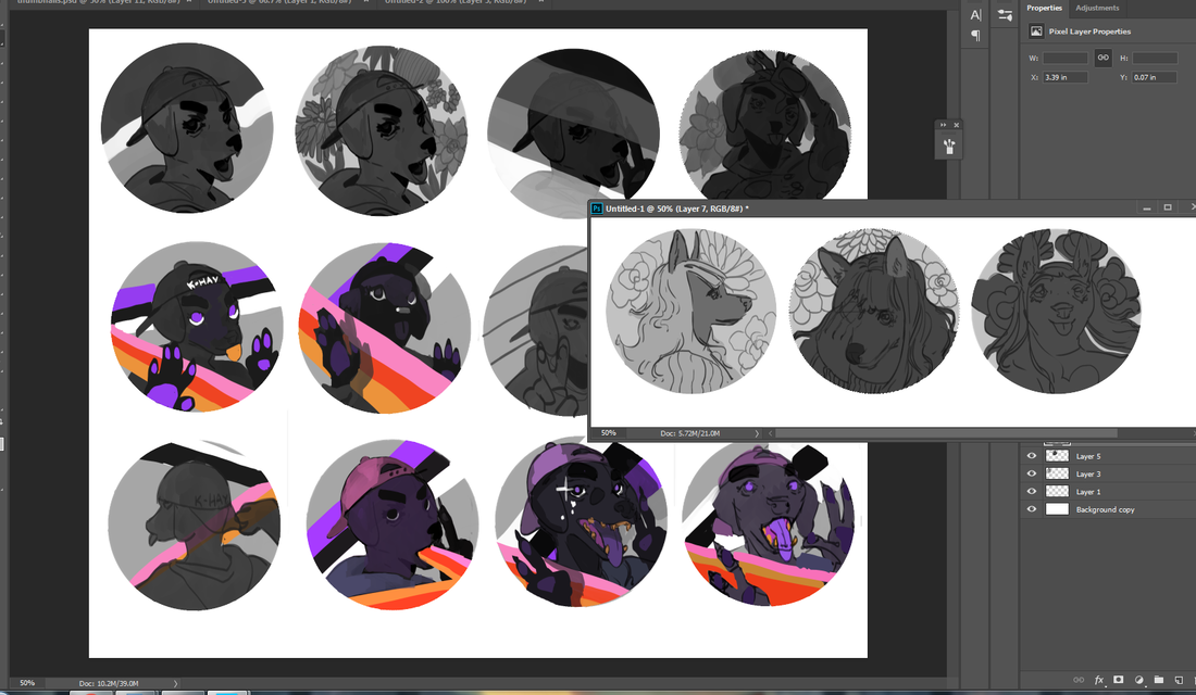
To the left are a few of the thumbnails I did while working on the first acrylic painting. I was already solidly in the groove and felt like trying my hand at their original character as I let the other thumbs simmer. I adored their character's rosy ombre hair and little heart sweater (already similar to my own fashion sense).
If you can't already tell, they have a knack for simple-and-striking designs. I've noticed how they tend to embody two or three poppy colors and a dominant fashion focal point, like a hat or a top. Really, they hearken to some of the best platformer characters of the 90's.
0 Comments
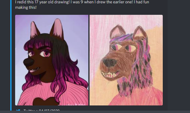
I haven't traditionally painted in almost a year. You heard that right. Despite what you may hear in snooty art circles, it's not necessary to draw or paint every day to keep a skill alive. In fact, taking a break can be just as beneficial as hard practice. As it stands, 2020 burnt me out pretty hard. Not only was I running out of steam juggling several gigs throughout a stressful year, I pulled a muscle in my neck and upper shoulder in the middle of a hefty project and found myself bedridden for a week. I was popping Tylenol every six hours, struggling to walk further than my kitchen and, at one point, found myself dissolving into tears of frustration. That injury also happened right when my period started! Yeah. That was a fun week. It's worth noting that digital painting and traditional painting are similar enough as it is, so I technically never fell out of practice. Still, it was refreshing to revisit my old supplies and dip into a well-worn skill. A friend of mine sent me a wonderful custom postcard not too long afterwards, which made my whole month. They're a fantastic illustrator and designer looking to try their hand at packaging design soon (and you can find their portfolio here). What better way to say thank you than with some art of my own?
I figure now's a good time to talk about why I've learned not to make New Year's Resolutions. I understand the appeal. The desire to just...rinse off all the bad, keep the good and glide into the future with a lighter spirit. The socially acceptable ritual of drinking like crazy and waking up with a New Year hangover? I certainly feel the urge in my bones, and it's not even Thanksgiving yet! I won't be doing it, though. I haven't for several years, in fact! I've learned New Year's resolutions tend to be, at best, dramatic declarations with little (if any) long-term payoff. They feel great in the moment, but once it comes down to keeping pace with your ambitions? Resolutions are a recipe for failure that shows in every deadline missed, personal promise delayed and mediocre result gained. So I skip it...and instead focus on building good habits instead. This is a subtle, yet hugely life-changing mentality that I've picked up from B2B writing/content marketing spaces. It makes sense, since the nature of that skillset is about crafting progress in bite-sized increments. Whether or not you're a freelancer, I highly recommend checking out Ed Gandia and BlackFreelance. They have several wonderful pieces that explore the benefits of shifting your mentality with smaller gestures, rather than going for a 'cold turkey' approach that has you falling back on old habits. Good habits are just as hard to break as bad ones. For example, I brush, floss and rinse every single night, and missing just one night? It has me all out of sorts. I extend this same minimalist logic to other things, working backwards from the goal. Instead of just saying I want to lose a certain amount of pounds, I instead signed up at a local gym with my roommate for two sessions per week (as well as fewer sweets). Instead of just saying I want to wake up earlier, I instead push myself to go to bed an hour sooner. When it comes to art? Well, I want to improve my production, quality and outreach. But what do I have to do to get there...and will it be small enough to incorporate into my everyday life without a drastic overhaul? For now...I'm focusing on traditional sketches. They're the foundation of most of the work I do and take the most effort from me. All those big goals of a shinier portfolio and fleshed-out projects? Those come later.
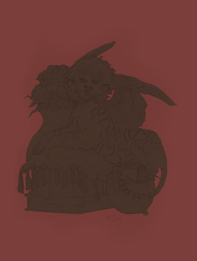
This is a piece of character art I did back in 2017, and one I'm still deeply proud of. It's a direction/technique I want to pick up again moving forward. I also figure it's time to talk about traditional and digital art, a juxtaposition that tends to get a lot of ire from gatekeeper blowhards. In my previous posts I talked about how I like to combine a little traditional art with digital, even though working 100% digital is often faster. There's a certain texture to pencil sketches that translates very well to digital painting. I took a wonderful general painting class back in high school -- alongside mentoring under an acrylic painting professor from a local university -- that helped set a strong foundation for my work today. Contrary to what some say (yes, sometimes to my face), traditional art is not better -- or more real -- than digital art. There's a pervasive -- and self-serving -- myth that a thing being harder automatically makes it better. Now, you won't get me saying traditional art doesn't have a steeper learning curve than digital. That is absolutely true. There are simply more steps involved. You have to prep the canvas (or wood or cardboard or-), create or transfer the sketch, mix your colors, protect your colors throughout several sessions, clean your brushes, preserve the final work, frame, package...yes. That is absolutely more work. But more work doesn't automatically mean better work. I've seen traditional art that's hardly moved me. I've seen digital art that's captured my imagination. This purity myth is steeped in gatekeeping attitudes that equate more difficulties with success...usually by those who don't face quite as many of those difficulties (such as having studio space or money for supplies) in the first place. I will not, however, create more myths around digital art. Digital art is easier than traditional. It's still not easy. If you're not familiar with layering, masking, color theory, light and shadow, design, mixing up your references...? Going digital is not suddenly going to fix that, no more than buying a fancy set of Copic markers and Bristol board will transform you into an overnight art master. In that regard...these two art forms are honestly not all that different. Digital art today is a brilliant tool to create art while saving space and money. It's painting without the mess. It's less costly. It's more flexible, especially if you're like me and constantly come up with new ideas on the fly. Already having a traditional art foundation just gives you a head start, as it makes the transition far smoother and gives your work a look that's not easily replicated. Doing a traditional sketch filled in with digital colors gives me the best of both worlds: the tight, grainy detail of pencil with the rich, sumptuous colors of a few Photoshop sessions.
|
AuthorHere I post WIPs, sketches, speedpaints, thumbnails and anything else thrown into the veritable stew of artistic process. Archives
January 2021
Categories
All
|
 RSS Feed