You just have to speak things into existence. I was contacted by Zero Issue Beer not too long ago -- a Canadian craft brewery -- and was asked if I was interested in doing an illustration for their new seasonal beer line-up. What a coincidence 2020 was the year I wanted to get into packaging design and illustration, particularly for beverages! Even better, the proceeds are going to Sankofa Arts & Music Foundation for black Canadian youth. As you can likely imagine, I was sold twenty times over. I have a short interview that will be appearing on their site here. For now? I'm going to share the creative process behind this piece, from the rough beginning stages to the inspiration behind it all. I'll share some tips I've learned about packaging design, too, for any of you who want to branch out your portfolio. Spoiler: there are harpies. My references are put together in collage format. Just an ongoing slapdash of visual inspiration and technical reference. While I adore my harpies and sphinxes, I still considered exploring some lesser-known hybrids like winged nagas, manticores and anggitay (a unicorn centaur from Filipino folklore). These references are far from a one-use-only deal. They can give birth to several different pieces by themselves, all with the benefit of saving me some work searching Google Images' royalty-free sections. Work smarter, not harder. Zero Issue Beer is very upfront about their love for nerddom: videogames, anime, D&D, you name it. I considered it all as I was designing my buzzed creatures: a giant mountain sphinx, a hoppy harpy, a deer bard and an owl gryphon. I had actually considered doing a lo-fi retro anime-styled design, but that was a case of too many cooks spoiling the proverbial broth. Limitation can actually be your best friend when a piece needs to be finished by a certain date, and considering I had a lot of creative freedom, I knew I needed to dial it back or I'd go crazy. See, I'm on the other side of the artistic extreme. Some artists struggle to come up with anything, while I come up with a ton and can get overwhelmed. The only specification for this art, aside from being CMYK, is the little stick figure. This character is a reoccurring element in all of Zero Issue Beer's logo design. A Where's Waldo hopped up on hops, if you will. First tip: learn the difference between RGB and CMYK. I frequently get both of these requested, with the preference changing depending on the type of commission (printed cover, digital promotion, product). Creative Pro has a useful breakdown on how these printing types affect printed work and web display. That unfinished block to the right is around where the beer can begins to wrap. It was interesting having to keep in mind the 3D nature of the can and what the viewer should more or less be seeing and touching in-person. It's one of the many things I love about packaging: it engages even more of your artistic senses than usual. I was torn between having the little stick figure be a wandering traveler in the hills or having him look like an abstract flower in the harpy's flower crown. I settled on the latter because I loved how the silhouette made me look twice. Afterwards, figuring out what to do with the little sparks of light eventually pushed me toward a sun-like design. Now for the final sketch. I had to redo those leaves a few times because they weren't quite popping out like I wanted. Throughout this process I constantly zoomed out to a rough size of the beer can on my monitor screen. Rich detail is certainly beautiful, but you can end up working far too hard on something that won't even show up when printed. Second tip: when in doubt? Zoom out. A lot of what you think is meticulous detail in a painting is actually texture and contrast suggesting more than what's actually there. Not only does it save you time, it looks much more natural. Unless you have the eyes of a red-tailed hawk, you can't actually pick out every last leaf or blade of grass in the distance. My color overlays took a little more doing, as I was torn on how much warm and cool contrast I wanted in the final version. Zero Issue Beer ended up leaning more toward the green, which I very much agreed with. Even a dominant color can still be made distinctive through shade, saturation and focal point. I mixed in some darker, cooler green with bright, warmer ones for contrast. I then tossed in a blue sky and a pop of yellow to keep everything from being too uniform. Third tip: color is much more complex than you likely give it credit for, so get comfortable with vocabulary like hue, shade, saturation, warm, cool and reflected lighting. If you need to return to the basics, check out Color And Light by James Gurney. This book has been on my to-buy list for a while and I can't wait to read it. This was one of my most relaxing paintings of the year. Honestly? I really needed that. Not only is it for a project that I'm deeply invested in, it was a return to indulgence that has run off with me somewhat. Something I'll always be keen on sharing are the bumps on the art-making road. 2020 has been a series of blows to emotional, mental and physical health for many. Contrary to the popular myth of the endlessly inspired struggling artist, many professionals, myself included, have struggled to create lately. When we're not tired, we're demoralized. When we're not demoralized, we're spreading ourselves too thin. To be able to enjoy a painting so thoroughly from beginning to end was the kind of artistic refresher I sorely needed. I was asked to offer up a series of names with hopeful connotations, and we eventually settled on 'Reverie'. It's a nostalgic, sweet sentiment, one I'm working on falling into more in lieu of doomsday thoughts that leave me drained. The character here is meant to be a return to joy. A moment of green and comfort, set to a fizzy buzz. Here's roughly what the final can will look like, with brand logo, drink name and drink type. Last art tip? Draw what you love.
0 Comments
Been a while since I've done one of these! Indulgent art has always held a high priority for me. Why bother painting or drawing things I'm not invested in? Not to mention I need to show what I want to get hired for, so...kill two birds with one stone. This piece, however, was peak indulgence. Like, a dollop of whipped cream on top of whipped cream indulgence. You have a harpy. You have flowers. You have a ton of colors. Hell, there are even the mildest of vaporwave vibes (pink + blue surrealism) that snuck in without me realizing. Expect to see more of that. This year has been an absolute trainwreck and it's barely halfway over. Soaking in the subjects and styles I love to the nth degree is as self-care as it gets. As a side-note, I'm going to be keeping these progress posts a little brief from now on so I don't repeat myself. I mean, you know I love color. The part where I start phasing out the sketch and start rendering is orgasmic. Yadda yadda. I'll focus more on the unique challenges of each piece and what, exactly, was going on in my mind when making it. It's time to get indulgent. Cobbled together quite a few references for this one, on top of looking into the mirror to get the hands looking right. Let me tell you, it is damn hard finding a photo of a bird from the belly up with its wings folded. That little ballpoint pen doodle was done on an envelope in-between research and drafting. It's often when I'm thinking the least the best compositions come to me. There's a lesson to be learned here. I was really feeling the color composition here, but wasn't quite sure how to break up the space a little more. I added a pile of heads in the second one (which also did more to tell a story), but there still wasn't enough contrast. A little too much pink and...not enough everything else. In the far right I added more blue flourishes to get the eye traveling more easily, as well as more plants, and eventually found my happy balance.
There was a lot of gradually tweaking small details in the middle of painting. Wings looked uneven, tail crooked, needing more plants. I wasn't going for perfect symmetry here, but I still needed it to look somewhat straightened out. I was constantly debating that floating blood splatter above the harpy's head, too. In the end, I couldn't get rid of it. It was just too interesting a detail to leave out. For all that I kept straightening out certain elements, I left that crooked kettle handle in for a while. Ugh! Fixed it up the day before posting because it was driving me nuts. Next time? I'm using a stencil. This is the ideal combination of artistic influences. You may not like it, but this is what peak indulgence looks like. I've got pieces simmering on my computer (and more old envelopes-) with yet more mythical creatures, surreal imagery and vague future nostalgia touches. Environment art and concept art is a big focus of mine this year, though, and I am eager to dip into packaging design. Thiiink mock-ups for coffee bags and wine bottles. It's a lot to keep in mind and I'm taking everything one day at a time. In the meantime, I really, really want to start a new sketchbook. I even had a dream about browsing a bookstore and wanting to buy one last night. I have a box of unused ones sitting in the corner of my room! The only problem is...which one to pick. Here's to indulgence. What qualifies as really indulgent art for you? How do you incorporate multiple favorite subjects or styles into a single piece?
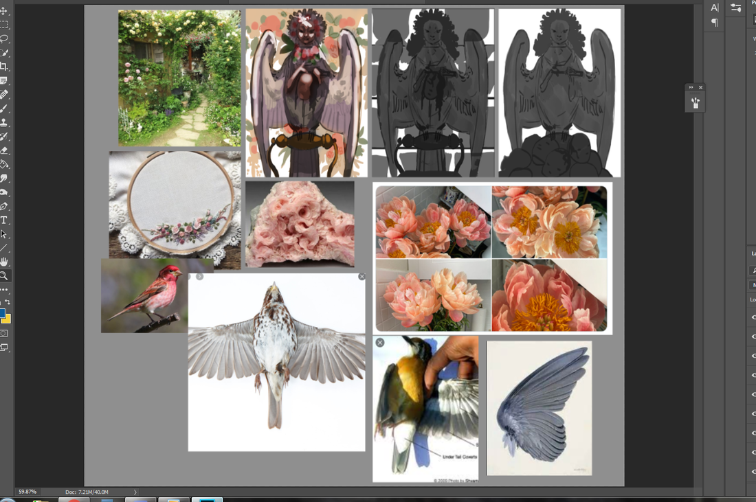
Sometimes you need to start over fresh. There's no shame in it. Why waste effort picking away at something you could just re-do in half the time? Other times, though, you'll need to bite the bullet and push through. Knowing which one of these to commit to is part of being a productive artist. I've talked about it before and I'll repeat until I'm blue in the face. It's a gamechanger. Now that that's out of the way...let me start this by saying I wanted to drop this piece like a cheap vase. Even worse? This was one of my favorite sketches in my sketch batch. Talk about artistic whiplash. It didn't help I was winging the color scheme and many of the supporting details (a habit I've developed since color theory is one of my strongest skills). I had a vague idea I wanted blue and gold, that I wanted everything fancy and dream-like...and that was about it. For once, my guesswork backfired and made me fudge around more than normal. This doesn't happen often -- I've winged crazier pieces than this -- but it cost me several hours that could've been saved if I fleshed out the draft stages better. This was a good reminder of how badly a piece can backfire if you don't have the basics down. I thought of throwing my hands up in the air and outright moving on to another sketch, but something about this one told me to keep going. 'Make it work' is a phrase made famous from Project Runway and one I've adopted. It's a saying that tells you to work with your mistakes and find a way out of the hedgemaze you've built for yourself. I might just have to do a post on all my personal quotes one of these days. (If you're curious about other pieces I've done, check out my recent post on the progress of 'Yasar'.) As you can see, I did the work of thumbnailing out these outlandish outfits. Just, well...didn't actually think about everything else! From now on I think I'll hash out a quick color scheme in Photoshop -- a cluster of dots ordered from most dominant to least -- before committing. A few minutes to save me a few hours. Same with the big block of starry space. Yeeeah, I added that in during the last stages, too. I was extremely happy with how this sketch turned out. Both the pose and silhouette were the right amount of elegant and playful. I also used a reference of a kid playing the flute to make sure the hands looked right. This character's fashion is inspired heavily by classic JRPGs, magical girl anime and various architectural designs. While many of my characters have a certain theme, this one is intentionally all over the place. All the colors, all the silhouettes, all the patterns! The only rule is a visual smorgasbord: they're a lion child with a wild imagination that, fittingly, helps my imagination run wild. As such, I don't care too much about logistics when it comes to their outfits (beyond differentiating texture and a reasonable fit). I've been drawing this character for years and enjoying every fanciful, floofy, extravagant clusterfuck they end up in. It just hit me that gold tends to be a dominant hue or focal point, an entirely subconscious detail. These were done back in 2015, all made up on the spot and something I still don't recommend you doing, ha ha. I can't believe winging it used to be my default. Reconnecting with my youthful spontaneity is a goal I still want to nurture moving forward. It won't replace the reliable structure of thumbnail-draft-sketch, but rather, support it. In came the first problem: what even the hell color scheme? At the very least, I made sure to adhere to the basics. If you have a lot of cool colors, add a pop of something warm. If a certain color dominates up top, see what can contrast it below. It's like a math equation if math sucked less. Even though I ended up veering away from the olive backdrop, I still like how it contrasted against everything else. Might have a green-and-gold centered piece later. Speaking of which, check out 'Green And Gold' by Lianne La Havas. Gorgeous song. There may be a lot of working parts in this piece, but the face has the most pressure to be done well. It's what we tend to gravitate to as human beings, after all, and flubbing the expression/eyes/etc is like ruining the broth in a soup. The science behind the face is a fascinating topic for me and a big reason why I do so many portraits. Oh, the gold decorations around the scepter ball drove me crazy. I kept fudging with them in the hopes they'd look better and eventually went, "Fuck this." Yes, you can give up and keep pushing in the same illustration. I was given some very helpful feedback in one of the Discord communities I'm part of, particularly concerning the fish. While outside eyes thought they looked fine, this element just rubbed me the wrong way. They were too cluttered, and yet, not enough. These magical betta didn't provide enough contrast and took up so much space the eye didn't know where to travel. I didn't want to eliminate them entirely, though... ...so I went for the 'less is more' approach. The piece immediately felt more breathable. The eye traveled more naturally, too, from the shooting star down to the fish down to the face. I made sure to keep the shade close to the scepter, too, to tie together the color scheme. A little .gif for those that missed my Twitter post. I'm loving making these so much I might start playing with simple animations in 2020. At the last second I decided to go for a light lavender backdrop, mostly because there was already a lot of blue in the piece. This piece was another lesson in 'just because you can, doesn't mean you should'. Just because I usually am able to wing my designs doesn't mean I should go into a piece flying by the seat of my pants. All in all? I'm glad I stuck with it. I'm going to celebrate what I did well and learn from what could've been better. It's a New Year, ripe with potential, and I'm going to stick to growing my good habits. I've talked before about how I don't make lofty New Year's declarations, instead preferring to focus on the smaller baby steps that lead up to goals. Now, that's not to say I don't have some idea on what I want. I'm going to continue to test my skills and build my portfolio. I want to create breathtaking illustrations that tell captivating stories, with emphasis on character interaction and complex backgrounds. I want to design all sorts of unforgettable characters and creatures. I want to expand a little and branch out into concept art, 3D modeling and fashion design. Here are some small goals I'll be doing over the next few months:
Reaching goals, big or small, means lots of thumbnailing, lots of rough drafts and lots of baby steps. Stay tuned!
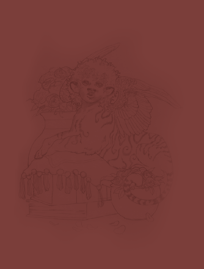
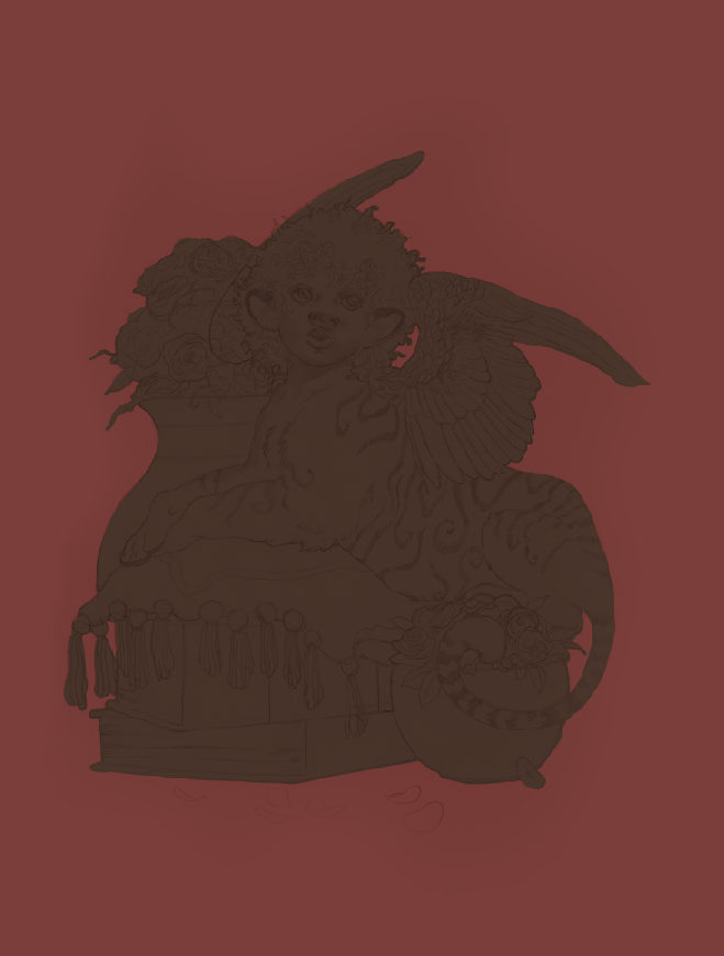
I have so many characters. Jesus Christ. It's to the point that even doing art of other characters I don't paint very often feels excessive. Like I'm choosing a favorite child. As it stands, I've only drawn Yasar a few times, despite the fact he's a prominent supporting character in a big (and very old) story of mine. I'd go into greater detail about his personality and history, but I'm viciously protective of my intellectual property. Maybe someday when I actually commit this story to a game or a book. I like to separate character art into three categories: simple, complex and illustrative. The first is exactly what it says on the tin, with no background or any supporting elements whatsoever. The middle adds a little more, such as an item or animal. The latter is an illustration in all but name, with the focus still heavily on the character themselves. I take a lot of inspiration from fashion magazines for that last one, since they tend to showcase models in all sorts of environments that play second-fiddle to the subject. This character art is somewhere between a simple and complex, as the giant gilded egg fills out the space without any additional interaction. Funny enough, even after extensive thumbnailing (see below), I still didn't have any idea what I was going to put behind him. Just...something. Something to round out that space! Throwing in a big fancy egg while painting ended up giving me an idea for one of his powers, since he's an illusionist that depends on sleight-of-hand and a jack-of-all-trades approach. ...Don't do what I did, though. Figure everything out in the draft stage. It'll save you so much more trouble. Thumbnailing my character art was something I did sparingly in the past. Mainly because I internalized some bullshit ideas about how fast my art should be. Thumbnails and rough drafts were for illustrations, right? The complex stuff. The ones with backgrounds and action poses. ...Yeah, that's not true at all. Literally everything can be thumbnailed, from the smallest sliver of concept art to the most elaborate multi-character tapestry. Since my designs tend to be pretty fanciful, this step is extra helpful, allowing me to work out everything before committing to a polished pencil sketch. also to the middle left you can see my main reference for the pose, particularly for the legs Sketches take me between three to five hours on average, maybe a little longer. Thumbnails, on the other hand, are whipped up in minutes. Sitting down for an hour and hashing out a dozen thumbnails is peak relaxation. Sometimes I get so addicted to it I don't want to move on to later stages, even though later stages are also my favorite. I've been working on a sketch buffer these past few weeks: painting is my greatest strength and it saves me time to have a bunch of pencil drawings ready to go. This was my favorite in the pile, so I decided to start off strong. To the right I added a flat to bring out the silhouette -- the key to any good character art -- and move from there. I've been falling in crazy love all over again with persian and baroque architecture, so you're going to be seeing a lot of inspiration stemming from there, pastels and acanthus and stars galore the egg begins The soft brush remains my go-to for creating base colors. I love everything bleeding into each other. It's a very traditionalist approach to digital art and something I want to keep pushing; see just how buttery and iridescent I can get. I've been experimenting quite a bit with color burn, overlay and soft light layers to add more subtlety. I want colors so rich you feel like you could bite into them like a ripe fruit. Remember: paintings are conversations. You learn as you go. I realized the legs looked kind of stringy, so I used the magic wand tool to thicken them. Also, I'm obsessed with this guy's pants. They are seriously satisfying to look at. It took a few passes for me to figure out the most appealing color balance between the character and the egg. The teal ended up being a really tasty contrast with the pink backdrop: almost like a sandwich between the equally warm dominant colors of the character's outfit. I also made the head a little smaller and the hands a little bigger. Probably a sign for me to not get too lost in all the extravagance and keep in mind basic proportions. A little progress .gif for your viewing pleasure. I need fifteen more hands. Worked on this on-and-off over four to five days. I need to start tallying up the hours, because I honestly don't remember how long it took me overall. I really wanted to push my painting abilities with this one. Interestingly, I feel more success not in the final result, but the process: of committing to a thumbnailing/rough draft stage, using references and getting back into traditional sketching. I also got to show off all my strengths in one place. Fashion design, color theory, character design, lighting, texture. I plan on getting more playful with my layouts, as well as focusing on dynamic poses. I've got a pile of great ideas sitting in Photoshop, so this is one challenge I'll be happily meeting head-on. There's nothing quite so intoxicating as having a goal and being like, "Yeah? No fucking problem." I have more character art on the way, which means more processes, more .gifs, more rambles. I'm also considering making the switch from Photoshop CC to a different digital art program. Stay tuned!
I figure now's a good time to talk about why I've learned not to make New Year's Resolutions. I understand the appeal. The desire to just...rinse off all the bad, keep the good and glide into the future with a lighter spirit. The socially acceptable ritual of drinking like crazy and waking up with a New Year hangover? I certainly feel the urge in my bones, and it's not even Thanksgiving yet! I won't be doing it, though. I haven't for several years, in fact! I've learned New Year's resolutions tend to be, at best, dramatic declarations with little (if any) long-term payoff. They feel great in the moment, but once it comes down to keeping pace with your ambitions? Resolutions are a recipe for failure that shows in every deadline missed, personal promise delayed and mediocre result gained. So I skip it...and instead focus on building good habits instead. This is a subtle, yet hugely life-changing mentality that I've picked up from B2B writing/content marketing spaces. It makes sense, since the nature of that skillset is about crafting progress in bite-sized increments. Whether or not you're a freelancer, I highly recommend checking out Ed Gandia and BlackFreelance. They have several wonderful pieces that explore the benefits of shifting your mentality with smaller gestures, rather than going for a 'cold turkey' approach that has you falling back on old habits. Good habits are just as hard to break as bad ones. For example, I brush, floss and rinse every single night, and missing just one night? It has me all out of sorts. I extend this same minimalist logic to other things, working backwards from the goal. Instead of just saying I want to lose a certain amount of pounds, I instead signed up at a local gym with my roommate for two sessions per week (as well as fewer sweets). Instead of just saying I want to wake up earlier, I instead push myself to go to bed an hour sooner. When it comes to art? Well, I want to improve my production, quality and outreach. But what do I have to do to get there...and will it be small enough to incorporate into my everyday life without a drastic overhaul? For now...I'm focusing on traditional sketches. They're the foundation of most of the work I do and take the most effort from me. All those big goals of a shinier portfolio and fleshed-out projects? Those come later. I'll be delving into my polished sketching process in further posts (which involves some jumping back and forth between Photoshop). For now, here's a peek at some of the character art I'll be painting over the coming weeks. I've also got some illustration sketches (not pictured) and recently started pieces. It's more than I've been doing for a while now and I'm pretty proud of myself, to be honest! I've got so many characters clamoring for attention, too, and it feels so good to get some* of them out onto the page. A few don't have names still, despite having fleshed-out backstories, personalities, powers...I'll have to start cooking some up instead of relying on codenames. Like Lion Head and Goat Girl. Tch! *some being the key word lmao I don't like losing my groove when I've got portfolio pieces to upload and commissions to finish. Keeping the ball rolling is one of the easiest ways to produce strong work with little effort. Need a breather? Switch over to another piece. Too tired to sketch? Just scan in a drawing and paint. This sketch buffer kills several birds with one stone. Never underestimate the groove. I've mentioned before how much I just love to scan in traditional sketches and go to town with digital paint. I'm honestly vibrating with excitement over this sketch buffer, because that means just color color color color color. Oh, it's the best form of therapy! I've been using references for poses and outfits, finding that happy balance between learning as I go and making do with what I know. I recently checked out Noah Bradley's free figure drawing compendium for some ideas, when my full-body mirror ran short. These are pencil and copy paper: nice and simple to keep my mind from twisting itself into knots (fancier materials can do that). That said, I will sketch on cardstock or bristol board from time-to-time if I want to preserve the drawing in the long-term. It's something I'll be considering when selling original sketches. I'll likely be touching on this topic again as the holiday season unfolds. For now...I've got sketches to finish. Stay tuned!
It's that time again. The autumn leaves are falling, our fingertips are freezing and the Inktober event is in full swing. ...Ish. I made a poll at the beginning of the month asking for thoughts on Inktober, the popular October art tradition: the consensus was non-committal, with the majority either being wishy-washy on the idea or outright refusing. Is it any surprise? Making art is already enough of a process without churning out daily pieces, which are disruptive by nature due to being free work sandwiched in-between jobs, school and life obligations. This response is on top of countless counterposts I've seen just browsing my feed. For health-related reasons or not having enough time, I'm really happy to see artists prioritizing other things, to be honest. Burnout is a pretty serious issue without adding FOMO to the mix. Burnout is so serious, in fact, it can literally make you sick. It's an easy trap to fall into as a freelancer, as well, since you're in the position of having to dictate your own hours and find your own work. Getting said work? Often means creating free work in the hopes of someday being paid for it. More than once I've found myself working ridiculously long days without a full break. I've even come down with illnesses that don't usually affect my age group (which I'll talk about in a later post). Does that mean I'm against the concept of Inktober or any variant thereof? Not at all! Daily art exercises have their time and place: 1. They're a smart way to nip overthinking in the bud (how many pieces lie unfinished because of too much prep work?). 2. They supplement portfolios with smaller pieces (great for blogging and/or Patreons). 3. They're great practice and, with the right mindset, a ton of fun. If you're feeling guilty for not participating, however...that's when you're deprioritizing artistic growth in favor of FOMO: a fluff goal for shallow social media attention that doesn't amount to anything substantial. Art deserves better than that, right? So, why am I sort-of-kind-of participating? Well, I figured this month was a good opportunity to push myself back into experimenting. I miss just being...loosey-goosey with my paintings. Scribbling down whatever and seeing where it takes me. I talked about this in my last post, on how old work can sometimes be stronger than new work, and I'm eager to touch base with myself. Rather than dwell, I'm dedicating some (keyword: some) days in October to my own spin: Paintober. It's been a lot of fun crafting new brushes and playing around. These took a few hours each: unlike my last Paintober, the only overarching theme of this month is to just let my imagination and hand run loose. Used a reference to create a portrait of an older character of mine (you might recognize him from my portfolio's character art section). Had a fellow ask if they could use this painting as their background wallpaper. I don't know what's sweeter: having my art greet someone every time they turn on their computer or being asked in the first place. This one was a challenge...and, believe it or not, it wasn't the architecture, but the color scheme that gave me the most trouble! I went in with the goal to push my buildings and sense of space, yet ended up seriously flubbing the colors and having to do a bunch of tweaks. All-in-all, a very illuminating painting. I might just recycle it into something more portfolio-worthy. It's the kind of old-fashioned whimsy I've been craving in my work lately. I just...love Spyro so much. What else can I even say at this point? What I love about smaller paintings is how they allow me to get out ideas without committing too much time. I have a lot on my plate and, as much as I'd love to churn out endless fancy illustrations...I just can't! Additionally, this gives me more incentive to step up my speedpaint game. One hour or less! I've already got new custom brush packs I've been working on. Now to take things a step further and go back to studying some of my favorite concept artists. I've always been a fan of Feng Zhu and Jason Chan, among others. I'll be sharing old Paintober posts later, as well as step-by-step shots of the paintings above. I've also been working on some pencil sketches to beef up my portfolio for 2020. Stay tuned!
Sometimes you don't know how a piece is going to turn out. It's the eternal conundrum: do you keep going with a sketch that's quite not working...or start over? Then there are the times you don't know what the hell you're doing at all. I've gotten better at resolving this over the years. At this point I can tell when something isn't going to go where I want it to, no matter how hard I try. One common sign of this is when I rework a certain area of a painting over and over and over. Other times I'll notice something is wrong when there is an abnormally huge gap between the preliminary stages and the final sketch. Art is a conversation. It'll go in places you don't always expect and, just like any dialogue, you should take warning signs at face value. Sometimes, though...unpredictability is your friend. Sometimes you're not sure where your art is going...and that's the best part. The pieces are laid before you, the ideas and the mood are there, but you haven't arranged them into anything resembling sense yet. This is, honestly, one of my favorite ways to paint. This illustration below originally started out as a bunch of ovals and circles. No thumbnail. No rough draft or references. Just a mess of blobs I shuffled around until they gradually formed an image in my head. This tends to be what I do when I'm having a hard time creating work and want to push myself. As is my wont, I go for a half-human creature. What can I say? I know what I like. This method of laying down shapes and shuffling them around isn't unlike whittling away at a block of clay. I elongated the oval, added a face and neck to the circles, then kept working from there. I tend to vacillate between sketching the old-fashioned way and laying down blocky shapes. The collision of the draftswoman and the fine artist. I wish I had the first few passes screencapped, but, again...I didn't know where I was going with this! makes a mental note to screencap literally everything Throughout this sketching and blocking stage I intentionally kept the other harpies in the backdrop and foreground more faded. It's actually a touch I wish I kept in the coloring stage. A little more atmospheric perspective would have gone a long way to tie the whole piece together. Live and learn! Wings are one of my absolute favorite things to paint. I swear they're my therapy at this point. It's fascinating thinking about how much of our life bleeds into our art without our knowing it. As I was detailing the wings and feathers I remember thinking about how much calmer I felt. How my normally frazzled mind finally slowed to a crawl. On a conscious level, I prefer complex work because of how easy it is to get lost in all the details. There's always something else to discover with every new viewing! On a subconscious level, however...I've realized I gravitate to details due to how they relaxe my mind and heart. When you're mentally ill? That's not a feature you can take lightly. Flow is a psychological phenomenon where intense focus and relaxation has us losing sense of time. Painting is a popular way of achieving this, though you can just as easily enjoy flow by crocheting, knitting, playing piano, dancing or cooking. Any activity that gets your hands moving and your mind lost in the sway of your work. You know you've done a good job when you glance at the clock and wonder where the past three hours have run off to. Once everything started coming together I pulled up a few references of crows over on Google. Even the most whimsical and freeform piece will be better off with a visual aid or two. Color remains one of my strong points. I had no idea what sort of scheme I wanted to do here and, just like the sketching stage, I went with whatever felt good at the time. It's something I'm going to focus just a little less on going forward, just so I can give my technical drawing and perspective skills time to catch up. This isn't to say I still don't have areas to improve! I just know color theory isn't tripping me up as much compared to, say, urban landscapes. I will master them one of these days There's no shame in starting over. There are also times you have to give yourself a chance and push through with what you have, even when you're not sure what the hell you're doing. Especially so. You may just be surprised at what the deepest recesses of your mind spits up. I've got more goodness on the way. Stay tuned!
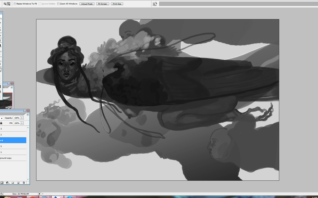
This is a piece of character art I did back in 2017, and one I'm still deeply proud of. It's a direction/technique I want to pick up again moving forward. I also figure it's time to talk about traditional and digital art, a juxtaposition that tends to get a lot of ire from gatekeeper blowhards. In my previous posts I talked about how I like to combine a little traditional art with digital, even though working 100% digital is often faster. There's a certain texture to pencil sketches that translates very well to digital painting. I took a wonderful general painting class back in high school -- alongside mentoring under an acrylic painting professor from a local university -- that helped set a strong foundation for my work today. Contrary to what some say (yes, sometimes to my face), traditional art is not better -- or more real -- than digital art. There's a pervasive -- and self-serving -- myth that a thing being harder automatically makes it better. Now, you won't get me saying traditional art doesn't have a steeper learning curve than digital. That is absolutely true. There are simply more steps involved. You have to prep the canvas (or wood or cardboard or-), create or transfer the sketch, mix your colors, protect your colors throughout several sessions, clean your brushes, preserve the final work, frame, package...yes. That is absolutely more work. But more work doesn't automatically mean better work. I've seen traditional art that's hardly moved me. I've seen digital art that's captured my imagination. This purity myth is steeped in gatekeeping attitudes that equate more difficulties with success...usually by those who don't face quite as many of those difficulties (such as having studio space or money for supplies) in the first place. I will not, however, create more myths around digital art. Digital art is easier than traditional. It's still not easy. If you're not familiar with layering, masking, color theory, light and shadow, design, mixing up your references...? Going digital is not suddenly going to fix that, no more than buying a fancy set of Copic markers and Bristol board will transform you into an overnight art master. In that regard...these two art forms are honestly not all that different. Digital art today is a brilliant tool to create art while saving space and money. It's painting without the mess. It's less costly. It's more flexible, especially if you're like me and constantly come up with new ideas on the fly. Already having a traditional art foundation just gives you a head start, as it makes the transition far smoother and gives your work a look that's not easily replicated. Doing a traditional sketch filled in with digital colors gives me the best of both worlds: the tight, grainy detail of pencil with the rich, sumptuous colors of a few Photoshop sessions. I've had this character since I was a teenager. I love him to bits. My traditional art background includes acrylic, gouache, watercolor, colored pencils and China markers. I've never had the studio space to get down and dirty with oils, but I really want to in the future. ...And before you ask, yes. Acrylic and gouache have both been considered 'lowbrow' paints for decades due to their commercial associations, while oil has remained the highbrow standard in fine art circles. It's no coincidence that oil paints take a lot more money and space than acrylic or gouache. They also have a higher health risk. See what I mean with difficulty being equated with superiority? I use traditional painting techniques in Photoshop throughout the entire process, including working dark-to-light and adding subtle gradients to make my brush strokes look rich. I'm also a huge fan of overlay layers and am constantly 'glazing' with the soft round to balance out my hard-edged brushes. You won't see me using more than five to ten layers at any given time, though I will regularly create new layers, add an effect, then flatten. It helps Photoshop run smoothly while keeping me organized. You can see which areas are more defined and which are fuzzier, a balance I work with as I go to keep the eye traveling naturally. Contrast is an essential part of any style or technique, as it gives the eye stopping and starting points. It's like a guitar solo in a rock song or the blank space in a living room. Balancing out hard v.s. soft, textured v.s. smooth, bright v.s. dark is a give and take that's become second nature. Even then? Years of experience doesn't stop me from flubbing my composition or struggling through a pose. I'm still amazed I knocked this sketch out in one go without a rough draft. Painter tip: you don't need to render every little part of the painting. Even if you go for a more realistic style. Notice how the final piece has areas with little detail and sometimes no detail, like some of the tassles and the edge of the (viewer's) left wing. This does the dual work of saving you unnecessary work and giving your painting more balance. A win-win. I've touched on this in past posts, but I take a lot of inspiration from the Romantic and Baroque periods. Not just in terms of subject matter, but in technique. Oily. Lavish. Rosy. Evocative. Rich. Bold. Powerful. Luscious. These are all adjectives I strive for. Be proud of your old work. Don't feel shame in taking a few steps backwards and revisiting a technique or subject you like. Most of all, don't fall for the myth that traditional or digital art is superior to the other. When in doubt? Do both. For those interested, I also have a few leftover prints of this very piece that I plan on selling soon. I have more WIPs and studies coming up (as well as more art rants), so stay tuned!
|
AuthorHere I post WIPs, sketches, speedpaints, thumbnails and anything else thrown into the veritable stew of artistic process. Archives
January 2021
Categories
All
|