|
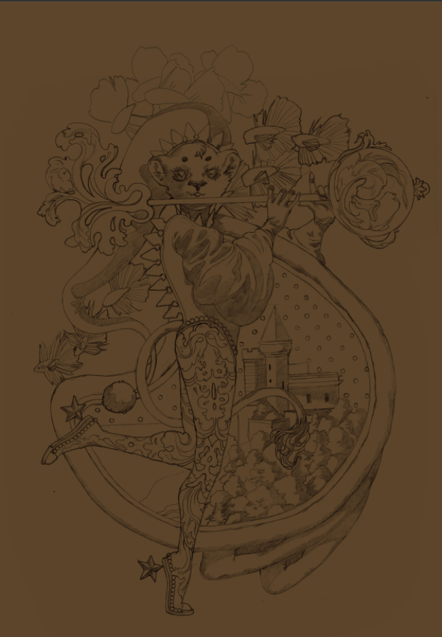
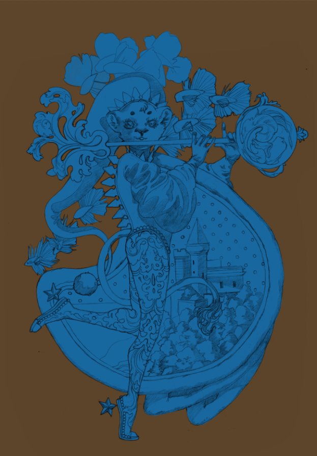
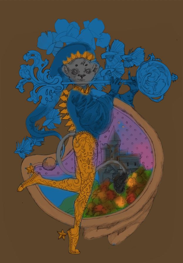
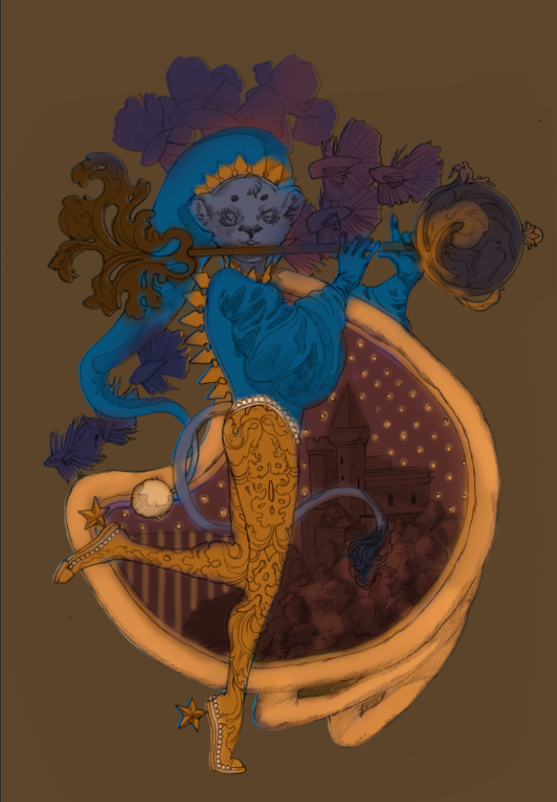
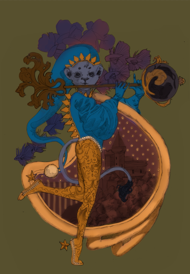
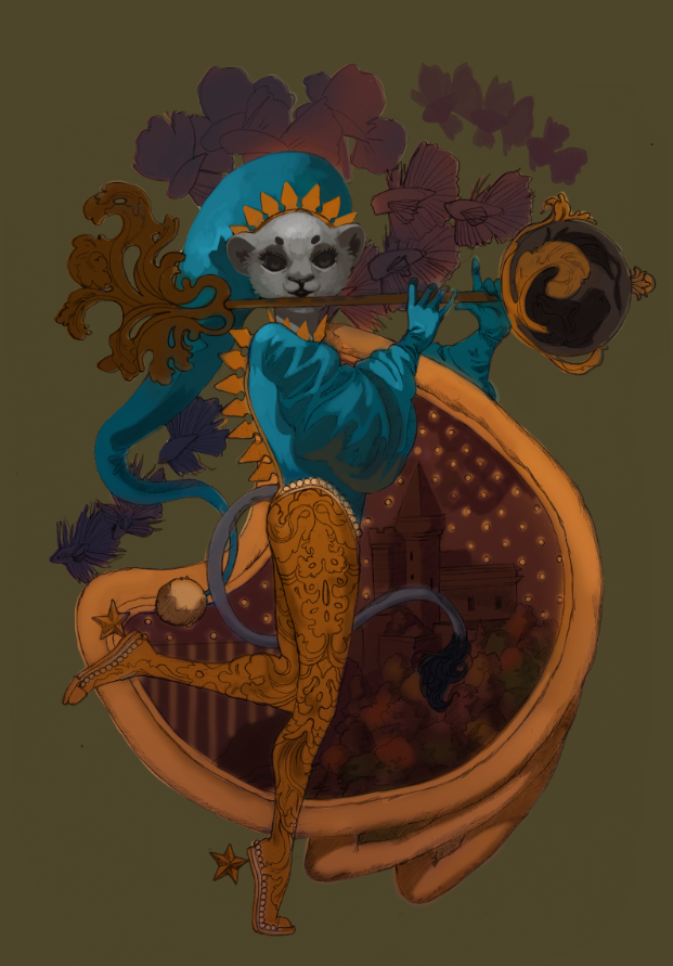
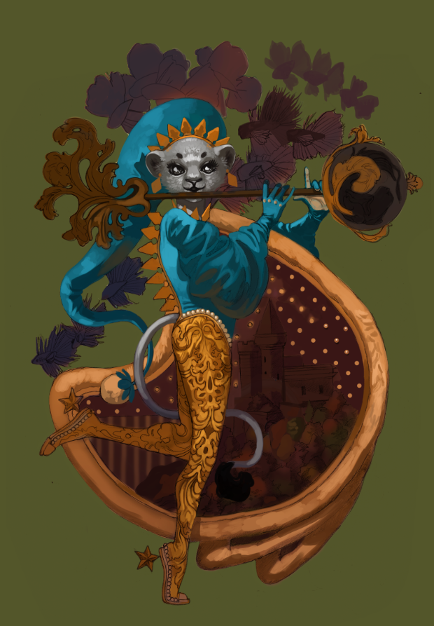
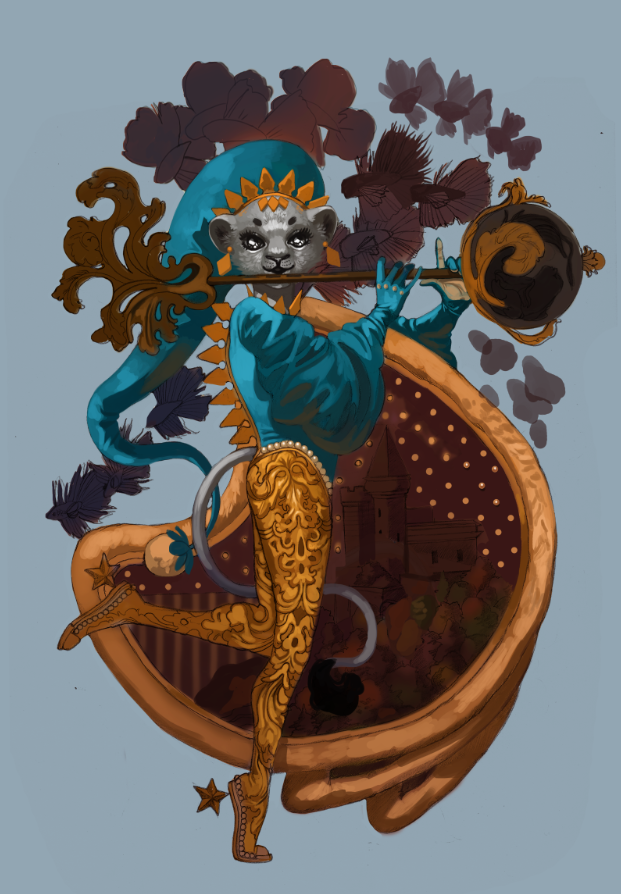
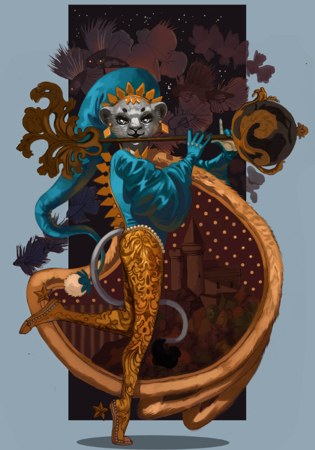
Sometimes you need to start over fresh. There's no shame in it. Why waste effort picking away at something you could just re-do in half the time? Other times, though, you'll need to bite the bullet and push through. Knowing which one of these to commit to is part of being a productive artist. I've talked about it before and I'll repeat until I'm blue in the face. It's a gamechanger. Now that that's out of the way...let me start this by saying I wanted to drop this piece like a cheap vase. Even worse? This was one of my favorite sketches in my sketch batch. Talk about artistic whiplash. It didn't help I was winging the color scheme and many of the supporting details (a habit I've developed since color theory is one of my strongest skills). I had a vague idea I wanted blue and gold, that I wanted everything fancy and dream-like...and that was about it. For once, my guesswork backfired and made me fudge around more than normal. This doesn't happen often -- I've winged crazier pieces than this -- but it cost me several hours that could've been saved if I fleshed out the draft stages better. This was a good reminder of how badly a piece can backfire if you don't have the basics down. I thought of throwing my hands up in the air and outright moving on to another sketch, but something about this one told me to keep going. 'Make it work' is a phrase made famous from Project Runway and one I've adopted. It's a saying that tells you to work with your mistakes and find a way out of the hedgemaze you've built for yourself. I might just have to do a post on all my personal quotes one of these days. (If you're curious about other pieces I've done, check out my recent post on the progress of 'Yasar'.) 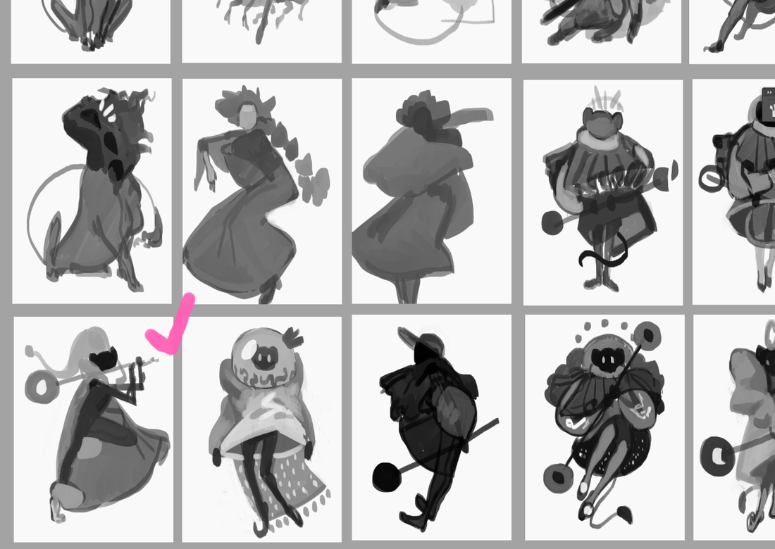 As you can see, I did the work of thumbnailing out these outlandish outfits. Just, well...didn't actually think about everything else! From now on I think I'll hash out a quick color scheme in Photoshop -- a cluster of dots ordered from most dominant to least -- before committing. A few minutes to save me a few hours. Same with the big block of starry space. Yeeeah, I added that in during the last stages, too.
I was extremely happy with how this sketch turned out. Both the pose and silhouette were the right amount of elegant and playful. I also used a reference of a kid playing the flute to make sure the hands looked right. This character's fashion is inspired heavily by classic JRPGs, magical girl anime and various architectural designs. While many of my characters have a certain theme, this one is intentionally all over the place. All the colors, all the silhouettes, all the patterns! The only rule is a visual smorgasbord: they're a lion child with a wild imagination that, fittingly, helps my imagination run wild. As such, I don't care too much about logistics when it comes to their outfits (beyond differentiating texture and a reasonable fit).
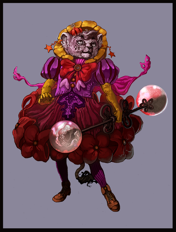
I've been drawing this character for years and enjoying every fanciful, floofy, extravagant clusterfuck they end up in. It just hit me that gold tends to be a dominant hue or focal point, an entirely subconscious detail. These were done back in 2015, all made up on the spot and something I still don't recommend you doing, ha ha. I can't believe winging it used to be my default. Reconnecting with my youthful spontaneity is a goal I still want to nurture moving forward. It won't replace the reliable structure of thumbnail-draft-sketch, but rather, support it.
In came the first problem: what even the hell color scheme? At the very least, I made sure to adhere to the basics. If you have a lot of cool colors, add a pop of something warm. If a certain color dominates up top, see what can contrast it below. It's like a math equation if math sucked less.
Even though I ended up veering away from the olive backdrop, I still like how it contrasted against everything else. Might have a green-and-gold centered piece later. Speaking of which, check out 'Green And Gold' by Lianne La Havas. Gorgeous song.
There may be a lot of working parts in this piece, but the face has the most pressure to be done well. It's what we tend to gravitate to as human beings, after all, and flubbing the expression/eyes/etc is like ruining the broth in a soup. The science behind the face is a fascinating topic for me and a big reason why I do so many portraits.
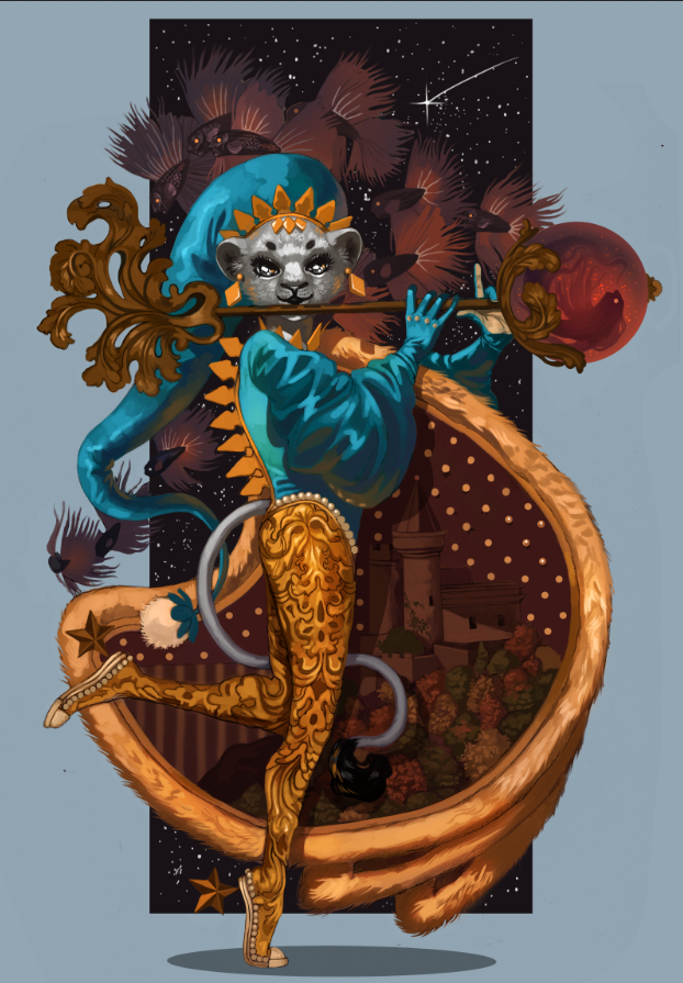
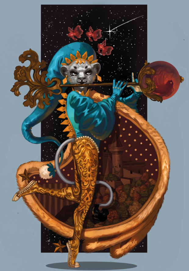
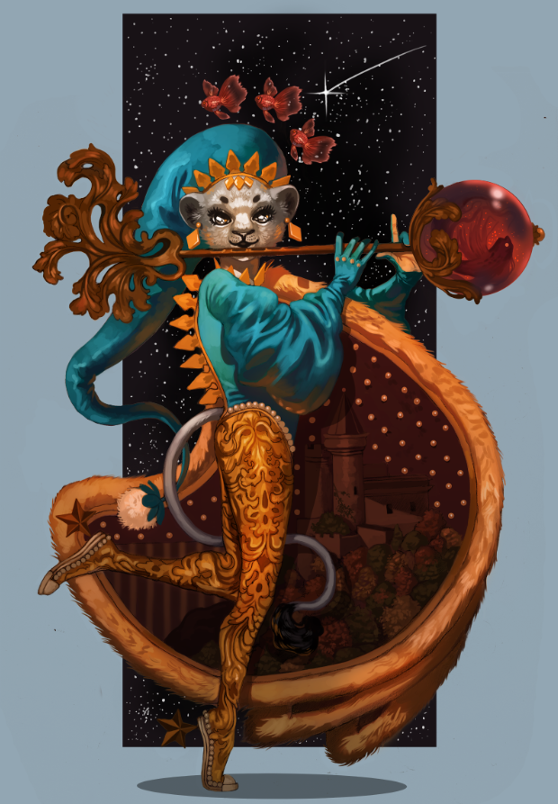
Oh, the gold decorations around the scepter ball drove me crazy. I kept fudging with them in the hopes they'd look better and eventually went, "Fuck this." Yes, you can give up and keep pushing in the same illustration. I was given some very helpful feedback in one of the Discord communities I'm part of, particularly concerning the fish. While outside eyes thought they looked fine, this element just rubbed me the wrong way. They were too cluttered, and yet, not enough. These magical betta didn't provide enough contrast and took up so much space the eye didn't know where to travel. I didn't want to eliminate them entirely, though...
...so I went for the 'less is more' approach. The piece immediately felt more breathable. The eye traveled more naturally, too, from the shooting star down to the fish down to the face. I made sure to keep the shade close to the scepter, too, to tie together the color scheme. 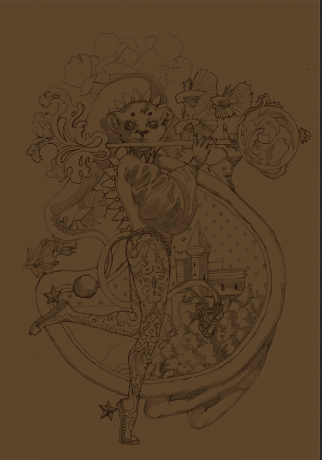 A little .gif for those that missed my Twitter post. I'm loving making these so much I might start playing with simple animations in 2020. 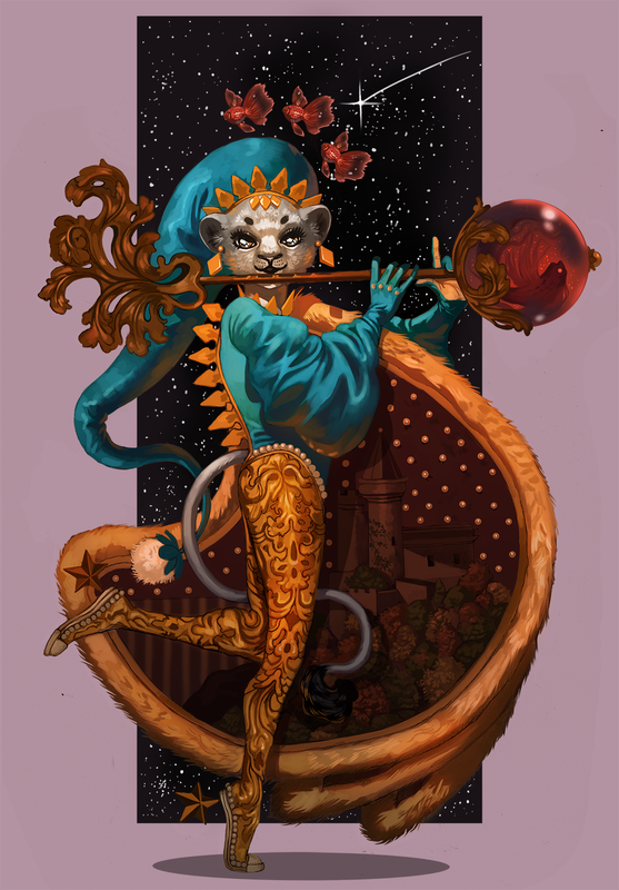 At the last second I decided to go for a light lavender backdrop, mostly because there was already a lot of blue in the piece. This piece was another lesson in 'just because you can, doesn't mean you should'. Just because I usually am able to wing my designs doesn't mean I should go into a piece flying by the seat of my pants. All in all? I'm glad I stuck with it. I'm going to celebrate what I did well and learn from what could've been better. It's a New Year, ripe with potential, and I'm going to stick to growing my good habits. I've talked before about how I don't make lofty New Year's declarations, instead preferring to focus on the smaller baby steps that lead up to goals. Now, that's not to say I don't have some idea on what I want. I'm going to continue to test my skills and build my portfolio. I want to create breathtaking illustrations that tell captivating stories, with emphasis on character interaction and complex backgrounds. I want to design all sorts of unforgettable characters and creatures. I want to expand a little and branch out into concept art, 3D modeling and fashion design. Here are some small goals I'll be doing over the next few months:
Reaching goals, big or small, means lots of thumbnailing, lots of rough drafts and lots of baby steps. Stay tuned!
0 Comments
Your comment will be posted after it is approved.
Leave a Reply. |
AuthorHere I post WIPs, sketches, speedpaints, thumbnails and anything else thrown into the veritable stew of artistic process. Archives
January 2021
Categories
All
|


 RSS Feed