I've been rifling through more of my old studies and personal thumbnails, analyzing what I've learned over the years with October right around the corner. These ones are all the way back from 2015, a little scratchier and more middle-of-the-road value-wise than I do now. Nonetheless, it's useful to analyze the areas where you've gotten stronger, as well as understanding where your skill starts to peter out and improve more slowly. Moving backwards is still movement! I've spoken about Frank Brangwyn before and how he's been a major fine art inspiration of mine. His ability to somehow create chaotic and extremely simple compositions is endlessly fascinating, which is to say nothing of his lighting. Buttery and bold, he's able to craft out a figure's weight, age and personality with just a few deceptively simple strokes. I've done enough traditional and digital studies over the years that I feel comfortable getting a lot down with very little. Silhouettes, in particular, are a very reliable way of carving out what you see. Moving forward I want to keep polishing up these areas. I want to paint faster, create more stunning compositions and improve my technical perspective. I also want to get comfortable all over again with being sloppy and loose. I love how just a little white splotch can communicate so much. A spot of sunlight on a roof. A worker's cap. A rock in water. Less really is more. While my art is a little too tightly polished to be called impressionistic, it's still a movement I take inspiration from in my preliminary work. The vibrant movement and sharp texture does a lot to keep my creative mind churning. Not all of my pieces are planned, after all. A single blob can be interpreted a dozen different ways. It's really fun figuring it all out on the fly. I'll have to upload more .gifs of my process so you can see just how many times I shrink, flip and rotate my work. These studies were instrumental in giving me a feel for Frank Brangwyn's work. His blobby, squished subjects and lavish detail just can't be confused for anyone else. On the other hand, I was clearly figuring out what was more important: getting all the details in the right place or keeping the study readable for the viewer. More contrast and smoother linework would have helped here. Speaking of which, I'll be getting into my favorite brushes in later posts, most of which include some sort of 'natural' jagged border. Clearly I learned something of value (ha!) from all these studies, because these personal thumbnails I did around the same time are much more readable. These compositions draw the eye toward a strong focal point, with the background either swooping or angling toward the subject for maximum effect. On top of that, atmospheric perspective is utilized in abundance to create a more believable sense of space. Perspective isn't just intimidating grid lines and boxes, but how objects fade, overlap and contrast each other. ...And, to be entirely honest? There are actually areas in my 2015 and 2016 work that are stronger than my current work. More dynamic. More lively. Looser textures, compositions that almost seem to breathe...it's no coincidence those happened to be easier artmaking years for me, as well. I was so much less wracked with pressure putting tablet to pen, letting anything and everything flow as it came. It's been hard for me to churn out the same amount of work I used to, and it's in studying my earlier pieces can I better get in touch with what's tripping me up. October is coming up, meaning Inktober...or in my case, Paintober. That means lots of new paintings and lots of new posts. Stay tuned!
0 Comments
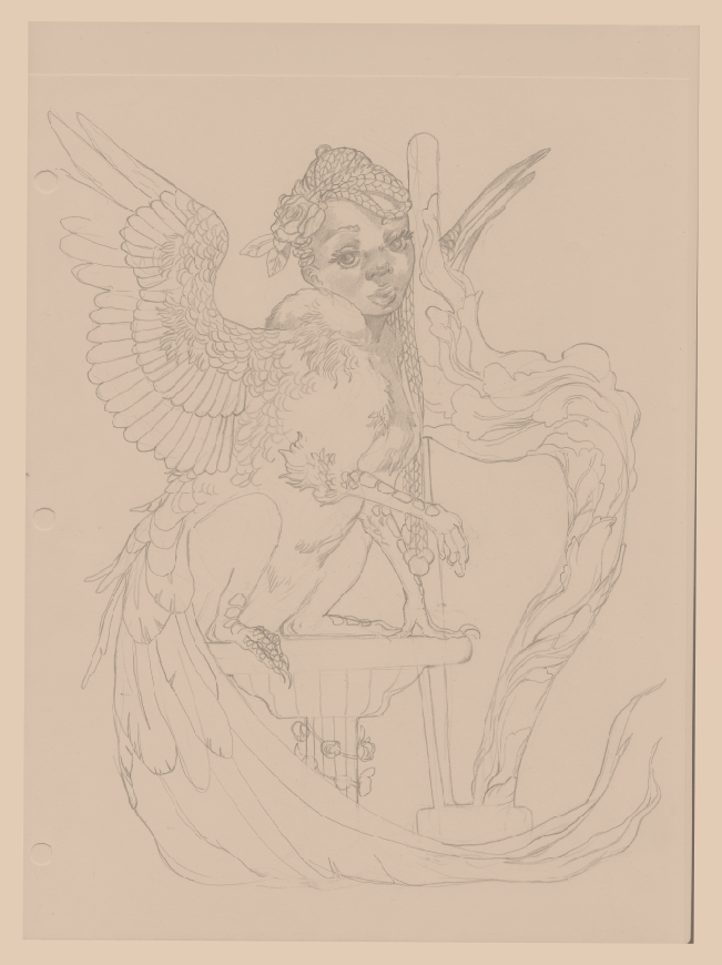
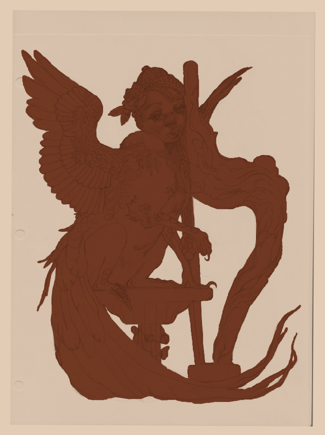
You want to be a character designer? Design characters. You want to be a concept artist? Create concepts for a hypothetical product or videogame. You want to be an animator? Animate. This advice may come across as intentionally obtuse, but so much of the narrative surrounding working artists is...convoluted. There are far too many art schools out there with archaic curriculums that exhaust rather than inspire. The amount of horror stories I hear from working professionals with degrees? It'd make your head spin (if you aren't one of those postgraduates already). Capitalism also has many of us afraid to specialize in one or two paths due to the inherent instability of the job market. Hell, just living your life and juggling time between kids, a part-time job and/or school? Underfed possibility will have you overwhelmed by the time you sit down to work on your art. I'm no stranger to it. Contrary to what you may hear, specializing is actually a good thing. A major reason I get work in fantasy illustration...is because I draw and paint a lot of fantasy. No attempts to be a jack-of-all-trades doing every last style under the sun, no self-flogging because I'm still weak in some areas (like urban cityscapes). I do what I like and I get hired to do what I like. Just like a gymnast has to do a set of repetitions thousands of times, so too do you need to draw something over and over before you get really good at it. All of this would've been harder if I spent a big chunk of time painting, say, cars (which I could really care less about). This isn't to say life experiences outside of art are unimportant, nor that variety is a waste of time. Far from it. The best art comes from a wealth of first-hand, lived experiences -- it's a reflection of life, after all, and art that lacks a healthy foundation will show its cracks. Over the past ten years I've gone from being an educational ASL interpreter to several barista positions to B2B writing. I've learned so much about myself and have drawn on these life experiences to improve my craft. All the while? I've drawn and painted what I wanted to. What made my mind, heart and soul sing. I sometimes wavered on this over the years, wondering if I was 'limiting myself' because I leaned toward a certain style and handful of genres. Whether you are leaning toward human subjects, a shoujo-esque style or wanting to commit to a sequential art major, you are limiting yourself...so you can specialize and become a master of one. Variety is important and specialization is not a curse. I've talked before about how language matters. The art industry is ever in need of nuance. Here we're going to take a look at another old character of mine, a pheasant-griffon sphinx that embodies so much of what I love to paint: I'll never lose touch with my eight year-old self filling in a coloring book. A good, old-fashioned pencil sketch scanned into Photoshop CC. On the right I fill up with a base color, which does the dual work of filling up the space and helping me better see my lineart. Choose a hue that's predominant in the final piece: this'll save you a little time when you finally sit down to paint. It's all about working smarter, not harder in these commercial illustration streets! I use hard-edged brushes when painting, but prefer soft-edged brushes during preliminary stages or touch-up stages. This gives me a sumptuous base that looks more natural. I also don't prefer to fill in areas manually, but quick mask and brush over my base color. It honestly looks nice when colors very gently 'bleed' into one another (thanks, traditional art!). On the right I then pull everything together with a gradient overlay. I keep it flowing in the direction of the lighting (from the top-right) so that it already looks complete, even before I've started rendering. It's extremely subtle, but I upped the saturation on the left -- I needed the reds and oranges to pop a little more. On the right I start painting with my usual dark-to-light (very common for acrylic and oil painters). One of my favorite quotes (and I can't remember who said it) was treating light like water: if you were to take a bucket and splash a subject, where would the water hit first? Where would it travel and where would it land? This simplifies key lighting fundamentals like a main light source and reflected lighting. 'Buttery' and 'oily' were the main adjectives running through my head here. Even though I've only toyed with oil paints in the past (since I don't have the studio space for them), I've always adored their glowing results. It's really satisfying seeing pencil strokes blur and vanish beneath the digital paint. Sometimes I'll let a little show through, depending on just how polished I want the final piece to be. As per my last post, art is a conversation. Embrace surprises. Borders are something I've been steering away from in recent work, though I may try it again for very classical-type pieces. I'm also thinking of more interesting way to do simple pin-ups. This piece is from 2017 and remains a shining example of what I love to see in my work: rich colors, fantastic creatures, beautiful black people, countless details and an irresistible sense of mystery or wonder. If you want to get work doing a certain thing, do the thing. Give yourself the space and time to focus on a certain subject, genre and/or style -- experiment enough to learn what you like, specialize enough to let yourself improve. The Internet has made it easier than ever to put your work up and be seen, as well as learn from others. Promoting yourself, though, is a major hurdle for many working artists (particularly introverted ones), which is something I'll be talking about in future posts. I have more goodness on the way, including posts about work-life balance and what day-to-day physical therapy looks like. Stay tuned!
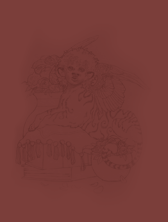
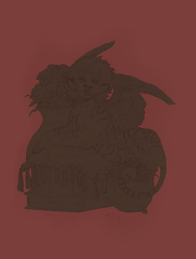
This is a piece of character art I did back in 2017, and one I'm still deeply proud of. It's a direction/technique I want to pick up again moving forward. I also figure it's time to talk about traditional and digital art, a juxtaposition that tends to get a lot of ire from gatekeeper blowhards. In my previous posts I talked about how I like to combine a little traditional art with digital, even though working 100% digital is often faster. There's a certain texture to pencil sketches that translates very well to digital painting. I took a wonderful general painting class back in high school -- alongside mentoring under an acrylic painting professor from a local university -- that helped set a strong foundation for my work today. Contrary to what some say (yes, sometimes to my face), traditional art is not better -- or more real -- than digital art. There's a pervasive -- and self-serving -- myth that a thing being harder automatically makes it better. Now, you won't get me saying traditional art doesn't have a steeper learning curve than digital. That is absolutely true. There are simply more steps involved. You have to prep the canvas (or wood or cardboard or-), create or transfer the sketch, mix your colors, protect your colors throughout several sessions, clean your brushes, preserve the final work, frame, package...yes. That is absolutely more work. But more work doesn't automatically mean better work. I've seen traditional art that's hardly moved me. I've seen digital art that's captured my imagination. This purity myth is steeped in gatekeeping attitudes that equate more difficulties with success...usually by those who don't face quite as many of those difficulties (such as having studio space or money for supplies) in the first place. I will not, however, create more myths around digital art. Digital art is easier than traditional. It's still not easy. If you're not familiar with layering, masking, color theory, light and shadow, design, mixing up your references...? Going digital is not suddenly going to fix that, no more than buying a fancy set of Copic markers and Bristol board will transform you into an overnight art master. In that regard...these two art forms are honestly not all that different. Digital art today is a brilliant tool to create art while saving space and money. It's painting without the mess. It's less costly. It's more flexible, especially if you're like me and constantly come up with new ideas on the fly. Already having a traditional art foundation just gives you a head start, as it makes the transition far smoother and gives your work a look that's not easily replicated. Doing a traditional sketch filled in with digital colors gives me the best of both worlds: the tight, grainy detail of pencil with the rich, sumptuous colors of a few Photoshop sessions. I've had this character since I was a teenager. I love him to bits. My traditional art background includes acrylic, gouache, watercolor, colored pencils and China markers. I've never had the studio space to get down and dirty with oils, but I really want to in the future. ...And before you ask, yes. Acrylic and gouache have both been considered 'lowbrow' paints for decades due to their commercial associations, while oil has remained the highbrow standard in fine art circles. It's no coincidence that oil paints take a lot more money and space than acrylic or gouache. They also have a higher health risk. See what I mean with difficulty being equated with superiority? I use traditional painting techniques in Photoshop throughout the entire process, including working dark-to-light and adding subtle gradients to make my brush strokes look rich. I'm also a huge fan of overlay layers and am constantly 'glazing' with the soft round to balance out my hard-edged brushes. You won't see me using more than five to ten layers at any given time, though I will regularly create new layers, add an effect, then flatten. It helps Photoshop run smoothly while keeping me organized. You can see which areas are more defined and which are fuzzier, a balance I work with as I go to keep the eye traveling naturally. Contrast is an essential part of any style or technique, as it gives the eye stopping and starting points. It's like a guitar solo in a rock song or the blank space in a living room. Balancing out hard v.s. soft, textured v.s. smooth, bright v.s. dark is a give and take that's become second nature. Even then? Years of experience doesn't stop me from flubbing my composition or struggling through a pose. I'm still amazed I knocked this sketch out in one go without a rough draft. Painter tip: you don't need to render every little part of the painting. Even if you go for a more realistic style. Notice how the final piece has areas with little detail and sometimes no detail, like some of the tassles and the edge of the (viewer's) left wing. This does the dual work of saving you unnecessary work and giving your painting more balance. A win-win. I've touched on this in past posts, but I take a lot of inspiration from the Romantic and Baroque periods. Not just in terms of subject matter, but in technique. Oily. Lavish. Rosy. Evocative. Rich. Bold. Powerful. Luscious. These are all adjectives I strive for. Be proud of your old work. Don't feel shame in taking a few steps backwards and revisiting a technique or subject you like. Most of all, don't fall for the myth that traditional or digital art is superior to the other. When in doubt? Do both. For those interested, I also have a few leftover prints of this very piece that I plan on selling soon. I have more WIPs and studies coming up (as well as more art rants), so stay tuned!
|
AuthorHere I post WIPs, sketches, speedpaints, thumbnails and anything else thrown into the veritable stew of artistic process. Archives
January 2021
Categories
All
|