The Art Of Ashe Samuels
  • The Art Of Ashe Samuels
  • Old Art
  • Contact
  • About
  • Commission Info
  • Blog
  • The Art Of Ashe Samuels
  • Old Art
  • Contact
  • About
  • Commission Info
  • Blog

Blog

Moving backwards is still movement.

9/25/2019

0 Comments

 
I've been rifling through more of my old studies and personal thumbnails, analyzing what I've learned over the years with October right around the corner. These ones are all the way back from 2015, a little scratchier and more middle-of-the-road value-wise than I do now. Nonetheless, it's useful to analyze the areas where you've gotten stronger, as well as understanding where your skill starts to peter out and improve more slowly. Moving backwards is still movement!
I've spoken about Frank Brangwyn before and how he's been a major fine art inspiration of mine. His ability to somehow create chaotic and extremely simple compositions is endlessly fascinating, which is to say nothing of his lighting. Buttery and bold, he's able to craft out a figure's weight, age and personality with just a few deceptively simple strokes. I've done enough traditional and digital studies over the years that I feel comfortable getting a lot down with very little. Silhouettes, in particular, are a very reliable way of carving out what you see. 
Moving forward I want to keep polishing up these areas. I want to paint faster, create more stunning compositions and improve my technical perspective. I also want to get comfortable all over again with being sloppy and loose.
Picture
I love how just a little white splotch can communicate so much. A spot of sunlight on a roof. A worker's cap. A rock in water. Less really is more.
Picture
While my art is a little too tightly polished to be called impressionistic, it's still a movement I take inspiration from in my preliminary work. The vibrant movement and sharp texture does a lot to keep my creative mind churning. Not all of my pieces are planned, after all. A single blob can be interpreted a dozen different ways. It's really fun figuring it all out on the fly. I'll have to upload more .gifs of my process so you can see just how many times I shrink, flip and rotate my work.
Picture
These studies were instrumental in giving me a feel for Frank Brangwyn's work. His blobby, squished subjects and lavish detail just can't be confused for anyone else. On the other hand, I was clearly figuring out what was more important: getting all the details in the right place or keeping the study readable for the viewer. More contrast and smoother linework would have helped here. Speaking of which, I'll be getting into my favorite brushes in later posts, most of which include some sort of 'natural' jagged border.
Picture
Picture
Picture
Picture
Picture
Clearly I learned something of value (ha!) from all these studies, because these personal thumbnails I did around the same time are much more readable. These compositions draw the eye toward a strong focal point, with the background either swooping or angling toward the subject for maximum effect. On top of that, atmospheric perspective is utilized in abundance to create a more believable sense of space. Perspective isn't just intimidating grid lines and boxes, but how objects fade, overlap and contrast each other.
...And, to be entirely honest? There are actually areas in my 2015 and 2016 work that are stronger than my current work. More dynamic. More lively. Looser textures, compositions that almost seem to breathe...it's no coincidence those happened to be easier artmaking years for me, as well. I was so much less wracked with pressure putting tablet to pen, letting anything and everything flow as it came. It's been hard for me to churn out the same amount of work I used to, and it's in studying my earlier pieces can I better get in touch with what's tripping me up. 
October is coming up, meaning Inktober...or in my case, Paintober. That means lots of new paintings and lots of new posts. Stay tuned!
0 Comments

Study from the masters. Yes...you are copying to LEARN.

9/2/2019

0 Comments

 
Like the sun rises and sets, there is always hubbub in the art community around copying...and rightfully so. No self-respecting artist wants to be a glorified scanner, nor should they want to make a mockery of another artist's work for short-term gain. Then there's the whole 'getting sued' thing. 
The word 'copying', however, should come with an asterisk: there's a big difference between mindless copying and studying. Any artist that wants to improve on a technical and personal level needs to know this. To study another's craft is to go in with the intent of bettering yourself. Of carving out your unique voice. This can be strengthening your composition by asking how, say, a commercial illustrator makes their work so readable. This can be improving your technique, such as figuring out a fine artist's strong grasp on light and shadow (though you should be studying from life, too). Perhaps your favorite artists have a certain style that just speaks to you.
All are valid reasons to pick up a pen and do some homework. That doesn't mean mindlessly copy and hope for the best. Studying is a conscientious act, with a goal to achieve after a set of repetitions. Studying from just one artist can increase the risk of copying, too, which is an easy enough problem to fix: have more than one inspiration. Just like a healthy diet can't solely rely on carbs, so too does a healthy artistic foundation need a variety of sources to pull from. Growing up I was surrounded by inspiration. I was heavily influenced by Pokemon, Final Fantasy and more books than I could shake a stick at. Jerry Pinkney, Janell Cannon, Mary GrandPré, Yoshitaka Amano and Pete Lyon are all incredible illustrators who did so much to capture my imagination (and still do).
To this day, I have more artistic inspirations than I can count. Commercial illustrators, fine artists, musicians, game designers, fashion designers. For now, I'm going to look at some studies I did in 2017 and 2018 of two of my favorite painting masters: Frank Brangwyn and Jeffrey Catherine Jones.
Picture
I don't remember where I first found Frank Brangwyn's work, but I do remember being completely floored by it. He's been a major painting inspiration for years for his beautiful technique and deceptively complex compositions. I say deceptively because, despite so many subjects and details, they remain relatively easy to break down into two or three parts. It's the base of any good composition: less is more. Also...his colors. Oh. They're so buttery I could cry.
I did these studies in grayscale, however, to focus more on tone and composition. They took me about an hour and a half to complete each, which will contrast the Brangwyn studies I did below. Doing these helped remind me how to gather up all my minor and major details in a way that's never confusing. 
Picture
Jeffrey Catherine Jones is another illustrator whose work just pops. Bold compositions with simplistic backdrops, combining the best in contemporary commercial illustration and classical paintings. Compared to Brangwyn's mundane romanticism, her work leans toward moody. Surreal. Even harsh. I'm a huge fan of how she uses black. There's almost always a striking black spot somewhere in the work, to draw the eye but not necessarily overwhelm.
Both of these artists represent different facets of my work I want to continue nurturing: warm, dreamy romanticism with intense, somber surrealism. *chef's kiss* A match made in heaven.
Picture
Not every study needs to (if you'll pardon the pun) be a masterpiece. ​
The quick ones, in fact, kill two birds with one stone: they help you loosen up and they force you to understand complex subjects on a basic level. There's a reason why you draw certain subjects faster than others. If you can't break something down in a short amount of time? It's likely you have a weak spot that need tending to. While not all of these turned out very nice (indeed, only a few did), they put my shortcomings on full blast. Told me where I took too long. Showed me where I didn't feel quite so comfortable (like cityscapes).
These took me about twenty to thirty minutes to do. I also do studies that take a few minutes each, which I'll be uploading here in the future. One of my favorite resources is to put on a dance choreography video, pause at random intervals and draw the interesting poses I get.
Picture
These also took twenty to thirty minutes. With the exception of the top right-hand corner, I didn't push the values on these enough. That's something I need to be careful of in the future: muddy, middle-of-the-road values. Yuck.
​ I have plenty more master studies I plan on doing, as well as studying from some of my favorite films/shows. Inspiration is everywhere. Enjoy it!
Being concerned about copying is an important part of being an artist. I have to constantly beware the subconscious inspiration my mind takes every time I do a commission. The thing is...none of us are dictionaries. It would be more accurate to describe the human mind as a thesaurus: a dynamic, and flawed, compendium that takes in the world and approximates it with similar words. Would you rather attempt to flee the inevitable and risk subconscious copying...or be smart about your influences? Instead of turning 'copying' into a dirty word, let's be a thesaurus.
Study from the masters and always cite your sources. Don't be a morally bankrupt clown and rip artists off.
I have new studies coming up, as well as a process post on one of my favorite portfolio pieces. Stay tuned!
0 Comments

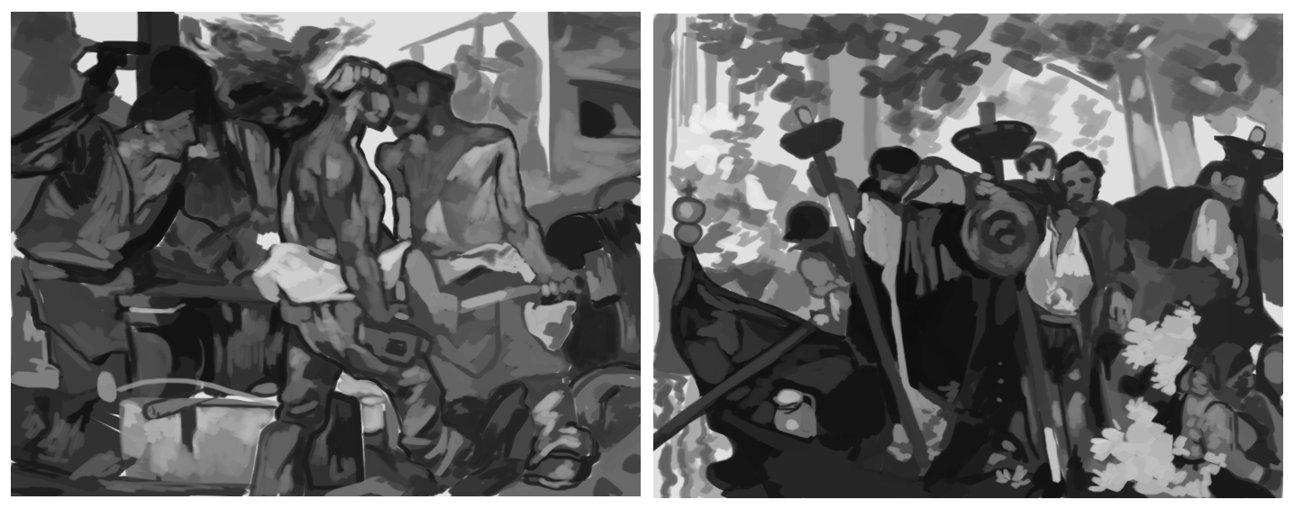
No art is wasted. Yes, even the art that turned out so wonky you want to pretend it never happened.

8/12/2019

0 Comments

 
I actually uploaded a few of these here back in 2017, but also left a few more buried in my art folders. For brevity's sake I'm going to dump all my studies of Donald's Glover's face (and one Bryan Tyree Henry) here.
I've grown tired of being embarrassed about older work, studies that turned out funny or sketches that were wildly off-base from the original idea. What's the point? Take a look at these, where I go from really knowing how to draw faces to not having a damn clue all in the same session. You can see me studying the same angle several times, because sometimes you're just not getting the hang of the thing. Maybe it's a subtle expression, maybe you're just warming up and can't draw right yet. No matter what, you keep going until you push through that wall.
​Not giving up really is 90% of the artistic process.
Picture
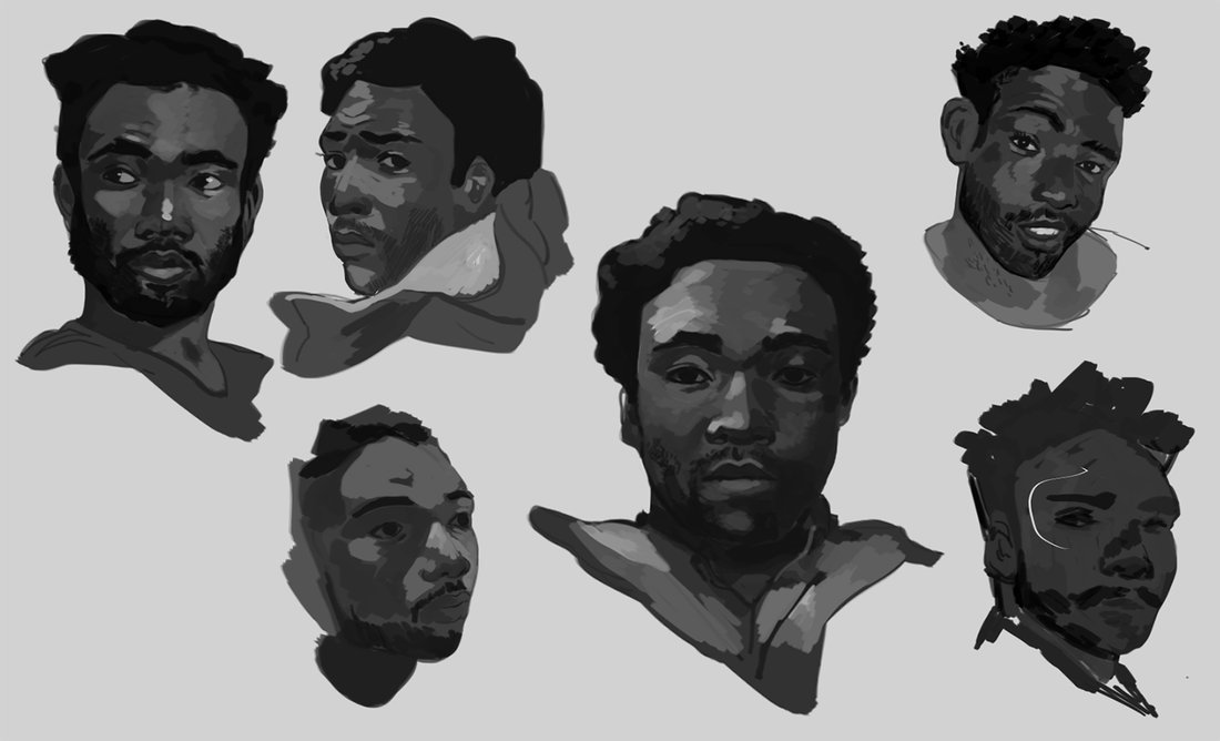
I watched a few clips from Atlanta (before watching full episodes with one of my Discord groups) to get more candid angles. A good exercise is to let a video play and pause at random. There's nothing wrong with studying your favorite angles, of course, but it can help to understand how the face works when it turns or stretches in ways you don't expect.
Keep an eye on that wonky one in the bottom left...
Picture
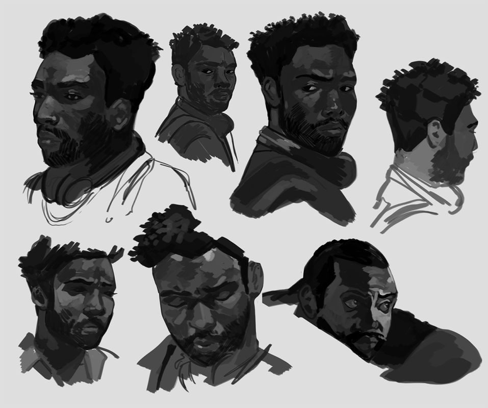
...because you can see where I started having a little trouble. Donald Glover had such a simple 3/4th angle here, yet I had a tough time capturing the subtleties of his expression. Instead of deeming it a lost cause, though, I warmed up on some different faces, then returned to it. Eventually I got close enough to deem the study a success.
Picture
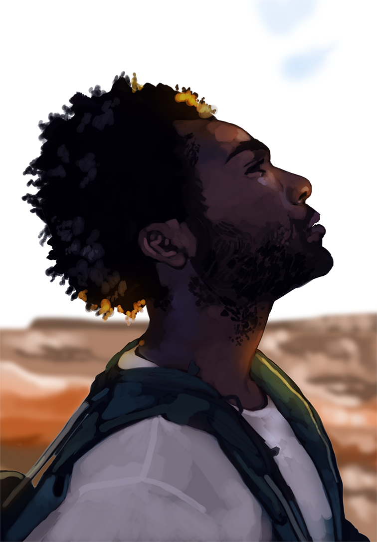
I then wrapped up the session with a color study based off one of his photoshoots. This one ended up looking a lot more 'marker-like' than most of my work, which I found interesting. It's not quite the finish I go for, but, eh. That's part of the process. You learn about what you want to do and what you don't want to do. Like fertilizer, art is never wasted.
There's more behind-the-scenes material coming up. Stay tuned!
0 Comments

    Author

    Here I post WIPs, sketches, speedpaints, thumbnails and anything else thrown into the veritable stew of artistic process.

    Archives

    January 2021
    November 2020
    June 2020
    March 2020
    February 2020
    January 2020
    December 2019
    November 2019
    October 2019
    September 2019
    August 2019
    July 2019
    December 2018
    October 2018
    August 2018
    May 2018
    April 2018
    March 2018
    February 2018
    December 2017
    October 2017
    September 2017
    August 2017

    Categories

    All
    Actor
    Anthros
    Beer
    Beer Can
    Behind The Scenes
    Behind-the-scenes
    Birdfolk
    Bryan Tree Henry
    Business
    Character Art
    Digital Art
    Donald Glover
    Fantasy
    Fantasy Art
    Fantasy Creature
    Fashion
    Fashion Art
    Frank Brangwyn
    Greyscale
    Harpies
    Harpy
    Jeffrey Catherine Jones
    Master Studies
    Mythical Creature
    Original Characters
    Paintober
    Photoshop
    Portraits
    Process
    References
    Resources
    Sketches
    Speedpaint
    Sphinx
    Studies
    Thumbnails
    Traditional Art
    Zero Issue Beer

    RSS Feed

Services

Book Covers
​Illustration
Character Art
Portraits
​Concept Art 

About

Commercial illustrator currently available for part-time and contract remote work. 

Contact

Find me on social media!
© COPYRIGHT 2015. ALL RIGHTS RESERVED.