There's always a simpler way to do things. I firmly believe in working smarter, not harder. We turn to custom brushes to help us get down redundant elements like foliage or scales with half the effort. We buy or create stencils so we can get down more accurate shapes without burning out our already precarious energy. Following this logic, this second acrylic painting went by a little quicker than the first due to me already having some paints mixed up from the last one, as well as the thumbnails being done in advance. The composition is similar to the first painting, to boot, and it all whittled an hour or two out of the process. I like it. This is an aspect of the creation process I'm keeping in mind for future work. What are ways I can snip out a little of the grind? How can I reuse past thumbnails or similar ideas for new projects? I've got more .psd files than I'd like to admit stuffed to the brim with spontaneous painting concepts, which I...really should organize into their own folder. That's so much fertilizer for new work. If you've got some old, unfinished art lying around, consider pulling them back out again and giving them a review. You could just have a hidden gem languishing away unseen. If you haven't read my first post for the first acrylic painting, check it out here. This character belongs to Khailed, a fellow illustrator who is currently open for icon and portrait commissions. Without further ado! To the left are a few of the thumbnails I did while working on the first acrylic painting. I was already solidly in the groove and felt like trying my hand at their original character as I let the other thumbs simmer. I adored their character's rosy ombre hair and little heart sweater (already similar to my own fashion sense). If you can't already tell, they have a knack for simple-and-striking designs. I've noticed how they tend to embody two or three poppy colors and a dominant fashion focal point, like a hat or a top. Really, they hearken to some of the best platformer characters of the 90's.
0 Comments
Sometimes you need to start over fresh. There's no shame in it. Why waste effort picking away at something you could just re-do in half the time? Other times, though, you'll need to bite the bullet and push through. Knowing which one of these to commit to is part of being a productive artist. I've talked about it before and I'll repeat until I'm blue in the face. It's a gamechanger. Now that that's out of the way...let me start this by saying I wanted to drop this piece like a cheap vase. Even worse? This was one of my favorite sketches in my sketch batch. Talk about artistic whiplash. It didn't help I was winging the color scheme and many of the supporting details (a habit I've developed since color theory is one of my strongest skills). I had a vague idea I wanted blue and gold, that I wanted everything fancy and dream-like...and that was about it. For once, my guesswork backfired and made me fudge around more than normal. This doesn't happen often -- I've winged crazier pieces than this -- but it cost me several hours that could've been saved if I fleshed out the draft stages better. This was a good reminder of how badly a piece can backfire if you don't have the basics down. I thought of throwing my hands up in the air and outright moving on to another sketch, but something about this one told me to keep going. 'Make it work' is a phrase made famous from Project Runway and one I've adopted. It's a saying that tells you to work with your mistakes and find a way out of the hedgemaze you've built for yourself. I might just have to do a post on all my personal quotes one of these days. (If you're curious about other pieces I've done, check out my recent post on the progress of 'Yasar'.) As you can see, I did the work of thumbnailing out these outlandish outfits. Just, well...didn't actually think about everything else! From now on I think I'll hash out a quick color scheme in Photoshop -- a cluster of dots ordered from most dominant to least -- before committing. A few minutes to save me a few hours. Same with the big block of starry space. Yeeeah, I added that in during the last stages, too. I was extremely happy with how this sketch turned out. Both the pose and silhouette were the right amount of elegant and playful. I also used a reference of a kid playing the flute to make sure the hands looked right. This character's fashion is inspired heavily by classic JRPGs, magical girl anime and various architectural designs. While many of my characters have a certain theme, this one is intentionally all over the place. All the colors, all the silhouettes, all the patterns! The only rule is a visual smorgasbord: they're a lion child with a wild imagination that, fittingly, helps my imagination run wild. As such, I don't care too much about logistics when it comes to their outfits (beyond differentiating texture and a reasonable fit). I've been drawing this character for years and enjoying every fanciful, floofy, extravagant clusterfuck they end up in. It just hit me that gold tends to be a dominant hue or focal point, an entirely subconscious detail. These were done back in 2015, all made up on the spot and something I still don't recommend you doing, ha ha. I can't believe winging it used to be my default. Reconnecting with my youthful spontaneity is a goal I still want to nurture moving forward. It won't replace the reliable structure of thumbnail-draft-sketch, but rather, support it. In came the first problem: what even the hell color scheme? At the very least, I made sure to adhere to the basics. If you have a lot of cool colors, add a pop of something warm. If a certain color dominates up top, see what can contrast it below. It's like a math equation if math sucked less. Even though I ended up veering away from the olive backdrop, I still like how it contrasted against everything else. Might have a green-and-gold centered piece later. Speaking of which, check out 'Green And Gold' by Lianne La Havas. Gorgeous song. There may be a lot of working parts in this piece, but the face has the most pressure to be done well. It's what we tend to gravitate to as human beings, after all, and flubbing the expression/eyes/etc is like ruining the broth in a soup. The science behind the face is a fascinating topic for me and a big reason why I do so many portraits. Oh, the gold decorations around the scepter ball drove me crazy. I kept fudging with them in the hopes they'd look better and eventually went, "Fuck this." Yes, you can give up and keep pushing in the same illustration. I was given some very helpful feedback in one of the Discord communities I'm part of, particularly concerning the fish. While outside eyes thought they looked fine, this element just rubbed me the wrong way. They were too cluttered, and yet, not enough. These magical betta didn't provide enough contrast and took up so much space the eye didn't know where to travel. I didn't want to eliminate them entirely, though... ...so I went for the 'less is more' approach. The piece immediately felt more breathable. The eye traveled more naturally, too, from the shooting star down to the fish down to the face. I made sure to keep the shade close to the scepter, too, to tie together the color scheme. A little .gif for those that missed my Twitter post. I'm loving making these so much I might start playing with simple animations in 2020. At the last second I decided to go for a light lavender backdrop, mostly because there was already a lot of blue in the piece. This piece was another lesson in 'just because you can, doesn't mean you should'. Just because I usually am able to wing my designs doesn't mean I should go into a piece flying by the seat of my pants. All in all? I'm glad I stuck with it. I'm going to celebrate what I did well and learn from what could've been better. It's a New Year, ripe with potential, and I'm going to stick to growing my good habits. I've talked before about how I don't make lofty New Year's declarations, instead preferring to focus on the smaller baby steps that lead up to goals. Now, that's not to say I don't have some idea on what I want. I'm going to continue to test my skills and build my portfolio. I want to create breathtaking illustrations that tell captivating stories, with emphasis on character interaction and complex backgrounds. I want to design all sorts of unforgettable characters and creatures. I want to expand a little and branch out into concept art, 3D modeling and fashion design. Here are some small goals I'll be doing over the next few months:
Reaching goals, big or small, means lots of thumbnailing, lots of rough drafts and lots of baby steps. Stay tuned!
I have so many characters. Jesus Christ. It's to the point that even doing art of other characters I don't paint very often feels excessive. Like I'm choosing a favorite child. As it stands, I've only drawn Yasar a few times, despite the fact he's a prominent supporting character in a big (and very old) story of mine. I'd go into greater detail about his personality and history, but I'm viciously protective of my intellectual property. Maybe someday when I actually commit this story to a game or a book. I like to separate character art into three categories: simple, complex and illustrative. The first is exactly what it says on the tin, with no background or any supporting elements whatsoever. The middle adds a little more, such as an item or animal. The latter is an illustration in all but name, with the focus still heavily on the character themselves. I take a lot of inspiration from fashion magazines for that last one, since they tend to showcase models in all sorts of environments that play second-fiddle to the subject. This character art is somewhere between a simple and complex, as the giant gilded egg fills out the space without any additional interaction. Funny enough, even after extensive thumbnailing (see below), I still didn't have any idea what I was going to put behind him. Just...something. Something to round out that space! Throwing in a big fancy egg while painting ended up giving me an idea for one of his powers, since he's an illusionist that depends on sleight-of-hand and a jack-of-all-trades approach. ...Don't do what I did, though. Figure everything out in the draft stage. It'll save you so much more trouble. Thumbnailing my character art was something I did sparingly in the past. Mainly because I internalized some bullshit ideas about how fast my art should be. Thumbnails and rough drafts were for illustrations, right? The complex stuff. The ones with backgrounds and action poses. ...Yeah, that's not true at all. Literally everything can be thumbnailed, from the smallest sliver of concept art to the most elaborate multi-character tapestry. Since my designs tend to be pretty fanciful, this step is extra helpful, allowing me to work out everything before committing to a polished pencil sketch. also to the middle left you can see my main reference for the pose, particularly for the legs Sketches take me between three to five hours on average, maybe a little longer. Thumbnails, on the other hand, are whipped up in minutes. Sitting down for an hour and hashing out a dozen thumbnails is peak relaxation. Sometimes I get so addicted to it I don't want to move on to later stages, even though later stages are also my favorite. I've been working on a sketch buffer these past few weeks: painting is my greatest strength and it saves me time to have a bunch of pencil drawings ready to go. This was my favorite in the pile, so I decided to start off strong. To the right I added a flat to bring out the silhouette -- the key to any good character art -- and move from there. I've been falling in crazy love all over again with persian and baroque architecture, so you're going to be seeing a lot of inspiration stemming from there, pastels and acanthus and stars galore the egg begins The soft brush remains my go-to for creating base colors. I love everything bleeding into each other. It's a very traditionalist approach to digital art and something I want to keep pushing; see just how buttery and iridescent I can get. I've been experimenting quite a bit with color burn, overlay and soft light layers to add more subtlety. I want colors so rich you feel like you could bite into them like a ripe fruit. Remember: paintings are conversations. You learn as you go. I realized the legs looked kind of stringy, so I used the magic wand tool to thicken them. Also, I'm obsessed with this guy's pants. They are seriously satisfying to look at. It took a few passes for me to figure out the most appealing color balance between the character and the egg. The teal ended up being a really tasty contrast with the pink backdrop: almost like a sandwich between the equally warm dominant colors of the character's outfit. I also made the head a little smaller and the hands a little bigger. Probably a sign for me to not get too lost in all the extravagance and keep in mind basic proportions. A little progress .gif for your viewing pleasure. I need fifteen more hands. Worked on this on-and-off over four to five days. I need to start tallying up the hours, because I honestly don't remember how long it took me overall. I really wanted to push my painting abilities with this one. Interestingly, I feel more success not in the final result, but the process: of committing to a thumbnailing/rough draft stage, using references and getting back into traditional sketching. I also got to show off all my strengths in one place. Fashion design, color theory, character design, lighting, texture. I plan on getting more playful with my layouts, as well as focusing on dynamic poses. I've got a pile of great ideas sitting in Photoshop, so this is one challenge I'll be happily meeting head-on. There's nothing quite so intoxicating as having a goal and being like, "Yeah? No fucking problem." I have more character art on the way, which means more processes, more .gifs, more rambles. I'm also considering making the switch from Photoshop CC to a different digital art program. Stay tuned!
Tl;dr: fashion is life. Long version: sometimes it's hard to believe I went from a gangly kid who religiously wore the same grey hoodie, old sneakers and side-braid to a woman who experiments with nearly every look. It's like a Pokemon evolution, only a lot slower. When I really think about it, though? It makes perfect sense. I had my time to be awkward (and sometimes outright disdainful) of how I look. I had the space to explore what I liked, what I didn't like and what I didn't quite feel ready to try out. It's the same logic around any unpleasant or disappointing experience: as Ava DuVernay likes to say, "It's not happening to you, it's happening for you." That hurdle of mine is well over and done with. Life is just too short to not celebrate your appearance. In the future I might just do a fashion retrospect, with each drawing representing where I was at major turning points (young child, teenager, young adult). For now... I compose my looks not unlike how I compose my paintings. I take into account the theme, such as cute casual or 80's nostalgia. I make sure colors and patterns are balanced. Got a lot of warm? Contrast it with something cool. Got a patterned top or leggings? Pair it with something simpler. It's hard to even come up with a name for my style, because I love to dabble in everything. Magical chic? Contemporary nostalgia? Flowery fatale? These are starting to sound like music genres. I'm not complaining. the term boho can go to hell, though. even though many of my looks would technically fall under that category in fashion SEO, I hate that term with a fiery passion 
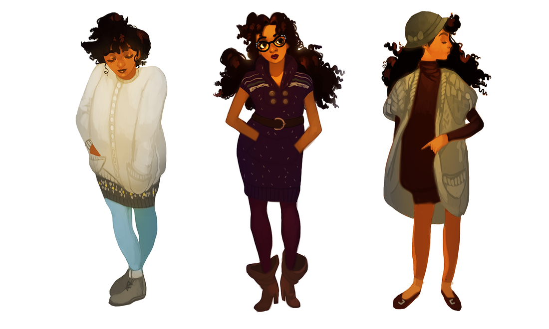
Why did it take me this long to embrace the utter power of the tunic dress? Seriously, come to my TED Talk. Let me tell you about how easy it is to mix and match these wonderful things, with the big fat bonus of skipping a step (shirt + pants). I had a tunic dress or two back in high school, but had no idea how to wear them. I'd actually tuck the damn things into my jeans so I wouldn't look 'weird'. There goes the point!!! The gray sweaterdress on the left with the white and yellow decorations is an old staple I still love. It was actually given to me by a high school friend and, a decade later, still fits me like a dream. Had to get rid of those cute boots, though. Listen to me. Pinched toes aren't worth it. Long tops and tunic dresses are two sides of the same coin. When in doubt? Stretch it out. I got the pink knitted tunic on the left back in Boston during my attendance as Arisia's guest of honor. I got the shoes and the rose gold headband at the same store to round out the purchase. The only thing more fun than traveling is picking up a fresh new look while you're there. Bonus points if you look like you walked out of a JRPG. These are my spring and summer looks: just layered enough to feed my obsession, still cool enough to hold up to the weather. I had a really cute encounter while wearing the middle outfit, where two shoppers at a grocery store walked by me in the parking lot and said, "Okay! I see you, salmon jeans!" Made my day. Then I gained twenty pounds and couldn't fit into my purple pair. Womp. I had another cute encounter at another grocery store with the middle outfit, where a guy complimented my hat: when I told him I got it for $2, he excitedly congratulated me. What can I say. Thrift shops really are that girl. Who said fashion is pain, anyway? So many of these outfits aren't just comfortable, they're insanely so. Something else I've been enchanted by lately are unique layers, like the outfit on the right. Regal, unusual drapery you don't see a lot in the day-to-day, like long sleeves peeking out of short sleeves or thigh-high boots with a peek of thigh-high socks. Just...careful details like that make my soul sing. I want to get crafty with my crafting. Finally bust out my gold cat ear headband (that I also got in Boston, by the by). At this point you're no doubt seeing a few clothing items reused, like the red ankle boots and the jewelry. When you like to switch things up, it helps not feeling the need to reinvent the wheel every single time. Sometimes you have a piece that's been collecting dust for months and deserves a moment in the spotlight. Hell, I can come up with a dozen great looks for a single dress. Again: get crafty. I went from being unable to find a pair of flats that fit me for months to suddenly finding all the pairs...right when it started getting cold. Go figure! Another favorite contrast of mine is bulky + slimming, like the left and the middle outfits. Cozy and stylish, in equal parts. My closet's pretty damn stuffed, but that doesn't stop me from reusing the same outfits. Yes, sometimes even I want to take a break from putting together a look. I wore the striped tunic dress on the left quite a bit during the summer. It's the perfect cute casual top, with just a little extra charm to make it pop (like the gaps in the elbows). The middle dress I wore to a concert: Beck and Cage The Elephant, two bands I've loved for years and who delivered one hell of a performance. Oh, the weather was perfect. So warm and breezy I could've been outside all night and not minded. and the beer was $15 per can, jesus christ- Looking back on all these different outfits, I feel proud. I like how I look. Nay, I love how I look, and I've never felt more honest with my appearance than the last five or six years. I'm not slicking my hair down with gel anymore to try and make it look straighter. I'm not wearing copious amounts of grey and black because I'm too shy to embrace my love for color. I'm not afraid to dabble in styles on-the-fly, try new things, let myself reinvent when needed and get lazy when desired. Keep in mind it's none of my business what anyone else chooses to wear: this is what works for me. There are still fashion languages I'm learning to speak. I want to add a little more green to my wardrobe, first off, which is hilarious because I actually love green. I just so happen to have a knee-jerk instinct to divebomb for anything maroon, lavender or gold. Currently my eyes are set on buying some thigh-high socks, hats that actually fit my fat head and, of course, more jewelry. Maybe one or two of those fancy claw rings. A tattoo will be in the works someday, but for now... ...anyone thinking of shaking up their looks in 2020? I have some new character art coming out this week, which also means more lengthy behind-the-scenes posts. Stay tuned!
|
AuthorHere I post WIPs, sketches, speedpaints, thumbnails and anything else thrown into the veritable stew of artistic process. Archives
January 2021
Categories
All
|