|
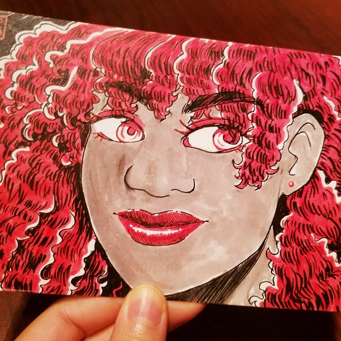
I haven't traditionally painted in almost a year. You heard that right. Despite what you may hear in snooty art circles, it's not necessary to draw or paint every day to keep a skill alive. In fact, taking a break can be just as beneficial as hard practice. As it stands, 2020 burnt me out pretty hard. Not only was I running out of steam juggling several gigs throughout a stressful year, I pulled a muscle in my neck and upper shoulder in the middle of a hefty project and found myself bedridden for a week. I was popping Tylenol every six hours, struggling to walk further than my kitchen and, at one point, found myself dissolving into tears of frustration. That injury also happened right when my period started! Yeah. That was a fun week. It's worth noting that digital painting and traditional painting are similar enough as it is, so I technically never fell out of practice. Still, it was refreshing to revisit my old supplies and dip into a well-worn skill. A friend of mine sent me a wonderful custom postcard not too long afterwards, which made my whole month. They're a fantastic illustrator and designer looking to try their hand at packaging design soon (and you can find their portfolio here). What better way to say thank you than with some art of my own?
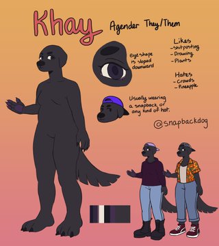
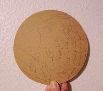
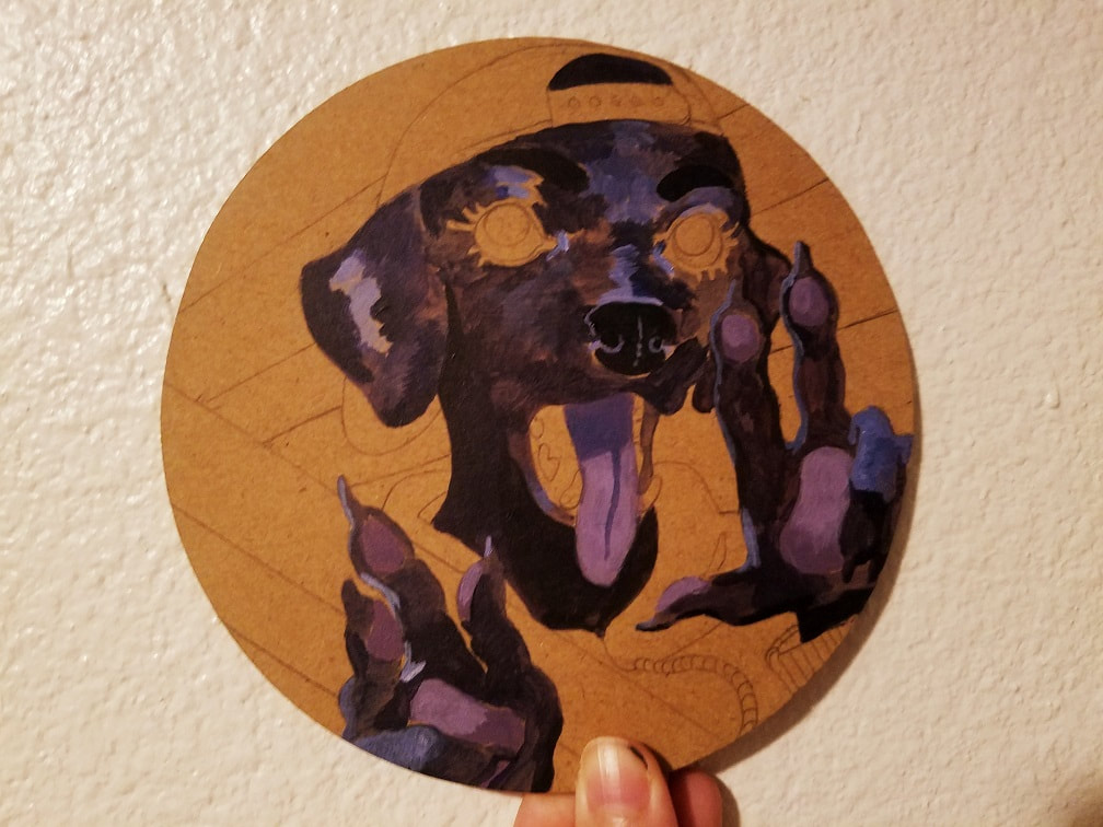
Their (gorgeous!) postcard is to the left, while their fursona is to the right. It's a very minimalist and striking design, which is just perfect considering the color scheme I want to use. I gathered up some references, warmed up with some doodles, then got started on a slew of thumbs and roughs.  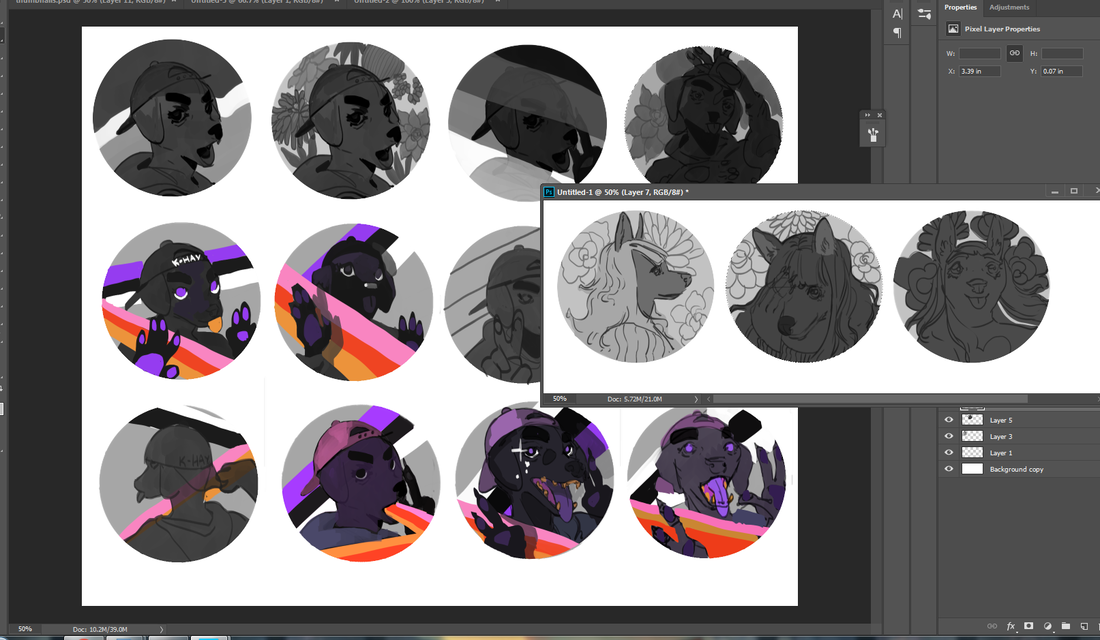 Thumbnailing, oh, how I love you so. Traditional or digital, this is where I let loose all the neat ideas flying around in my head. If it wasn't already obvious, the color scheme and style I prioritized here is based off classic VHS tapes (and badass VHS tape shoes). I find it a little funny the very last thumbnail was the one I ended up going with. Sometimes my first thumb is the best, sometimes the last. I honestly don't put too much stock into the when. Each piece comes with its own unique specifications and challenges: I can usually make a reasonable guess how long something will take me, but there will always be outliers. A few of these thumbnails have succulent plants instead, which I decided to reuse on the second character to the right. They'll show up in a later blog post. Until then... 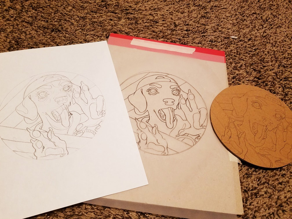 I really dig the prep stage of paintings. This is where I get to fine tune my composition and make sure there isn't a hair out of place. I sketched this three times before I put brush to surface: pencil on copy paper, transfer to tracing paper, then trace again onto the cardboard. If you're wondering where I got said cardboard, thank my roommate and her furniture packages. They often come with unique cardboard shapes that she's seen fit to stock me up on, for which I'm very grateful. Going to get on a soapbox really quick to wax philosophical about the beauty of cardboard as a painting surface. It's cheap (or free) and readily available in several varieties. You have your wrinkly, floppy cardboard. You also have cardboard that's pretty high quality: stiff, smooth and durable. It depends on the manufacturer and how much wear-and-tear it's been through. You can also increase a cardboard surface's durability with a few layers of gesso. Now, that doesn't mean you should go use something as delicate as watercolor. Acrylic and acrylic gouache are thick enough to be your best bet. Painting directly onto cardboard can leave it wrinkly and wet (unless you're using a strict impasto method), so I added a few layers of gel medium on top of my sketch. It's transparent, yet very durable, and gives me a much sturdier base to paint on. For the make-up enthusiasts out there it's not unlike putting primer beneath your foundation. If your brush strokes leave a little bumpiness, you can always sand it down with a little sandpaper, though I layer on smoothly enough this hasn't been a problem.
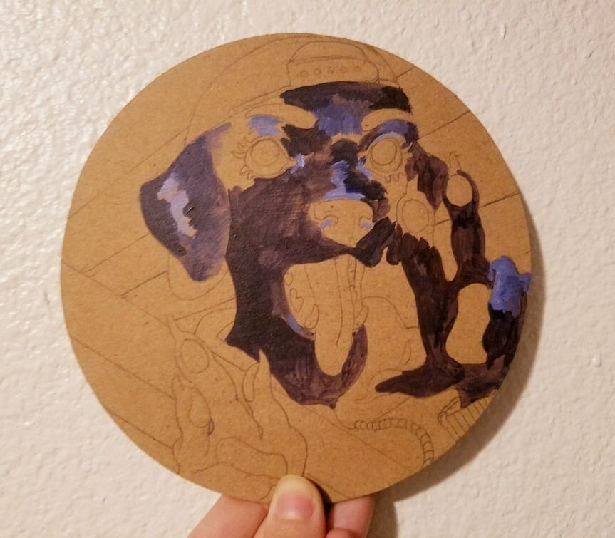
Fast tip: if you trace your sketch onto cardboard instead of drawing directly, keep in mind the darker color and rougher surface requires a heavier touch than your average sheet of bristol. I like to call the first hour or two of painting the 'growing pains'. This is where the paint can look a little streaky or blotchy since it hasn't been properly layered up to its full intensity. Part of this is working with student grade acrylics, too, which are a little lower in quality due to having less pigment. They're still very useful for smaller pieces and studies, though, and if anything? Artist grade and student grade are just two sides of the same coin. I'd much rather have both on hand than one or the other. I'm using my (very) old Art Advantage paints here and plan on buying either Winsor & Newton or Dick Blick paints sometime this year. On a related note, I've been enjoying a lot of beautiful gouache paintings from my social media feed. I'm strongly considering getting a set of student grade gouache for some plein-air studies and general color roughs. Its flexibility and bold color has earned it a reputation as a commercial illustrator's medium.
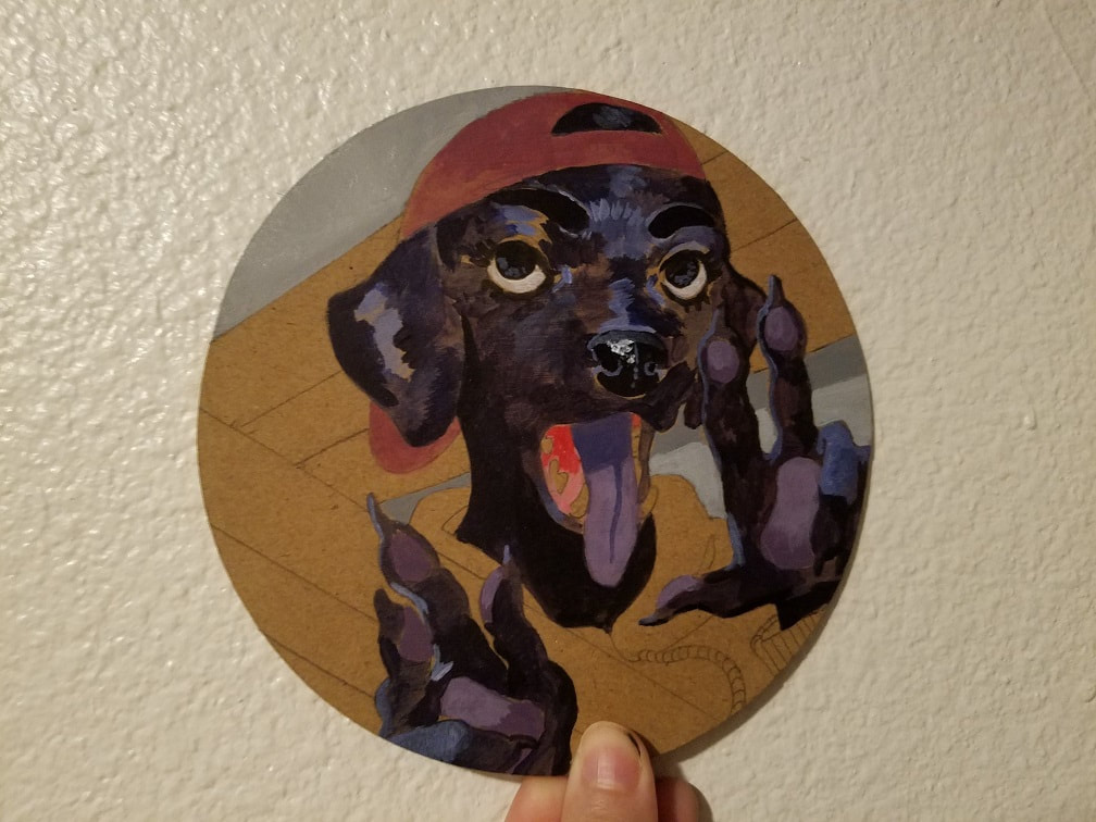
You can see things really taking shape at this stage. I was almost tempted to leave it half-finished because the colors popped so nicely against the light tan of the cardboard...but, nah. I'm going all out. I was originally going to write the fursona's name on the hat, too, but preferred the focus to be more on the face. Where you direct the eye first is the key to any visual composition.
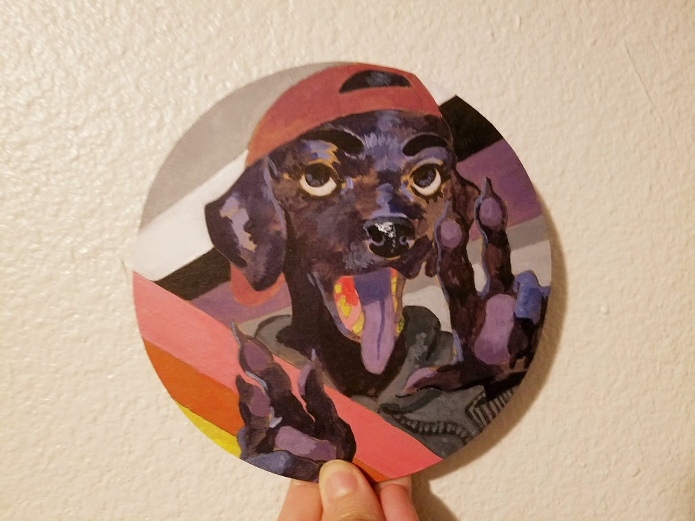
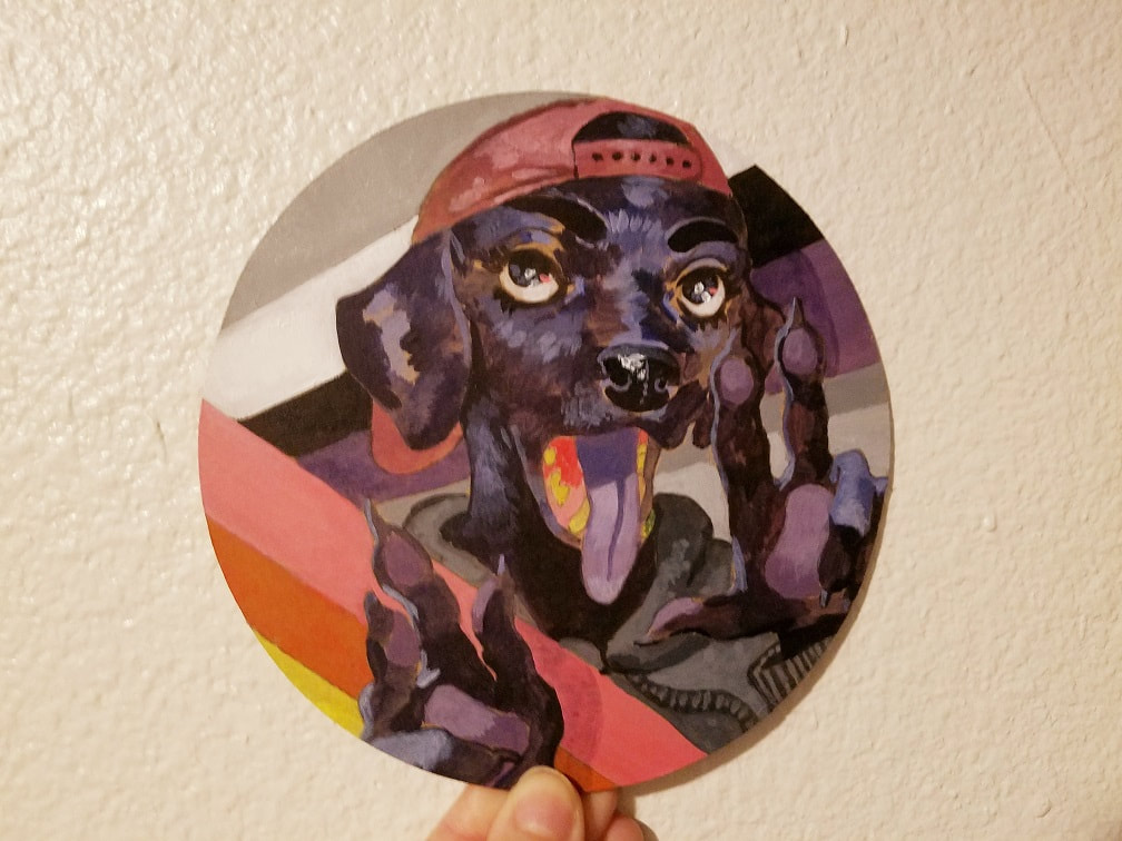
Just about done! I went and added a little sparkle to the eyes, with a dab of pink, and finished up the details in the hat. I've mentioned in past posts how I've been heavily leaning toward bold contrast in technique: buttery painterly realism juxtaposed with solid, splashy shapes. Oh, there's just something about how vividly they offset one another and bring out each other's best sides that's like satisfying an itch. It wasn't until I mailed the paintings that I realized I forgot a spot: the teeth! I meant to give them a little shadow and pop them out against the mouth. Welp! Live and learn. 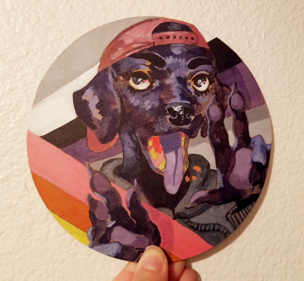 Ooh, I'm happy with how this turned out. It was a good refresher on the step-by-step process I missed so much: the gradual evolution from loosey-goosey roughs to concrete sketch and blotchy underpainting. The feel of the brush against the smooth cardboard and the colors blending together. Holding up the final piece to the light and admiring it from every angle, then etching in a last-second touch-up just because I can... (...which are the little orange spots, for those with a sharp eye) 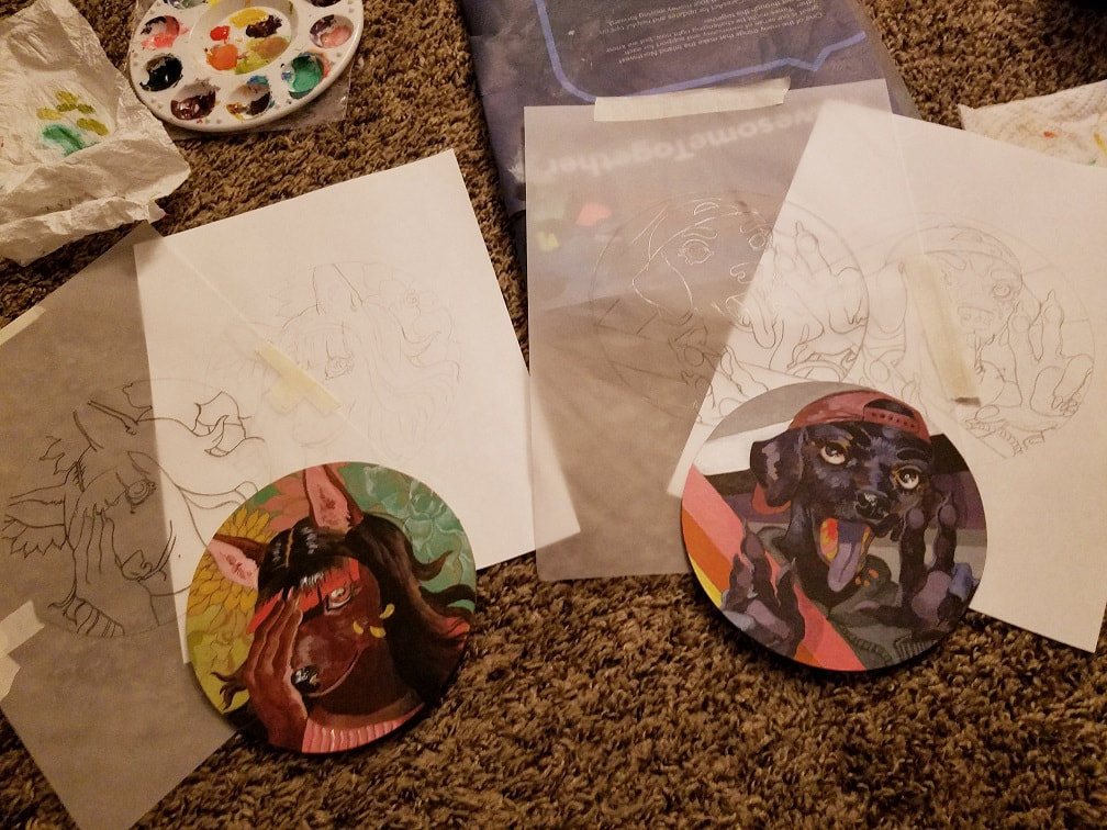 Why, yes, I am planning on getting an actual drafting desk to keep all these loose leaves together. The painting on the left is going to get a process post soon. I've also got future cardboard paintings in the works. Until then, thanks for reading!
0 Comments
Your comment will be posted after it is approved.
Leave a Reply. |
AuthorHere I post WIPs, sketches, speedpaints, thumbnails and anything else thrown into the veritable stew of artistic process. Archives
January 2021
Categories
All
|
 RSS Feed