There's always a simpler way to do things. I firmly believe in working smarter, not harder. We turn to custom brushes to help us get down redundant elements like foliage or scales with half the effort. We buy or create stencils so we can get down more accurate shapes without burning out our already precarious energy. Following this logic, this second acrylic painting went by a little quicker than the first due to me already having some paints mixed up from the last one, as well as the thumbnails being done in advance. The composition is similar to the first painting, to boot, and it all whittled an hour or two out of the process. I like it. This is an aspect of the creation process I'm keeping in mind for future work. What are ways I can snip out a little of the grind? How can I reuse past thumbnails or similar ideas for new projects? I've got more .psd files than I'd like to admit stuffed to the brim with spontaneous painting concepts, which I...really should organize into their own folder. That's so much fertilizer for new work. If you've got some old, unfinished art lying around, consider pulling them back out again and giving them a review. You could just have a hidden gem languishing away unseen. If you haven't read my first post for the first acrylic painting, check it out here. This character belongs to Khailed, a fellow illustrator who is currently open for icon and portrait commissions. Without further ado! 
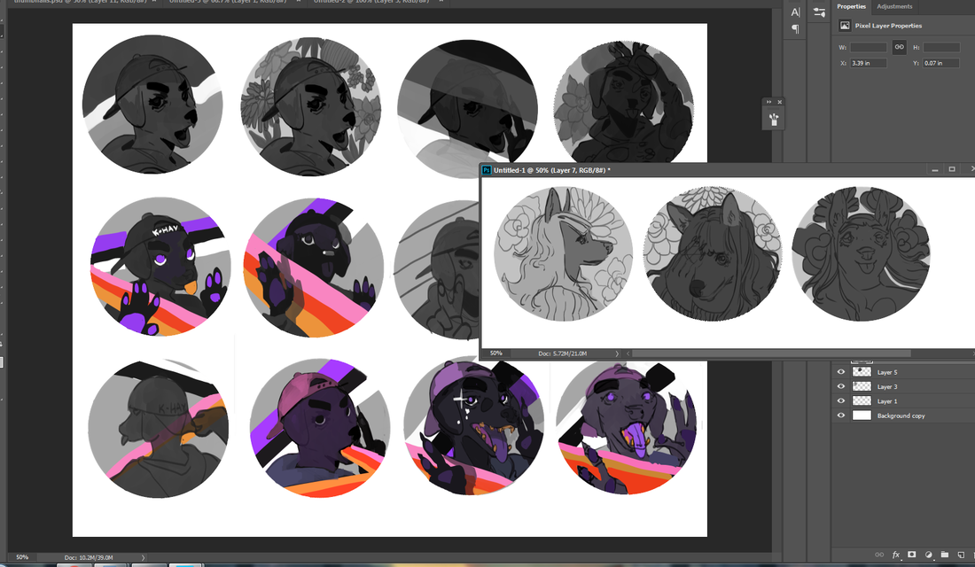
To the left are a few of the thumbnails I did while working on the first acrylic painting. I was already solidly in the groove and felt like trying my hand at their original character as I let the other thumbs simmer. I adored their character's rosy ombre hair and little heart sweater (already similar to my own fashion sense). If you can't already tell, they have a knack for simple-and-striking designs. I've noticed how they tend to embody two or three poppy colors and a dominant fashion focal point, like a hat or a top. Really, they hearken to some of the best platformer characters of the 90's.
0 Comments
I haven't traditionally painted in almost a year. You heard that right. Despite what you may hear in snooty art circles, it's not necessary to draw or paint every day to keep a skill alive. In fact, taking a break can be just as beneficial as hard practice. As it stands, 2020 burnt me out pretty hard. Not only was I running out of steam juggling several gigs throughout a stressful year, I pulled a muscle in my neck and upper shoulder in the middle of a hefty project and found myself bedridden for a week. I was popping Tylenol every six hours, struggling to walk further than my kitchen and, at one point, found myself dissolving into tears of frustration. That injury also happened right when my period started! Yeah. That was a fun week. It's worth noting that digital painting and traditional painting are similar enough as it is, so I technically never fell out of practice. Still, it was refreshing to revisit my old supplies and dip into a well-worn skill. A friend of mine sent me a wonderful custom postcard not too long afterwards, which made my whole month. They're a fantastic illustrator and designer looking to try their hand at packaging design soon (and you can find their portfolio here). What better way to say thank you than with some art of my own? Their (gorgeous!) postcard is to the left, while their fursona is to the right. It's a very minimalist and striking design, which is just perfect considering the color scheme I want to use. I gathered up some references, warmed up with some doodles, then got started on a slew of thumbs and roughs.
You just have to speak things into existence. I was contacted by Zero Issue Beer not too long ago -- a Canadian craft brewery -- and was asked if I was interested in doing an illustration for their new seasonal beer line-up. What a coincidence 2020 was the year I wanted to get into packaging design and illustration, particularly for beverages! Even better, the proceeds are going to Sankofa Arts & Music Foundation for black Canadian youth. As you can likely imagine, I was sold twenty times over. I have a short interview that will be appearing on their site here. For now? I'm going to share the creative process behind this piece, from the rough beginning stages to the inspiration behind it all. I'll share some tips I've learned about packaging design, too, for any of you who want to branch out your portfolio. Spoiler: there are harpies. My references are put together in collage format. Just an ongoing slapdash of visual inspiration and technical reference. While I adore my harpies and sphinxes, I still considered exploring some lesser-known hybrids like winged nagas, manticores and anggitay (a unicorn centaur from Filipino folklore). These references are far from a one-use-only deal. They can give birth to several different pieces by themselves, all with the benefit of saving me some work searching Google Images' royalty-free sections. Work smarter, not harder. Zero Issue Beer is very upfront about their love for nerddom: videogames, anime, D&D, you name it. I considered it all as I was designing my buzzed creatures: a giant mountain sphinx, a hoppy harpy, a deer bard and an owl gryphon. I had actually considered doing a lo-fi retro anime-styled design, but that was a case of too many cooks spoiling the proverbial broth. Limitation can actually be your best friend when a piece needs to be finished by a certain date, and considering I had a lot of creative freedom, I knew I needed to dial it back or I'd go crazy. See, I'm on the other side of the artistic extreme. Some artists struggle to come up with anything, while I come up with a ton and can get overwhelmed. The only specification for this art, aside from being CMYK, is the little stick figure. This character is a reoccurring element in all of Zero Issue Beer's logo design. A Where's Waldo hopped up on hops, if you will. First tip: learn the difference between RGB and CMYK. I frequently get both of these requested, with the preference changing depending on the type of commission (printed cover, digital promotion, product). Creative Pro has a useful breakdown on how these printing types affect printed work and web display. That unfinished block to the right is around where the beer can begins to wrap. It was interesting having to keep in mind the 3D nature of the can and what the viewer should more or less be seeing and touching in-person. It's one of the many things I love about packaging: it engages even more of your artistic senses than usual. I was torn between having the little stick figure be a wandering traveler in the hills or having him look like an abstract flower in the harpy's flower crown. I settled on the latter because I loved how the silhouette made me look twice. Afterwards, figuring out what to do with the little sparks of light eventually pushed me toward a sun-like design. Now for the final sketch. I had to redo those leaves a few times because they weren't quite popping out like I wanted. Throughout this process I constantly zoomed out to a rough size of the beer can on my monitor screen. Rich detail is certainly beautiful, but you can end up working far too hard on something that won't even show up when printed. Second tip: when in doubt? Zoom out. A lot of what you think is meticulous detail in a painting is actually texture and contrast suggesting more than what's actually there. Not only does it save you time, it looks much more natural. Unless you have the eyes of a red-tailed hawk, you can't actually pick out every last leaf or blade of grass in the distance. My color overlays took a little more doing, as I was torn on how much warm and cool contrast I wanted in the final version. Zero Issue Beer ended up leaning more toward the green, which I very much agreed with. Even a dominant color can still be made distinctive through shade, saturation and focal point. I mixed in some darker, cooler green with bright, warmer ones for contrast. I then tossed in a blue sky and a pop of yellow to keep everything from being too uniform. Third tip: color is much more complex than you likely give it credit for, so get comfortable with vocabulary like hue, shade, saturation, warm, cool and reflected lighting. If you need to return to the basics, check out Color And Light by James Gurney. This book has been on my to-buy list for a while and I can't wait to read it. This was one of my most relaxing paintings of the year. Honestly? I really needed that. Not only is it for a project that I'm deeply invested in, it was a return to indulgence that has run off with me somewhat. Something I'll always be keen on sharing are the bumps on the art-making road. 2020 has been a series of blows to emotional, mental and physical health for many. Contrary to the popular myth of the endlessly inspired struggling artist, many professionals, myself included, have struggled to create lately. When we're not tired, we're demoralized. When we're not demoralized, we're spreading ourselves too thin. To be able to enjoy a painting so thoroughly from beginning to end was the kind of artistic refresher I sorely needed. I was asked to offer up a series of names with hopeful connotations, and we eventually settled on 'Reverie'. It's a nostalgic, sweet sentiment, one I'm working on falling into more in lieu of doomsday thoughts that leave me drained. The character here is meant to be a return to joy. A moment of green and comfort, set to a fizzy buzz. Here's roughly what the final can will look like, with brand logo, drink name and drink type. Last art tip? Draw what you love.
Sometimes you need to start over fresh. There's no shame in it. Why waste effort picking away at something you could just re-do in half the time? Other times, though, you'll need to bite the bullet and push through. Knowing which one of these to commit to is part of being a productive artist. I've talked about it before and I'll repeat until I'm blue in the face. It's a gamechanger. Now that that's out of the way...let me start this by saying I wanted to drop this piece like a cheap vase. Even worse? This was one of my favorite sketches in my sketch batch. Talk about artistic whiplash. It didn't help I was winging the color scheme and many of the supporting details (a habit I've developed since color theory is one of my strongest skills). I had a vague idea I wanted blue and gold, that I wanted everything fancy and dream-like...and that was about it. For once, my guesswork backfired and made me fudge around more than normal. This doesn't happen often -- I've winged crazier pieces than this -- but it cost me several hours that could've been saved if I fleshed out the draft stages better. This was a good reminder of how badly a piece can backfire if you don't have the basics down. I thought of throwing my hands up in the air and outright moving on to another sketch, but something about this one told me to keep going. 'Make it work' is a phrase made famous from Project Runway and one I've adopted. It's a saying that tells you to work with your mistakes and find a way out of the hedgemaze you've built for yourself. I might just have to do a post on all my personal quotes one of these days. (If you're curious about other pieces I've done, check out my recent post on the progress of 'Yasar'.) As you can see, I did the work of thumbnailing out these outlandish outfits. Just, well...didn't actually think about everything else! From now on I think I'll hash out a quick color scheme in Photoshop -- a cluster of dots ordered from most dominant to least -- before committing. A few minutes to save me a few hours. Same with the big block of starry space. Yeeeah, I added that in during the last stages, too. I was extremely happy with how this sketch turned out. Both the pose and silhouette were the right amount of elegant and playful. I also used a reference of a kid playing the flute to make sure the hands looked right. This character's fashion is inspired heavily by classic JRPGs, magical girl anime and various architectural designs. While many of my characters have a certain theme, this one is intentionally all over the place. All the colors, all the silhouettes, all the patterns! The only rule is a visual smorgasbord: they're a lion child with a wild imagination that, fittingly, helps my imagination run wild. As such, I don't care too much about logistics when it comes to their outfits (beyond differentiating texture and a reasonable fit). I've been drawing this character for years and enjoying every fanciful, floofy, extravagant clusterfuck they end up in. It just hit me that gold tends to be a dominant hue or focal point, an entirely subconscious detail. These were done back in 2015, all made up on the spot and something I still don't recommend you doing, ha ha. I can't believe winging it used to be my default. Reconnecting with my youthful spontaneity is a goal I still want to nurture moving forward. It won't replace the reliable structure of thumbnail-draft-sketch, but rather, support it. In came the first problem: what even the hell color scheme? At the very least, I made sure to adhere to the basics. If you have a lot of cool colors, add a pop of something warm. If a certain color dominates up top, see what can contrast it below. It's like a math equation if math sucked less. Even though I ended up veering away from the olive backdrop, I still like how it contrasted against everything else. Might have a green-and-gold centered piece later. Speaking of which, check out 'Green And Gold' by Lianne La Havas. Gorgeous song. There may be a lot of working parts in this piece, but the face has the most pressure to be done well. It's what we tend to gravitate to as human beings, after all, and flubbing the expression/eyes/etc is like ruining the broth in a soup. The science behind the face is a fascinating topic for me and a big reason why I do so many portraits. Oh, the gold decorations around the scepter ball drove me crazy. I kept fudging with them in the hopes they'd look better and eventually went, "Fuck this." Yes, you can give up and keep pushing in the same illustration. I was given some very helpful feedback in one of the Discord communities I'm part of, particularly concerning the fish. While outside eyes thought they looked fine, this element just rubbed me the wrong way. They were too cluttered, and yet, not enough. These magical betta didn't provide enough contrast and took up so much space the eye didn't know where to travel. I didn't want to eliminate them entirely, though... ...so I went for the 'less is more' approach. The piece immediately felt more breathable. The eye traveled more naturally, too, from the shooting star down to the fish down to the face. I made sure to keep the shade close to the scepter, too, to tie together the color scheme. A little .gif for those that missed my Twitter post. I'm loving making these so much I might start playing with simple animations in 2020. At the last second I decided to go for a light lavender backdrop, mostly because there was already a lot of blue in the piece. This piece was another lesson in 'just because you can, doesn't mean you should'. Just because I usually am able to wing my designs doesn't mean I should go into a piece flying by the seat of my pants. All in all? I'm glad I stuck with it. I'm going to celebrate what I did well and learn from what could've been better. It's a New Year, ripe with potential, and I'm going to stick to growing my good habits. I've talked before about how I don't make lofty New Year's declarations, instead preferring to focus on the smaller baby steps that lead up to goals. Now, that's not to say I don't have some idea on what I want. I'm going to continue to test my skills and build my portfolio. I want to create breathtaking illustrations that tell captivating stories, with emphasis on character interaction and complex backgrounds. I want to design all sorts of unforgettable characters and creatures. I want to expand a little and branch out into concept art, 3D modeling and fashion design. Here are some small goals I'll be doing over the next few months:
Reaching goals, big or small, means lots of thumbnailing, lots of rough drafts and lots of baby steps. Stay tuned!
I have so many characters. Jesus Christ. It's to the point that even doing art of other characters I don't paint very often feels excessive. Like I'm choosing a favorite child. As it stands, I've only drawn Yasar a few times, despite the fact he's a prominent supporting character in a big (and very old) story of mine. I'd go into greater detail about his personality and history, but I'm viciously protective of my intellectual property. Maybe someday when I actually commit this story to a game or a book. I like to separate character art into three categories: simple, complex and illustrative. The first is exactly what it says on the tin, with no background or any supporting elements whatsoever. The middle adds a little more, such as an item or animal. The latter is an illustration in all but name, with the focus still heavily on the character themselves. I take a lot of inspiration from fashion magazines for that last one, since they tend to showcase models in all sorts of environments that play second-fiddle to the subject. This character art is somewhere between a simple and complex, as the giant gilded egg fills out the space without any additional interaction. Funny enough, even after extensive thumbnailing (see below), I still didn't have any idea what I was going to put behind him. Just...something. Something to round out that space! Throwing in a big fancy egg while painting ended up giving me an idea for one of his powers, since he's an illusionist that depends on sleight-of-hand and a jack-of-all-trades approach. ...Don't do what I did, though. Figure everything out in the draft stage. It'll save you so much more trouble. Thumbnailing my character art was something I did sparingly in the past. Mainly because I internalized some bullshit ideas about how fast my art should be. Thumbnails and rough drafts were for illustrations, right? The complex stuff. The ones with backgrounds and action poses. ...Yeah, that's not true at all. Literally everything can be thumbnailed, from the smallest sliver of concept art to the most elaborate multi-character tapestry. Since my designs tend to be pretty fanciful, this step is extra helpful, allowing me to work out everything before committing to a polished pencil sketch. also to the middle left you can see my main reference for the pose, particularly for the legs Sketches take me between three to five hours on average, maybe a little longer. Thumbnails, on the other hand, are whipped up in minutes. Sitting down for an hour and hashing out a dozen thumbnails is peak relaxation. Sometimes I get so addicted to it I don't want to move on to later stages, even though later stages are also my favorite. I've been working on a sketch buffer these past few weeks: painting is my greatest strength and it saves me time to have a bunch of pencil drawings ready to go. This was my favorite in the pile, so I decided to start off strong. To the right I added a flat to bring out the silhouette -- the key to any good character art -- and move from there. I've been falling in crazy love all over again with persian and baroque architecture, so you're going to be seeing a lot of inspiration stemming from there, pastels and acanthus and stars galore the egg begins The soft brush remains my go-to for creating base colors. I love everything bleeding into each other. It's a very traditionalist approach to digital art and something I want to keep pushing; see just how buttery and iridescent I can get. I've been experimenting quite a bit with color burn, overlay and soft light layers to add more subtlety. I want colors so rich you feel like you could bite into them like a ripe fruit. Remember: paintings are conversations. You learn as you go. I realized the legs looked kind of stringy, so I used the magic wand tool to thicken them. Also, I'm obsessed with this guy's pants. They are seriously satisfying to look at. It took a few passes for me to figure out the most appealing color balance between the character and the egg. The teal ended up being a really tasty contrast with the pink backdrop: almost like a sandwich between the equally warm dominant colors of the character's outfit. I also made the head a little smaller and the hands a little bigger. Probably a sign for me to not get too lost in all the extravagance and keep in mind basic proportions. A little progress .gif for your viewing pleasure. I need fifteen more hands. Worked on this on-and-off over four to five days. I need to start tallying up the hours, because I honestly don't remember how long it took me overall. I really wanted to push my painting abilities with this one. Interestingly, I feel more success not in the final result, but the process: of committing to a thumbnailing/rough draft stage, using references and getting back into traditional sketching. I also got to show off all my strengths in one place. Fashion design, color theory, character design, lighting, texture. I plan on getting more playful with my layouts, as well as focusing on dynamic poses. I've got a pile of great ideas sitting in Photoshop, so this is one challenge I'll be happily meeting head-on. There's nothing quite so intoxicating as having a goal and being like, "Yeah? No fucking problem." I have more character art on the way, which means more processes, more .gifs, more rambles. I'm also considering making the switch from Photoshop CC to a different digital art program. Stay tuned!
|
AuthorHere I post WIPs, sketches, speedpaints, thumbnails and anything else thrown into the veritable stew of artistic process. Archives
January 2021
Categories
All
|