|
There's always a simpler way to do things. I firmly believe in working smarter, not harder. We turn to custom brushes to help us get down redundant elements like foliage or scales with half the effort. We buy or create stencils so we can get down more accurate shapes without burning out our already precarious energy. Following this logic, this second acrylic painting went by a little quicker than the first due to me already having some paints mixed up from the last one, as well as the thumbnails being done in advance. The composition is similar to the first painting, to boot, and it all whittled an hour or two out of the process. I like it. This is an aspect of the creation process I'm keeping in mind for future work. What are ways I can snip out a little of the grind? How can I reuse past thumbnails or similar ideas for new projects? I've got more .psd files than I'd like to admit stuffed to the brim with spontaneous painting concepts, which I...really should organize into their own folder. That's so much fertilizer for new work. If you've got some old, unfinished art lying around, consider pulling them back out again and giving them a review. You could just have a hidden gem languishing away unseen. If you haven't read my first post for the first acrylic painting, check it out here. This character belongs to Khailed, a fellow illustrator who is currently open for icon and portrait commissions. Without further ado!
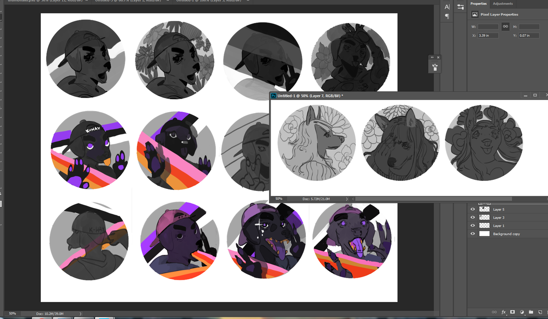
To the left are a few of the thumbnails I did while working on the first acrylic painting. I was already solidly in the groove and felt like trying my hand at their original character as I let the other thumbs simmer. I adored their character's rosy ombre hair and little heart sweater (already similar to my own fashion sense). If you can't already tell, they have a knack for simple-and-striking designs. I've noticed how they tend to embody two or three poppy colors and a dominant fashion focal point, like a hat or a top. Really, they hearken to some of the best platformer characters of the 90's. 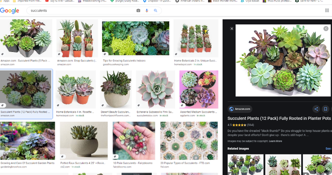 I really need to get some succulent plants for my room. They're just so cute. They little add pastel pops of color and don't require as much maintenance as some plants do. I even have a little bulbasaur succulent pot that's been sitting in my room untouched for years. 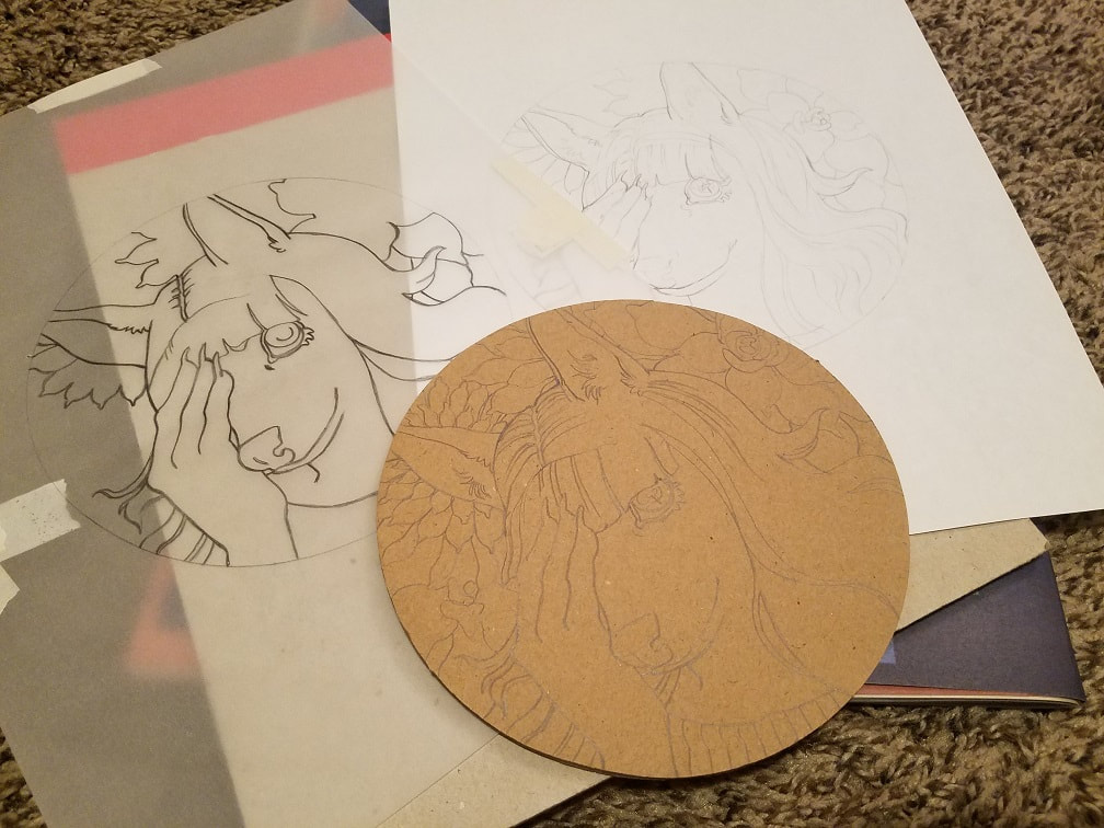 My 'set-up'. For those wondering, the drafting desk I'm currently eyeballing is this one over on Dick Blick. Nothing too fancy, but able to be lifted up at an angle and just large enough to collect all my loose leaves. Hunching on my tiny bedside table sounds nice in theory, but does my back no favors.
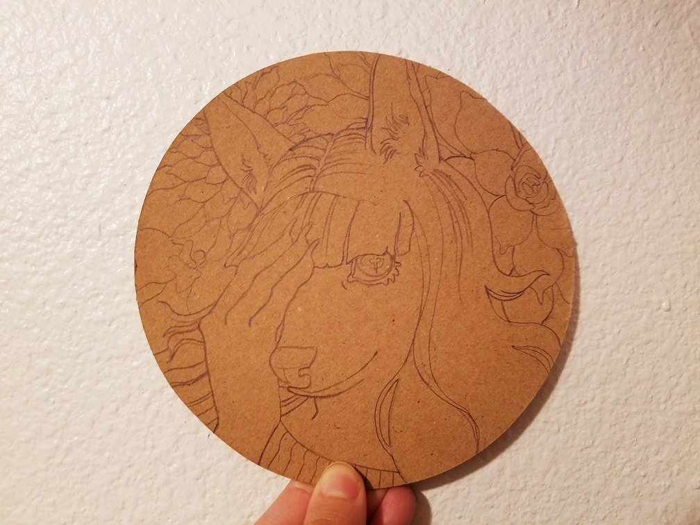
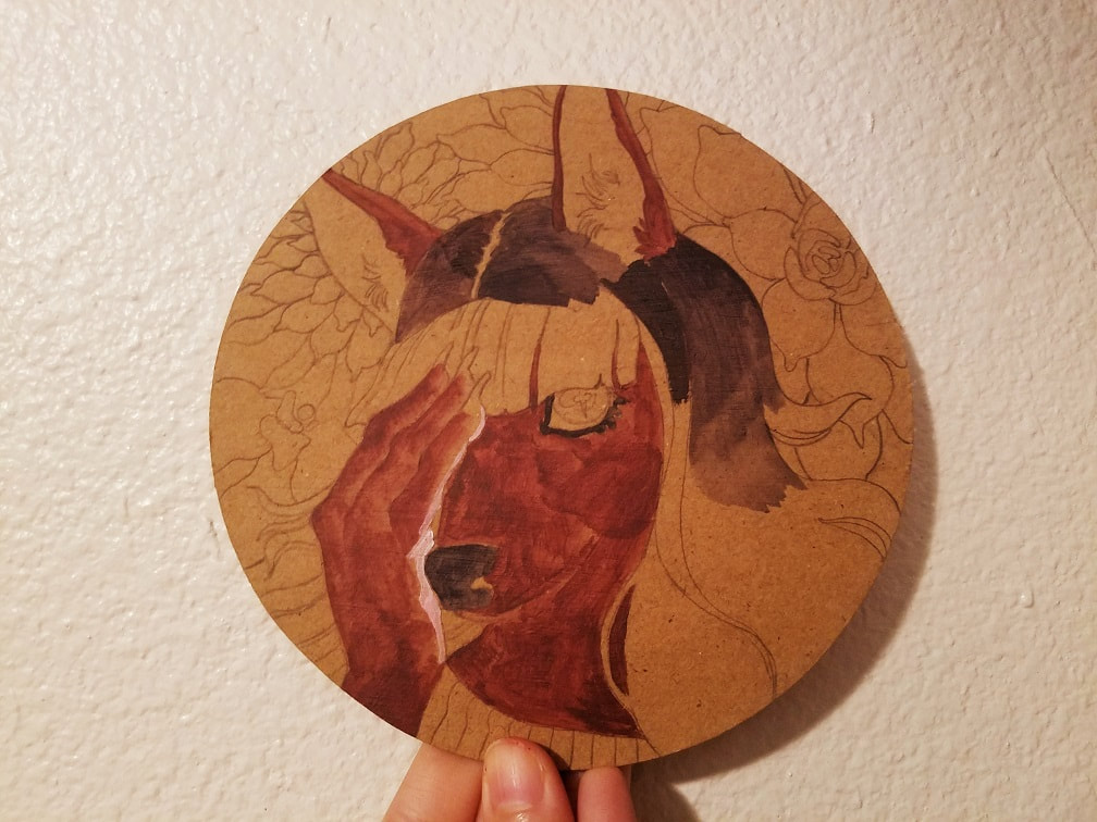
This sketch took no time at all. I learned from the first painting how finicky tracing paper gets on cardboard, so I used a heavier hand to get the lines as clear as possible. As you can plainly see from the right, the growing pains on this painting were much more stark. Brown has always been a tricky traditional painting color, in my experience, and gets pretty damn blotchy to start with. At least, taken straight out of the tube. Brown I've mixed together myself tends to hold up thicker.
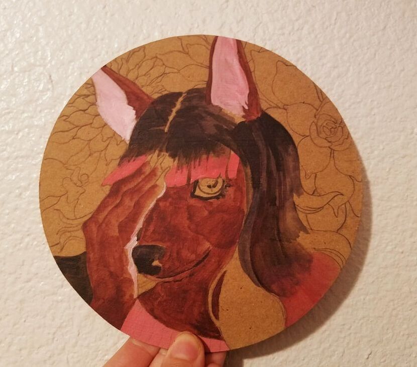
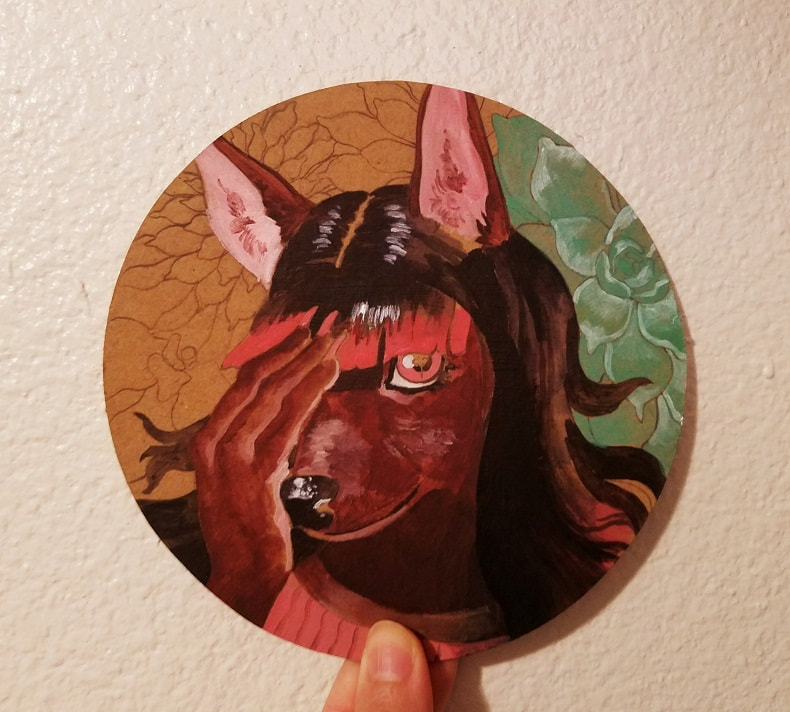
The growing pains continue! Part of being an artist is muscling through a work when it's not lining up with the image in your head. It's all too tempting to become your own worst critic and wonder if you have any clue what you're doing. Once I started laying down the hard shadows and etching out the succulent plants it started finally coming together. 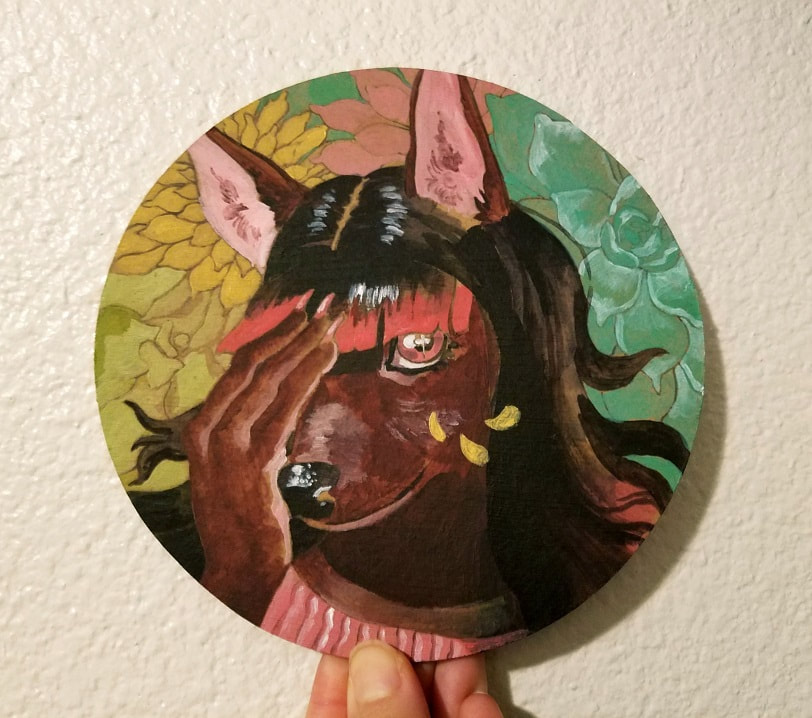 Shorter post for a faster painting! I'm not crazy about how the hair turned out, but that's nothing a little introspection can't fix. I think next time I'll do heavier layering and commit to a stronger silhouette for the hairstyle in the beginning stages. This technique looks like it doesn't know if it wants to be watercolor or gouache. 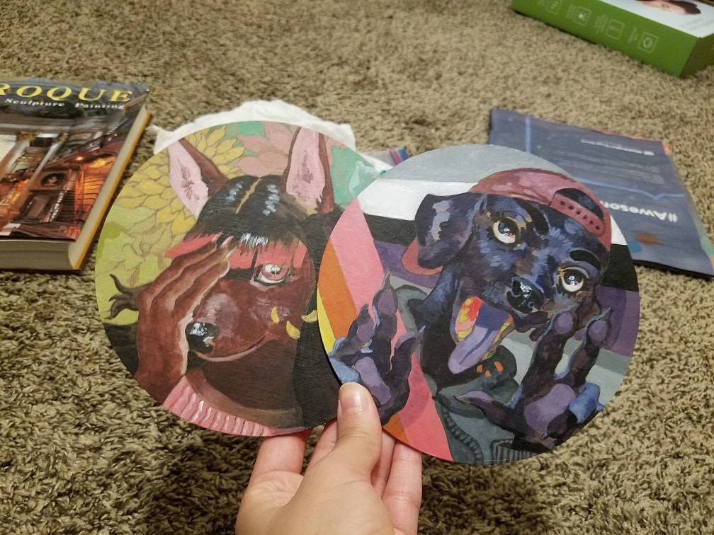 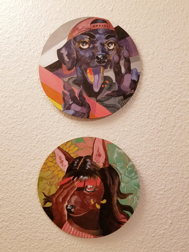 Last little note: I'm in love with different canvas shapes. I mean, don't get me wrong. The rectangle (and to a similar extent the square) is a staple for a reason, able to be reliably arranged in sections a la rule of thirds and craft intense compositions. Circles and ovals are uniquely...cozy, to me, and triangles are a more bold choice I want to try. Maybe I could get even more kooky. Flower or animal-shaped canvases, maybe? Never mind arranging separate canvases together into a unique whole... I've got another progress post once my next beer can design drops. Until then, consider digging around in your house for some cardboard to paint on. I guarantee you'll have a blast.
0 Comments
Your comment will be posted after it is approved.
Leave a Reply. |
AuthorHere I post WIPs, sketches, speedpaints, thumbnails and anything else thrown into the veritable stew of artistic process. Archives
January 2021
Categories
All
|
 RSS Feed