You just have to speak things into existence. I was contacted by Zero Issue Beer not too long ago -- a Canadian craft brewery -- and was asked if I was interested in doing an illustration for their new seasonal beer line-up. What a coincidence 2020 was the year I wanted to get into packaging design and illustration, particularly for beverages! Even better, the proceeds are going to Sankofa Arts & Music Foundation for black Canadian youth. As you can likely imagine, I was sold twenty times over. I have a short interview that will be appearing on their site here. For now? I'm going to share the creative process behind this piece, from the rough beginning stages to the inspiration behind it all. I'll share some tips I've learned about packaging design, too, for any of you who want to branch out your portfolio. Spoiler: there are harpies. My references are put together in collage format. Just an ongoing slapdash of visual inspiration and technical reference. While I adore my harpies and sphinxes, I still considered exploring some lesser-known hybrids like winged nagas, manticores and anggitay (a unicorn centaur from Filipino folklore). These references are far from a one-use-only deal. They can give birth to several different pieces by themselves, all with the benefit of saving me some work searching Google Images' royalty-free sections. Work smarter, not harder. Zero Issue Beer is very upfront about their love for nerddom: videogames, anime, D&D, you name it. I considered it all as I was designing my buzzed creatures: a giant mountain sphinx, a hoppy harpy, a deer bard and an owl gryphon. I had actually considered doing a lo-fi retro anime-styled design, but that was a case of too many cooks spoiling the proverbial broth. Limitation can actually be your best friend when a piece needs to be finished by a certain date, and considering I had a lot of creative freedom, I knew I needed to dial it back or I'd go crazy. See, I'm on the other side of the artistic extreme. Some artists struggle to come up with anything, while I come up with a ton and can get overwhelmed. The only specification for this art, aside from being CMYK, is the little stick figure. This character is a reoccurring element in all of Zero Issue Beer's logo design. A Where's Waldo hopped up on hops, if you will. First tip: learn the difference between RGB and CMYK. I frequently get both of these requested, with the preference changing depending on the type of commission (printed cover, digital promotion, product). Creative Pro has a useful breakdown on how these printing types affect printed work and web display. That unfinished block to the right is around where the beer can begins to wrap. It was interesting having to keep in mind the 3D nature of the can and what the viewer should more or less be seeing and touching in-person. It's one of the many things I love about packaging: it engages even more of your artistic senses than usual. I was torn between having the little stick figure be a wandering traveler in the hills or having him look like an abstract flower in the harpy's flower crown. I settled on the latter because I loved how the silhouette made me look twice. Afterwards, figuring out what to do with the little sparks of light eventually pushed me toward a sun-like design. Now for the final sketch. I had to redo those leaves a few times because they weren't quite popping out like I wanted. Throughout this process I constantly zoomed out to a rough size of the beer can on my monitor screen. Rich detail is certainly beautiful, but you can end up working far too hard on something that won't even show up when printed. Second tip: when in doubt? Zoom out. A lot of what you think is meticulous detail in a painting is actually texture and contrast suggesting more than what's actually there. Not only does it save you time, it looks much more natural. Unless you have the eyes of a red-tailed hawk, you can't actually pick out every last leaf or blade of grass in the distance. My color overlays took a little more doing, as I was torn on how much warm and cool contrast I wanted in the final version. Zero Issue Beer ended up leaning more toward the green, which I very much agreed with. Even a dominant color can still be made distinctive through shade, saturation and focal point. I mixed in some darker, cooler green with bright, warmer ones for contrast. I then tossed in a blue sky and a pop of yellow to keep everything from being too uniform. Third tip: color is much more complex than you likely give it credit for, so get comfortable with vocabulary like hue, shade, saturation, warm, cool and reflected lighting. If you need to return to the basics, check out Color And Light by James Gurney. This book has been on my to-buy list for a while and I can't wait to read it. This was one of my most relaxing paintings of the year. Honestly? I really needed that. Not only is it for a project that I'm deeply invested in, it was a return to indulgence that has run off with me somewhat. Something I'll always be keen on sharing are the bumps on the art-making road. 2020 has been a series of blows to emotional, mental and physical health for many. Contrary to the popular myth of the endlessly inspired struggling artist, many professionals, myself included, have struggled to create lately. When we're not tired, we're demoralized. When we're not demoralized, we're spreading ourselves too thin. To be able to enjoy a painting so thoroughly from beginning to end was the kind of artistic refresher I sorely needed. I was asked to offer up a series of names with hopeful connotations, and we eventually settled on 'Reverie'. It's a nostalgic, sweet sentiment, one I'm working on falling into more in lieu of doomsday thoughts that leave me drained. The character here is meant to be a return to joy. A moment of green and comfort, set to a fizzy buzz. Here's roughly what the final can will look like, with brand logo, drink name and drink type. Last art tip? Draw what you love.
0 Comments
Been a while since I've done one of these! Indulgent art has always held a high priority for me. Why bother painting or drawing things I'm not invested in? Not to mention I need to show what I want to get hired for, so...kill two birds with one stone. This piece, however, was peak indulgence. Like, a dollop of whipped cream on top of whipped cream indulgence. You have a harpy. You have flowers. You have a ton of colors. Hell, there are even the mildest of vaporwave vibes (pink + blue surrealism) that snuck in without me realizing. Expect to see more of that. This year has been an absolute trainwreck and it's barely halfway over. Soaking in the subjects and styles I love to the nth degree is as self-care as it gets. As a side-note, I'm going to be keeping these progress posts a little brief from now on so I don't repeat myself. I mean, you know I love color. The part where I start phasing out the sketch and start rendering is orgasmic. Yadda yadda. I'll focus more on the unique challenges of each piece and what, exactly, was going on in my mind when making it. It's time to get indulgent. Cobbled together quite a few references for this one, on top of looking into the mirror to get the hands looking right. Let me tell you, it is damn hard finding a photo of a bird from the belly up with its wings folded. That little ballpoint pen doodle was done on an envelope in-between research and drafting. It's often when I'm thinking the least the best compositions come to me. There's a lesson to be learned here. I was really feeling the color composition here, but wasn't quite sure how to break up the space a little more. I added a pile of heads in the second one (which also did more to tell a story), but there still wasn't enough contrast. A little too much pink and...not enough everything else. In the far right I added more blue flourishes to get the eye traveling more easily, as well as more plants, and eventually found my happy balance.
There was a lot of gradually tweaking small details in the middle of painting. Wings looked uneven, tail crooked, needing more plants. I wasn't going for perfect symmetry here, but I still needed it to look somewhat straightened out. I was constantly debating that floating blood splatter above the harpy's head, too. In the end, I couldn't get rid of it. It was just too interesting a detail to leave out. For all that I kept straightening out certain elements, I left that crooked kettle handle in for a while. Ugh! Fixed it up the day before posting because it was driving me nuts. Next time? I'm using a stencil. This is the ideal combination of artistic influences. You may not like it, but this is what peak indulgence looks like. I've got pieces simmering on my computer (and more old envelopes-) with yet more mythical creatures, surreal imagery and vague future nostalgia touches. Environment art and concept art is a big focus of mine this year, though, and I am eager to dip into packaging design. Thiiink mock-ups for coffee bags and wine bottles. It's a lot to keep in mind and I'm taking everything one day at a time. In the meantime, I really, really want to start a new sketchbook. I even had a dream about browsing a bookstore and wanting to buy one last night. I have a box of unused ones sitting in the corner of my room! The only problem is...which one to pick. Here's to indulgence. What qualifies as really indulgent art for you? How do you incorporate multiple favorite subjects or styles into a single piece?
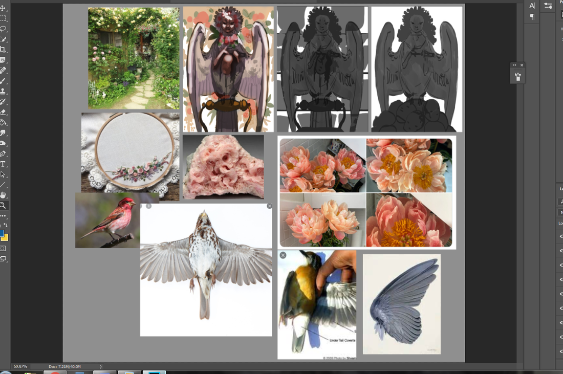
It's that time again. The autumn leaves are falling, our fingertips are freezing and the Inktober event is in full swing. ...Ish. I made a poll at the beginning of the month asking for thoughts on Inktober, the popular October art tradition: the consensus was non-committal, with the majority either being wishy-washy on the idea or outright refusing. Is it any surprise? Making art is already enough of a process without churning out daily pieces, which are disruptive by nature due to being free work sandwiched in-between jobs, school and life obligations. This response is on top of countless counterposts I've seen just browsing my feed. For health-related reasons or not having enough time, I'm really happy to see artists prioritizing other things, to be honest. Burnout is a pretty serious issue without adding FOMO to the mix. Burnout is so serious, in fact, it can literally make you sick. It's an easy trap to fall into as a freelancer, as well, since you're in the position of having to dictate your own hours and find your own work. Getting said work? Often means creating free work in the hopes of someday being paid for it. More than once I've found myself working ridiculously long days without a full break. I've even come down with illnesses that don't usually affect my age group (which I'll talk about in a later post). Does that mean I'm against the concept of Inktober or any variant thereof? Not at all! Daily art exercises have their time and place: 1. They're a smart way to nip overthinking in the bud (how many pieces lie unfinished because of too much prep work?). 2. They supplement portfolios with smaller pieces (great for blogging and/or Patreons). 3. They're great practice and, with the right mindset, a ton of fun. If you're feeling guilty for not participating, however...that's when you're deprioritizing artistic growth in favor of FOMO: a fluff goal for shallow social media attention that doesn't amount to anything substantial. Art deserves better than that, right? So, why am I sort-of-kind-of participating? Well, I figured this month was a good opportunity to push myself back into experimenting. I miss just being...loosey-goosey with my paintings. Scribbling down whatever and seeing where it takes me. I talked about this in my last post, on how old work can sometimes be stronger than new work, and I'm eager to touch base with myself. Rather than dwell, I'm dedicating some (keyword: some) days in October to my own spin: Paintober. It's been a lot of fun crafting new brushes and playing around. These took a few hours each: unlike my last Paintober, the only overarching theme of this month is to just let my imagination and hand run loose. Used a reference to create a portrait of an older character of mine (you might recognize him from my portfolio's character art section). Had a fellow ask if they could use this painting as their background wallpaper. I don't know what's sweeter: having my art greet someone every time they turn on their computer or being asked in the first place. This one was a challenge...and, believe it or not, it wasn't the architecture, but the color scheme that gave me the most trouble! I went in with the goal to push my buildings and sense of space, yet ended up seriously flubbing the colors and having to do a bunch of tweaks. All-in-all, a very illuminating painting. I might just recycle it into something more portfolio-worthy. It's the kind of old-fashioned whimsy I've been craving in my work lately. I just...love Spyro so much. What else can I even say at this point? What I love about smaller paintings is how they allow me to get out ideas without committing too much time. I have a lot on my plate and, as much as I'd love to churn out endless fancy illustrations...I just can't! Additionally, this gives me more incentive to step up my speedpaint game. One hour or less! I've already got new custom brush packs I've been working on. Now to take things a step further and go back to studying some of my favorite concept artists. I've always been a fan of Feng Zhu and Jason Chan, among others. I'll be sharing old Paintober posts later, as well as step-by-step shots of the paintings above. I've also been working on some pencil sketches to beef up my portfolio for 2020. Stay tuned!
I've been rifling through more of my old studies and personal thumbnails, analyzing what I've learned over the years with October right around the corner. These ones are all the way back from 2015, a little scratchier and more middle-of-the-road value-wise than I do now. Nonetheless, it's useful to analyze the areas where you've gotten stronger, as well as understanding where your skill starts to peter out and improve more slowly. Moving backwards is still movement! I've spoken about Frank Brangwyn before and how he's been a major fine art inspiration of mine. His ability to somehow create chaotic and extremely simple compositions is endlessly fascinating, which is to say nothing of his lighting. Buttery and bold, he's able to craft out a figure's weight, age and personality with just a few deceptively simple strokes. I've done enough traditional and digital studies over the years that I feel comfortable getting a lot down with very little. Silhouettes, in particular, are a very reliable way of carving out what you see. Moving forward I want to keep polishing up these areas. I want to paint faster, create more stunning compositions and improve my technical perspective. I also want to get comfortable all over again with being sloppy and loose. I love how just a little white splotch can communicate so much. A spot of sunlight on a roof. A worker's cap. A rock in water. Less really is more. While my art is a little too tightly polished to be called impressionistic, it's still a movement I take inspiration from in my preliminary work. The vibrant movement and sharp texture does a lot to keep my creative mind churning. Not all of my pieces are planned, after all. A single blob can be interpreted a dozen different ways. It's really fun figuring it all out on the fly. I'll have to upload more .gifs of my process so you can see just how many times I shrink, flip and rotate my work. These studies were instrumental in giving me a feel for Frank Brangwyn's work. His blobby, squished subjects and lavish detail just can't be confused for anyone else. On the other hand, I was clearly figuring out what was more important: getting all the details in the right place or keeping the study readable for the viewer. More contrast and smoother linework would have helped here. Speaking of which, I'll be getting into my favorite brushes in later posts, most of which include some sort of 'natural' jagged border. Clearly I learned something of value (ha!) from all these studies, because these personal thumbnails I did around the same time are much more readable. These compositions draw the eye toward a strong focal point, with the background either swooping or angling toward the subject for maximum effect. On top of that, atmospheric perspective is utilized in abundance to create a more believable sense of space. Perspective isn't just intimidating grid lines and boxes, but how objects fade, overlap and contrast each other. ...And, to be entirely honest? There are actually areas in my 2015 and 2016 work that are stronger than my current work. More dynamic. More lively. Looser textures, compositions that almost seem to breathe...it's no coincidence those happened to be easier artmaking years for me, as well. I was so much less wracked with pressure putting tablet to pen, letting anything and everything flow as it came. It's been hard for me to churn out the same amount of work I used to, and it's in studying my earlier pieces can I better get in touch with what's tripping me up. October is coming up, meaning Inktober...or in my case, Paintober. That means lots of new paintings and lots of new posts. Stay tuned!
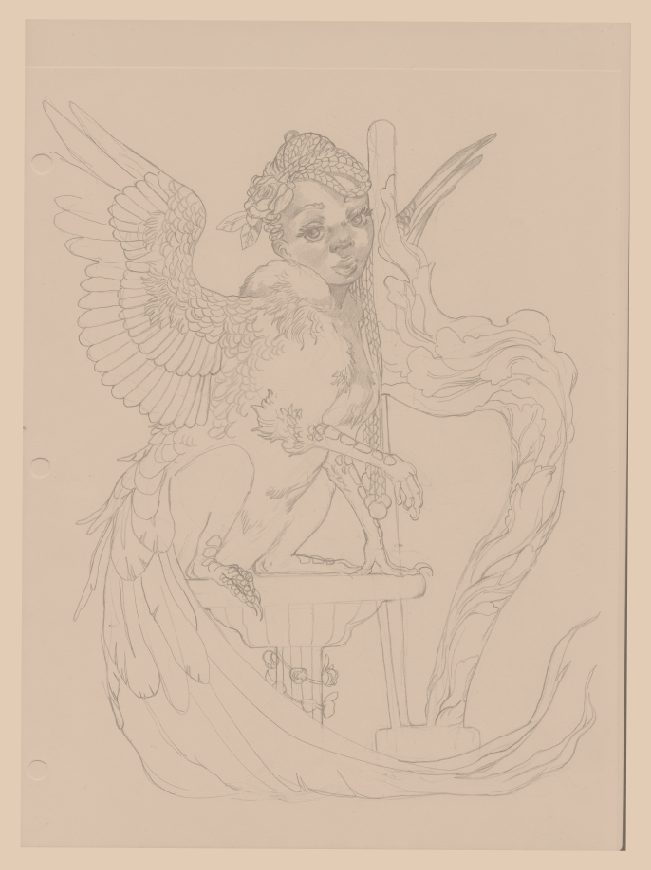
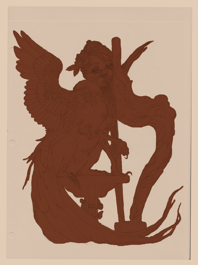
You want to be a character designer? Design characters. You want to be a concept artist? Create concepts for a hypothetical product or videogame. You want to be an animator? Animate. This advice may come across as intentionally obtuse, but so much of the narrative surrounding working artists is...convoluted. There are far too many art schools out there with archaic curriculums that exhaust rather than inspire. The amount of horror stories I hear from working professionals with degrees? It'd make your head spin (if you aren't one of those postgraduates already). Capitalism also has many of us afraid to specialize in one or two paths due to the inherent instability of the job market. Hell, just living your life and juggling time between kids, a part-time job and/or school? Underfed possibility will have you overwhelmed by the time you sit down to work on your art. I'm no stranger to it. Contrary to what you may hear, specializing is actually a good thing. A major reason I get work in fantasy illustration...is because I draw and paint a lot of fantasy. No attempts to be a jack-of-all-trades doing every last style under the sun, no self-flogging because I'm still weak in some areas (like urban cityscapes). I do what I like and I get hired to do what I like. Just like a gymnast has to do a set of repetitions thousands of times, so too do you need to draw something over and over before you get really good at it. All of this would've been harder if I spent a big chunk of time painting, say, cars (which I could really care less about). This isn't to say life experiences outside of art are unimportant, nor that variety is a waste of time. Far from it. The best art comes from a wealth of first-hand, lived experiences -- it's a reflection of life, after all, and art that lacks a healthy foundation will show its cracks. Over the past ten years I've gone from being an educational ASL interpreter to several barista positions to B2B writing. I've learned so much about myself and have drawn on these life experiences to improve my craft. All the while? I've drawn and painted what I wanted to. What made my mind, heart and soul sing. I sometimes wavered on this over the years, wondering if I was 'limiting myself' because I leaned toward a certain style and handful of genres. Whether you are leaning toward human subjects, a shoujo-esque style or wanting to commit to a sequential art major, you are limiting yourself...so you can specialize and become a master of one. Variety is important and specialization is not a curse. I've talked before about how language matters. The art industry is ever in need of nuance. Here we're going to take a look at another old character of mine, a pheasant-griffon sphinx that embodies so much of what I love to paint: I'll never lose touch with my eight year-old self filling in a coloring book. A good, old-fashioned pencil sketch scanned into Photoshop CC. On the right I fill up with a base color, which does the dual work of filling up the space and helping me better see my lineart. Choose a hue that's predominant in the final piece: this'll save you a little time when you finally sit down to paint. It's all about working smarter, not harder in these commercial illustration streets! I use hard-edged brushes when painting, but prefer soft-edged brushes during preliminary stages or touch-up stages. This gives me a sumptuous base that looks more natural. I also don't prefer to fill in areas manually, but quick mask and brush over my base color. It honestly looks nice when colors very gently 'bleed' into one another (thanks, traditional art!). On the right I then pull everything together with a gradient overlay. I keep it flowing in the direction of the lighting (from the top-right) so that it already looks complete, even before I've started rendering. It's extremely subtle, but I upped the saturation on the left -- I needed the reds and oranges to pop a little more. On the right I start painting with my usual dark-to-light (very common for acrylic and oil painters). One of my favorite quotes (and I can't remember who said it) was treating light like water: if you were to take a bucket and splash a subject, where would the water hit first? Where would it travel and where would it land? This simplifies key lighting fundamentals like a main light source and reflected lighting. 'Buttery' and 'oily' were the main adjectives running through my head here. Even though I've only toyed with oil paints in the past (since I don't have the studio space for them), I've always adored their glowing results. It's really satisfying seeing pencil strokes blur and vanish beneath the digital paint. Sometimes I'll let a little show through, depending on just how polished I want the final piece to be. As per my last post, art is a conversation. Embrace surprises. Borders are something I've been steering away from in recent work, though I may try it again for very classical-type pieces. I'm also thinking of more interesting way to do simple pin-ups. This piece is from 2017 and remains a shining example of what I love to see in my work: rich colors, fantastic creatures, beautiful black people, countless details and an irresistible sense of mystery or wonder. If you want to get work doing a certain thing, do the thing. Give yourself the space and time to focus on a certain subject, genre and/or style -- experiment enough to learn what you like, specialize enough to let yourself improve. The Internet has made it easier than ever to put your work up and be seen, as well as learn from others. Promoting yourself, though, is a major hurdle for many working artists (particularly introverted ones), which is something I'll be talking about in future posts. I have more goodness on the way, including posts about work-life balance and what day-to-day physical therapy looks like. Stay tuned!
Sometimes you don't know how a piece is going to turn out. It's the eternal conundrum: do you keep going with a sketch that's quite not working...or start over? Then there are the times you don't know what the hell you're doing at all. I've gotten better at resolving this over the years. At this point I can tell when something isn't going to go where I want it to, no matter how hard I try. One common sign of this is when I rework a certain area of a painting over and over and over. Other times I'll notice something is wrong when there is an abnormally huge gap between the preliminary stages and the final sketch. Art is a conversation. It'll go in places you don't always expect and, just like any dialogue, you should take warning signs at face value. Sometimes, though...unpredictability is your friend. Sometimes you're not sure where your art is going...and that's the best part. The pieces are laid before you, the ideas and the mood are there, but you haven't arranged them into anything resembling sense yet. This is, honestly, one of my favorite ways to paint. This illustration below originally started out as a bunch of ovals and circles. No thumbnail. No rough draft or references. Just a mess of blobs I shuffled around until they gradually formed an image in my head. This tends to be what I do when I'm having a hard time creating work and want to push myself. As is my wont, I go for a half-human creature. What can I say? I know what I like. This method of laying down shapes and shuffling them around isn't unlike whittling away at a block of clay. I elongated the oval, added a face and neck to the circles, then kept working from there. I tend to vacillate between sketching the old-fashioned way and laying down blocky shapes. The collision of the draftswoman and the fine artist. I wish I had the first few passes screencapped, but, again...I didn't know where I was going with this! makes a mental note to screencap literally everything Throughout this sketching and blocking stage I intentionally kept the other harpies in the backdrop and foreground more faded. It's actually a touch I wish I kept in the coloring stage. A little more atmospheric perspective would have gone a long way to tie the whole piece together. Live and learn! Wings are one of my absolute favorite things to paint. I swear they're my therapy at this point. It's fascinating thinking about how much of our life bleeds into our art without our knowing it. As I was detailing the wings and feathers I remember thinking about how much calmer I felt. How my normally frazzled mind finally slowed to a crawl. On a conscious level, I prefer complex work because of how easy it is to get lost in all the details. There's always something else to discover with every new viewing! On a subconscious level, however...I've realized I gravitate to details due to how they relaxe my mind and heart. When you're mentally ill? That's not a feature you can take lightly. Flow is a psychological phenomenon where intense focus and relaxation has us losing sense of time. Painting is a popular way of achieving this, though you can just as easily enjoy flow by crocheting, knitting, playing piano, dancing or cooking. Any activity that gets your hands moving and your mind lost in the sway of your work. You know you've done a good job when you glance at the clock and wonder where the past three hours have run off to. Once everything started coming together I pulled up a few references of crows over on Google. Even the most whimsical and freeform piece will be better off with a visual aid or two. Color remains one of my strong points. I had no idea what sort of scheme I wanted to do here and, just like the sketching stage, I went with whatever felt good at the time. It's something I'm going to focus just a little less on going forward, just so I can give my technical drawing and perspective skills time to catch up. This isn't to say I still don't have areas to improve! I just know color theory isn't tripping me up as much compared to, say, urban landscapes. I will master them one of these days There's no shame in starting over. There are also times you have to give yourself a chance and push through with what you have, even when you're not sure what the hell you're doing. Especially so. You may just be surprised at what the deepest recesses of your mind spits up. I've got more goodness on the way. Stay tuned!
|
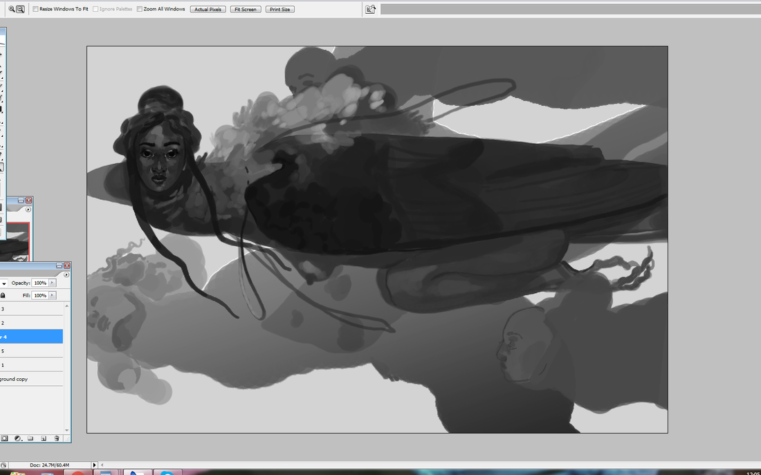
AuthorHere I post WIPs, sketches, speedpaints, thumbnails and anything else thrown into the veritable stew of artistic process. Archives
January 2021
Categories
All
|