|
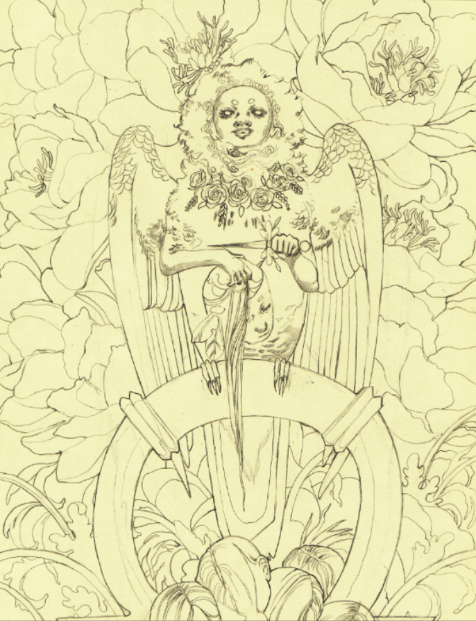
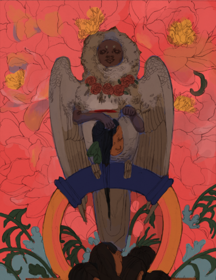
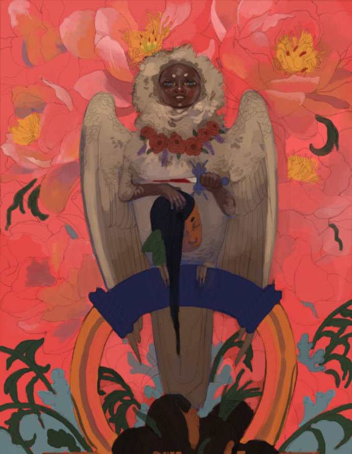
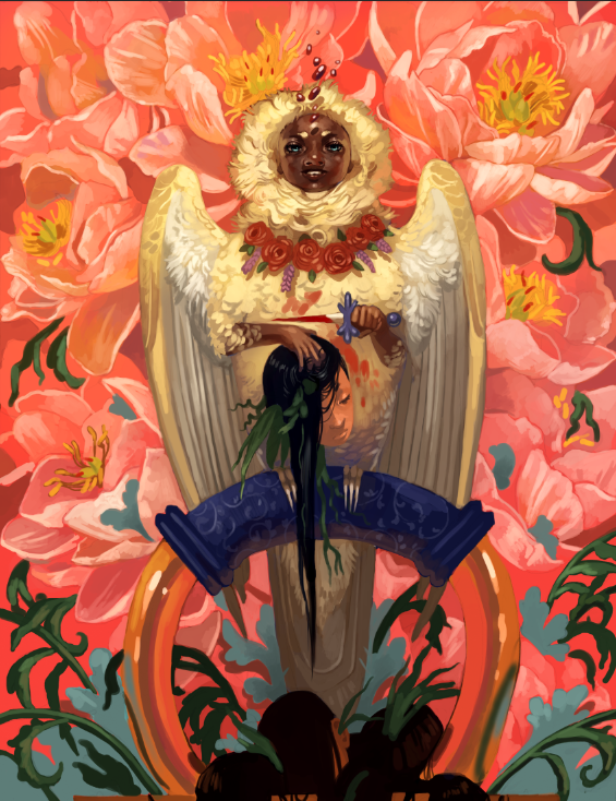
Been a while since I've done one of these! Indulgent art has always held a high priority for me. Why bother painting or drawing things I'm not invested in? Not to mention I need to show what I want to get hired for, so...kill two birds with one stone. This piece, however, was peak indulgence. Like, a dollop of whipped cream on top of whipped cream indulgence. You have a harpy. You have flowers. You have a ton of colors. Hell, there are even the mildest of vaporwave vibes (pink + blue surrealism) that snuck in without me realizing. Expect to see more of that. This year has been an absolute trainwreck and it's barely halfway over. Soaking in the subjects and styles I love to the nth degree is as self-care as it gets. As a side-note, I'm going to be keeping these progress posts a little brief from now on so I don't repeat myself. I mean, you know I love color. The part where I start phasing out the sketch and start rendering is orgasmic. Yadda yadda. I'll focus more on the unique challenges of each piece and what, exactly, was going on in my mind when making it. It's time to get indulgent. 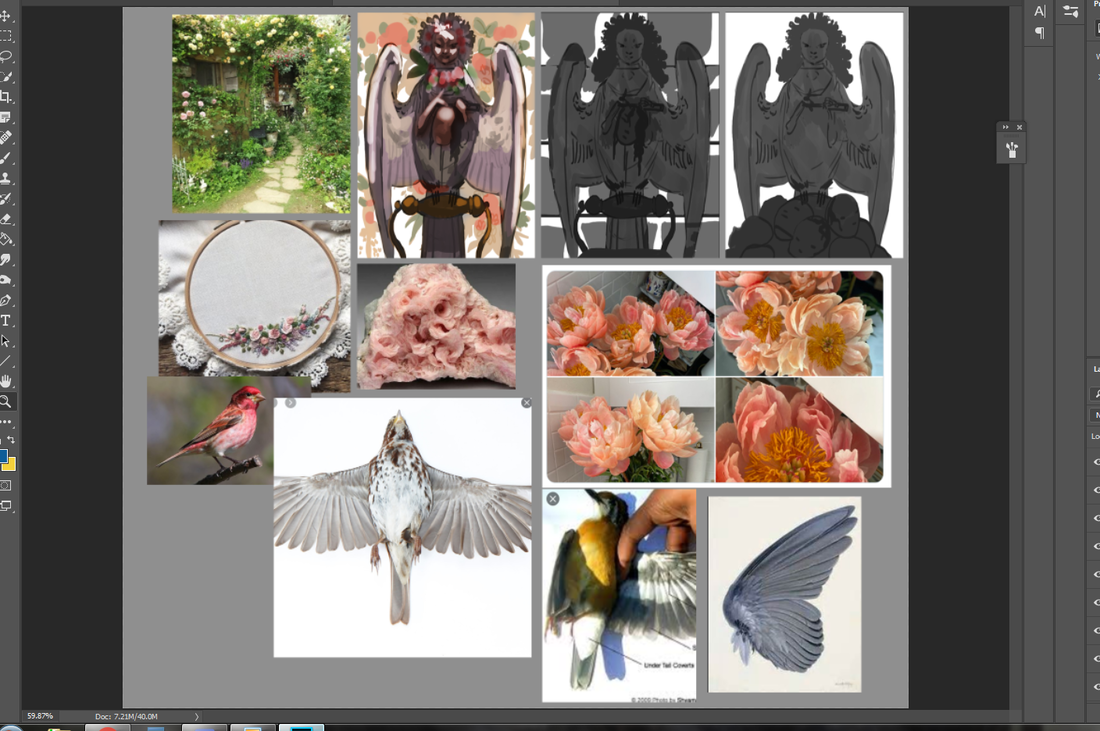 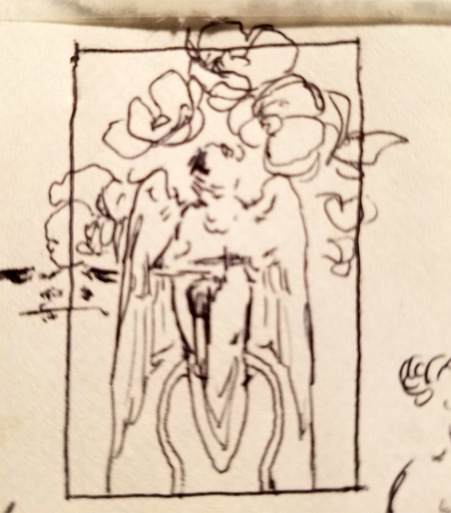 Cobbled together quite a few references for this one, on top of looking into the mirror to get the hands looking right. Let me tell you, it is damn hard finding a photo of a bird from the belly up with its wings folded. That little ballpoint pen doodle was done on an envelope in-between research and drafting. It's often when I'm thinking the least the best compositions come to me. There's a lesson to be learned here. 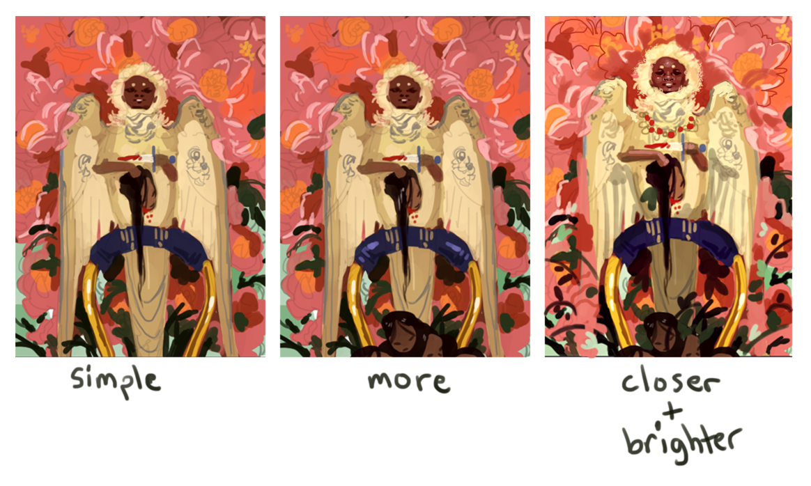 I was really feeling the color composition here, but wasn't quite sure how to break up the space a little more. I added a pile of heads in the second one (which also did more to tell a story), but there still wasn't enough contrast. A little too much pink and...not enough everything else. In the far right I added more blue flourishes to get the eye traveling more easily, as well as more plants, and eventually found my happy balance.
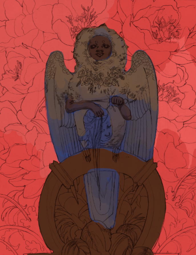
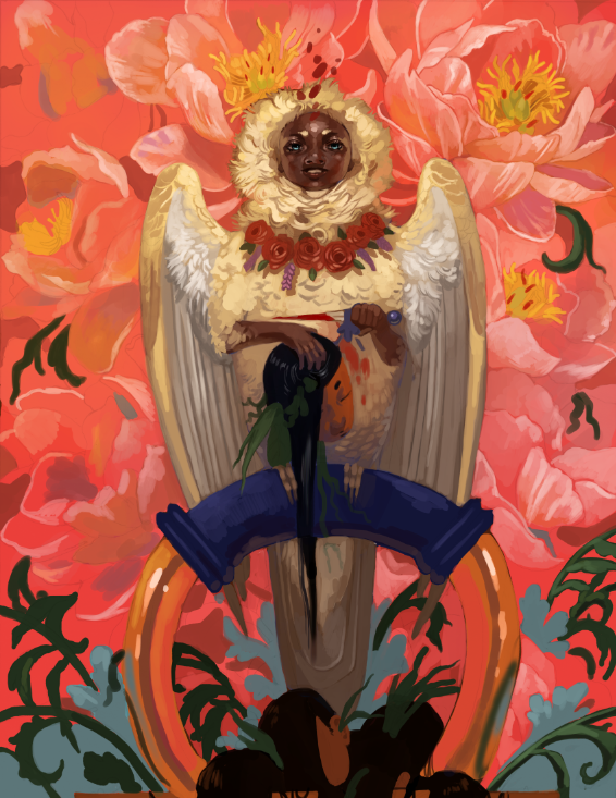
There was a lot of gradually tweaking small details in the middle of painting. Wings looked uneven, tail crooked, needing more plants. I wasn't going for perfect symmetry here, but I still needed it to look somewhat straightened out. I was constantly debating that floating blood splatter above the harpy's head, too. In the end, I couldn't get rid of it. It was just too interesting a detail to leave out.
For all that I kept straightening out certain elements, I left that crooked kettle handle in for a while. Ugh! Fixed it up the day before posting because it was driving me nuts. Next time? I'm using a stencil.  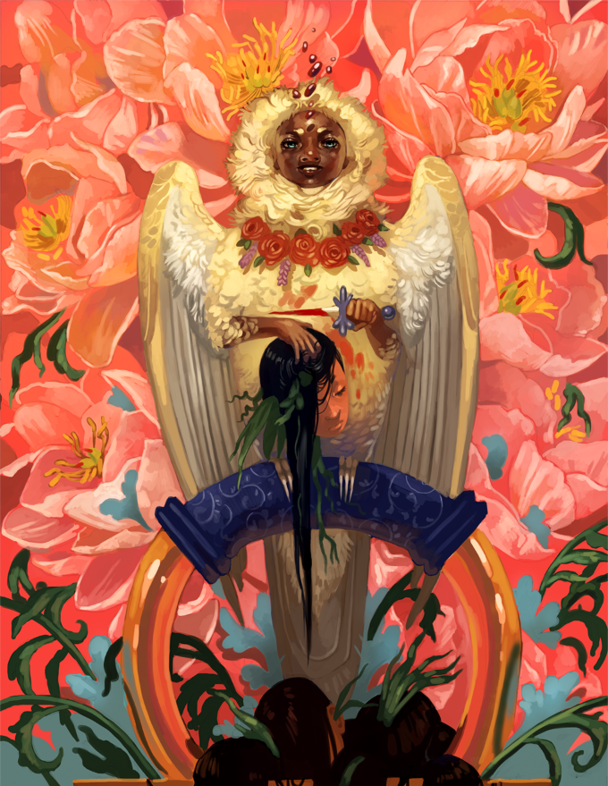 This is the ideal combination of artistic influences. You may not like it, but this is what peak indulgence looks like. I've got pieces simmering on my computer (and more old envelopes-) with yet more mythical creatures, surreal imagery and vague future nostalgia touches. Environment art and concept art is a big focus of mine this year, though, and I am eager to dip into packaging design. Thiiink mock-ups for coffee bags and wine bottles. It's a lot to keep in mind and I'm taking everything one day at a time. In the meantime, I really, really want to start a new sketchbook. I even had a dream about browsing a bookstore and wanting to buy one last night. I have a box of unused ones sitting in the corner of my room! The only problem is...which one to pick. 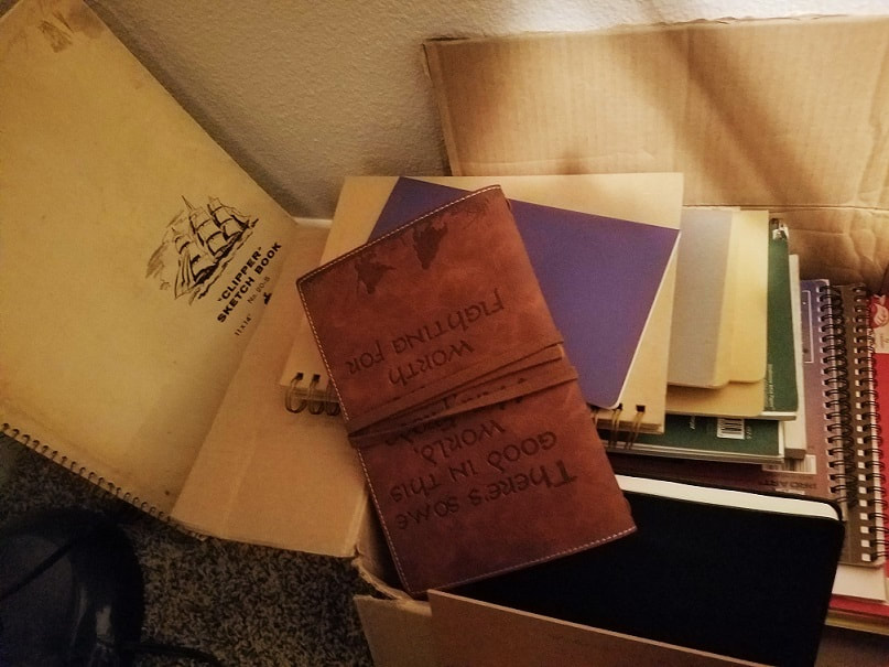 Here's to indulgence. What qualifies as really indulgent art for you? How do you incorporate multiple favorite subjects or styles into a single piece?
0 Comments
Your comment will be posted after it is approved.
Leave a Reply. |
AuthorHere I post WIPs, sketches, speedpaints, thumbnails and anything else thrown into the veritable stew of artistic process. Archives
January 2021
Categories
All
|

 RSS Feed