|
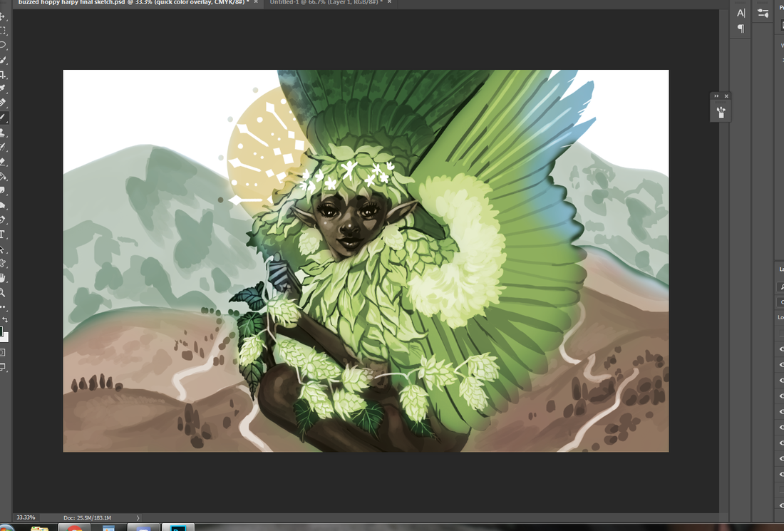
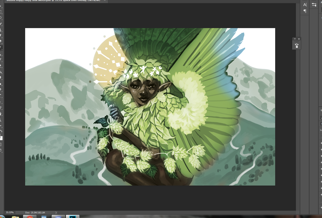
You just have to speak things into existence. I was contacted by Zero Issue Beer not too long ago -- a Canadian craft brewery -- and was asked if I was interested in doing an illustration for their new seasonal beer line-up. What a coincidence 2020 was the year I wanted to get into packaging design and illustration, particularly for beverages! Even better, the proceeds are going to Sankofa Arts & Music Foundation for black Canadian youth. As you can likely imagine, I was sold twenty times over. I have a short interview that will be appearing on their site here. For now? I'm going to share the creative process behind this piece, from the rough beginning stages to the inspiration behind it all. I'll share some tips I've learned about packaging design, too, for any of you who want to branch out your portfolio. Spoiler: there are harpies. 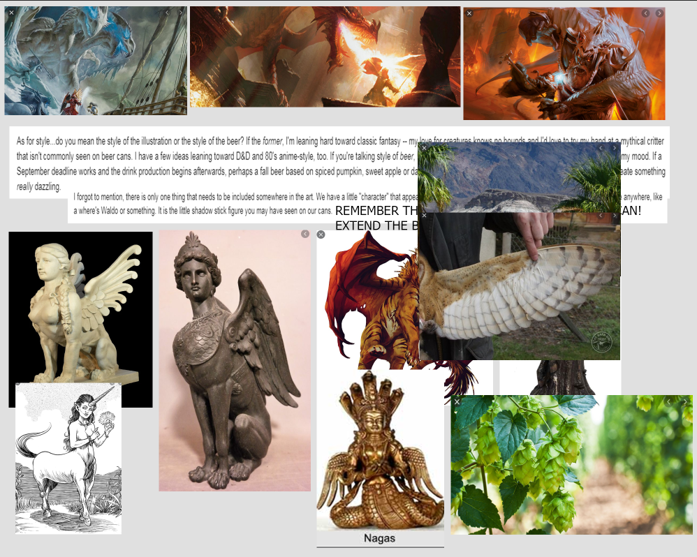 My references are put together in collage format. Just an ongoing slapdash of visual inspiration and technical reference. While I adore my harpies and sphinxes, I still considered exploring some lesser-known hybrids like winged nagas, manticores and anggitay (a unicorn centaur from Filipino folklore). These references are far from a one-use-only deal. They can give birth to several different pieces by themselves, all with the benefit of saving me some work searching Google Images' royalty-free sections. Work smarter, not harder. 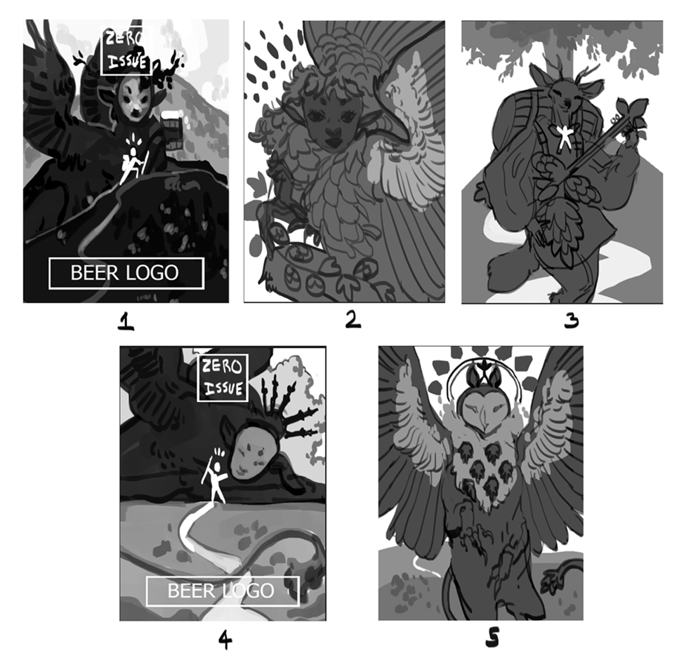 Zero Issue Beer is very upfront about their love for nerddom: videogames, anime, D&D, you name it. I considered it all as I was designing my buzzed creatures: a giant mountain sphinx, a hoppy harpy, a deer bard and an owl gryphon. I had actually considered doing a lo-fi retro anime-styled design, but that was a case of too many cooks spoiling the proverbial broth. Limitation can actually be your best friend when a piece needs to be finished by a certain date, and considering I had a lot of creative freedom, I knew I needed to dial it back or I'd go crazy. See, I'm on the other side of the artistic extreme. Some artists struggle to come up with anything, while I come up with a ton and can get overwhelmed. The only specification for this art, aside from being CMYK, is the little stick figure. This character is a reoccurring element in all of Zero Issue Beer's logo design. A Where's Waldo hopped up on hops, if you will. First tip: learn the difference between RGB and CMYK. I frequently get both of these requested, with the preference changing depending on the type of commission (printed cover, digital promotion, product). Creative Pro has a useful breakdown on how these printing types affect printed work and web display. 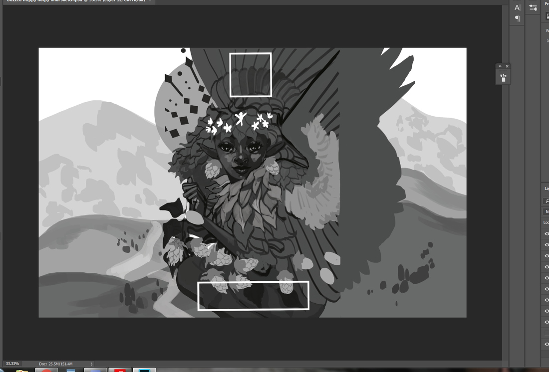 That unfinished block to the right is around where the beer can begins to wrap. It was interesting having to keep in mind the 3D nature of the can and what the viewer should more or less be seeing and touching in-person. It's one of the many things I love about packaging: it engages even more of your artistic senses than usual. I was torn between having the little stick figure be a wandering traveler in the hills or having him look like an abstract flower in the harpy's flower crown. I settled on the latter because I loved how the silhouette made me look twice. Afterwards, figuring out what to do with the little sparks of light eventually pushed me toward a sun-like design. 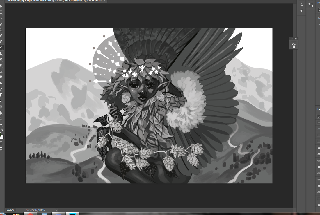 Now for the final sketch. I had to redo those leaves a few times because they weren't quite popping out like I wanted. Throughout this process I constantly zoomed out to a rough size of the beer can on my monitor screen. Rich detail is certainly beautiful, but you can end up working far too hard on something that won't even show up when printed. Second tip: when in doubt? Zoom out. A lot of what you think is meticulous detail in a painting is actually texture and contrast suggesting more than what's actually there. Not only does it save you time, it looks much more natural. Unless you have the eyes of a red-tailed hawk, you can't actually pick out every last leaf or blade of grass in the distance.
My color overlays took a little more doing, as I was torn on how much warm and cool contrast I wanted in the final version. Zero Issue Beer ended up leaning more toward the green, which I very much agreed with. Even a dominant color can still be made distinctive through shade, saturation and focal point. I mixed in some darker, cooler green with bright, warmer ones for contrast. I then tossed in a blue sky and a pop of yellow to keep everything from being too uniform. Third tip: color is much more complex than you likely give it credit for, so get comfortable with vocabulary like hue, shade, saturation, warm, cool and reflected lighting. If you need to return to the basics, check out Color And Light by James Gurney. This book has been on my to-buy list for a while and I can't wait to read it. 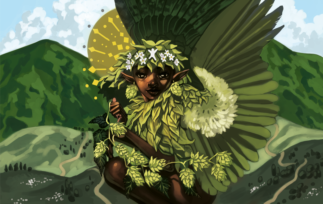 This was one of my most relaxing paintings of the year. Honestly? I really needed that. Not only is it for a project that I'm deeply invested in, it was a return to indulgence that has run off with me somewhat. Something I'll always be keen on sharing are the bumps on the art-making road. 2020 has been a series of blows to emotional, mental and physical health for many. Contrary to the popular myth of the endlessly inspired struggling artist, many professionals, myself included, have struggled to create lately. When we're not tired, we're demoralized. When we're not demoralized, we're spreading ourselves too thin. To be able to enjoy a painting so thoroughly from beginning to end was the kind of artistic refresher I sorely needed. I was asked to offer up a series of names with hopeful connotations, and we eventually settled on 'Reverie'. It's a nostalgic, sweet sentiment, one I'm working on falling into more in lieu of doomsday thoughts that leave me drained. The character here is meant to be a return to joy. A moment of green and comfort, set to a fizzy buzz. Here's roughly what the final can will look like, with brand logo, drink name and drink type. Last art tip? Draw what you love.
0 Comments
Your comment will be posted after it is approved.
Leave a Reply. |
AuthorHere I post WIPs, sketches, speedpaints, thumbnails and anything else thrown into the veritable stew of artistic process. Archives
January 2021
Categories
All
|
 RSS Feed