|
We have to change our language before we can change ourselves. 'Oldie, but a goodie' is a term I've been leaning away from these past few years, for a very conscious reason. Why should something being older immediately require the 'but' qualifier? I could detail an entire TED Talk on the cult obsession with youth in modern society and all the insidious ways it creeps into our everyday conversations. I could talk about the pervasive shame many artists have about old work and how it's misrepresentative of who they want to be. The constant qualifiers that spill out when sharing old art -- much less admiring it -- makes me sick straight to my gut. This phrase doesn't create personal progress. It's a roadblock in just a few words. Let's switch it up. This is an oldie and a goodie: a pin-up illustration of a character I painted in 2015. He's a lion-headed magician with a chip on his shoulder, always a little moody despite the child clientele he often entertains. 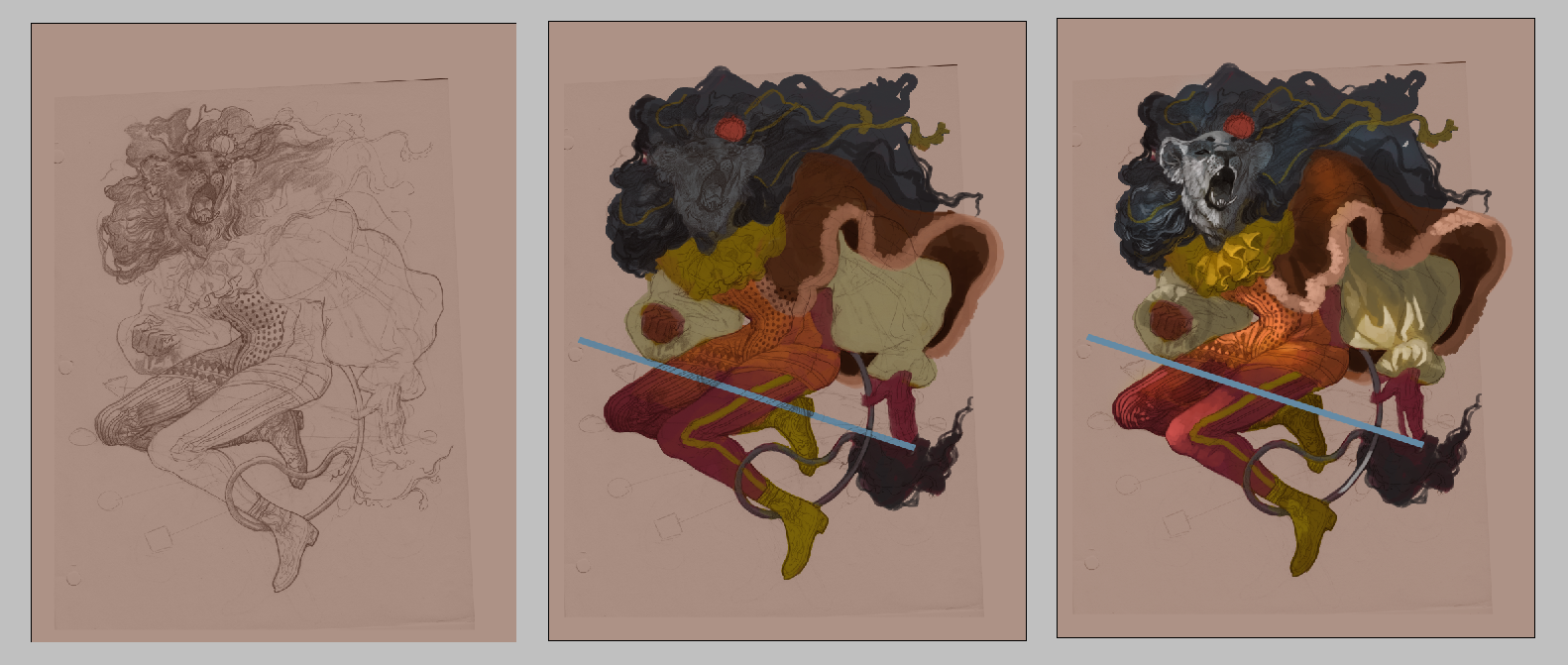 Even though I complete many of my pieces completely digitally, every once in a while I'll whip out a pencil sketch for the base. It's something I plan on doing more, actually, because it gives me a velvety, oily finish I don't quite get with my purely digital art. Also, it just feels good scanning in a drawing and going to town. Coloring comes easily to me and it's nice to just fill in the lines and let my mind wander. You can still see the edges of the paper where I scanned, even as the coloring is nearing completion. I've since learned ways of working around this. I create a separate lineart layer by adjusting the sketch's values, then using layer transparency and channels to separate the dark from the light. Saves you time and looks way better. You can find a tutorial on that here. 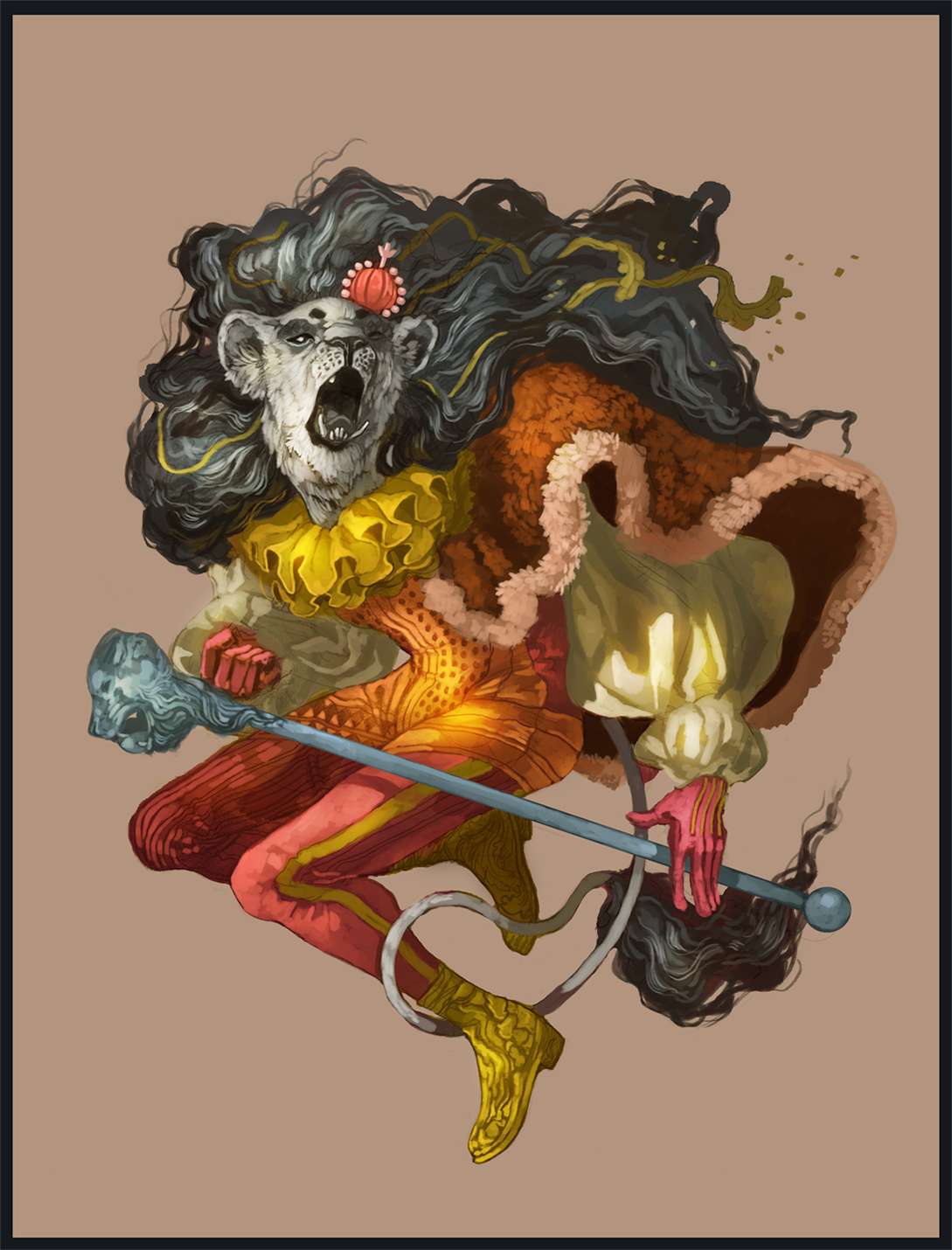 Hobby artists and professional artists? Let's change the way we talk about ourselves and our works. Self-deprecation doesn't actually improve your technical skill (no matter what some art teachers and industry gatekeepers will tell you about 'humility'). Running from your old work doesn't get you any closer to the artist you want to be. Art is an extension of yourself. If you're constantly browbeating your craft, take that as a sign to start chipping away at your personal growth. What old techniques have you kept from past work? How does your new work lean closer to your goals? Got more progress shots, recent doodles and, yes, old work on the way. Stay tuned!
0 Comments
Some of my favorite pieces come from just throwing down random shapes and making it work. This is yet another one of those pieces. (and if you're curious about more posts like these, check out these studies I did of John Boyega's British GQ photoshoot) This painting originally started out as a bunch of angular, blocky shapes because I just needed to paint something. I was stressed out and really not liking the fact I had barely any new work to post. Then I painted a merman over the random clutter and realized it'd make a great contribution to the #Mermay sketch event over on Twitter. I looked up a few references for the angle of the face (even the most spontaneous of art still looks better with a little help) and used my own hands for reference: 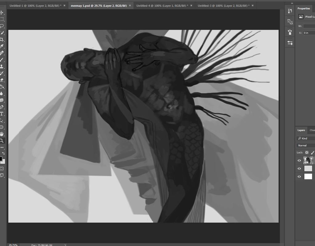 Not only did I study how my hands looked in the mirror, I took a minute to just feel along my neck. Figure out how each piece falls into place. The way the first and second knuckles curve over the throat, where the light would most likely hit first. It's about understanding something, not just copying and hoping you get a B on the test. There's a lot of unnecessary shame that comes with using references for art, both for beginners and experienced artists who 'should be beyond references by now'. Unless you've got a photographic memory, it simply isn't realistic to think you can spurt out complete accuracy 100% of the time. Whether or not you even want complete accuracy is a whole 'nother can of worms, at that. Whether you're someone who leans toward painterly realism, like myself, or prefer a cartoony style, references are always going to be part of the game. It's how you use them -- and what you take away once you're done -- that you should be concerned about. I use references because I'm not a dot matrix printer. Chances are, neither are you! I especially go into references with the goal of understanding how something works, so I don't have to rely on them quite so much. It's the difference between needing references 100% of the time or 40% of the time. A little quicker, right? It goes even deeper than that, though. Even the way you paint or draw a subject...it's obvious when an artist is just copying something down without further scrutiny. Likewise, it's obvious when they really get why something works the way it works. Why the cloth folds that way due to gravity and material. Why light scatters through skin to leave a certain glow. It's a subtle touch I want bursting out of my portfolio. 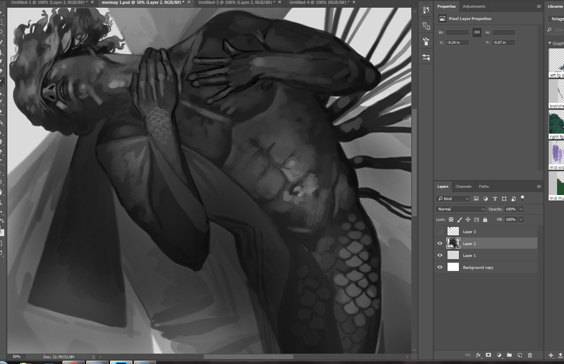 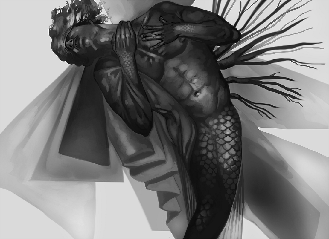 I thought about coloring this (indeed, I did a few experimental overlays), but it just looked better grayscale. Winging it to the very end. Thumbnailing and drafting is important, especially as a working professional, but other times it just gets in the way of doing the work. When in doubt? Throw up abstract shapes and turn it into a dream. now I gotta push myself to keep more progress shots of these spontaneous pieces, since by the time I remember I want to record my process the illustration's 90% done Got more progress posts coming up, including one piece that's a few years old and a fanart I did last year. Stay tuned!
In the first post we took a look at one of the studies I did for John Boyega's British GQ photoshoot. I did a second one below that follows much of the same principles: Owning your unique process. 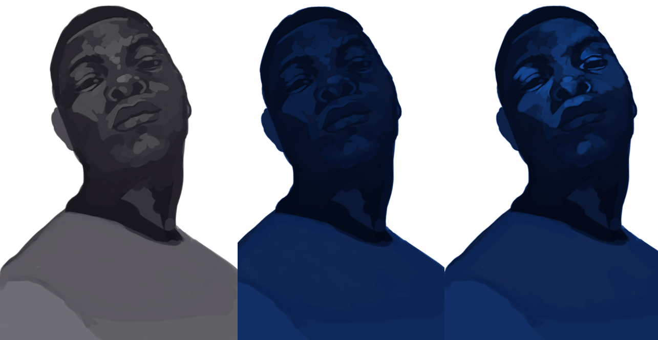 I've made no bones about how my process can look wildly different from piece-to-piece. Sometimes I work with pencil lineart, which I do with basic copy paper and scan in. No matter what, the inner child in me loves creating her own coloring books. There's also a satisfying graininess that comes with blending traditional art and digital art. Pencil art + digital paint always appears a little tighter, a little more polished. Not so for these studies, however. Other times my sketching process needs to be more loose. I'll need space to tweak on the fly. Erase, flip, distort, smudge, tweak the values. Digital art is brilliant in that regard, able to literally slice up your process into little pieces that can be viewed with redo and undo, and has given me so much more freedom to approach my art. No matter how many people try to push it down the lowbrow ladder. (if digital art is automatically less valid by virtue of having extra conveniences, then acrylic paint, pencils and erasers, whiteout, gouache, charcoal and nearly every piece of equipment ever should receive the same energy) I also can't stress enough the benefit of experimenting and seeing what happens. For example, the finished study below has a thin, bright line around most of the subject, which is an aftereffect of a masking layer + overlay layer. It was actually unintentional, but I ended up appreciating that thin, crisp glow and kept it in. When in doubt? Quote Bob Ross: "There are no mistakes. Only happy accidents." 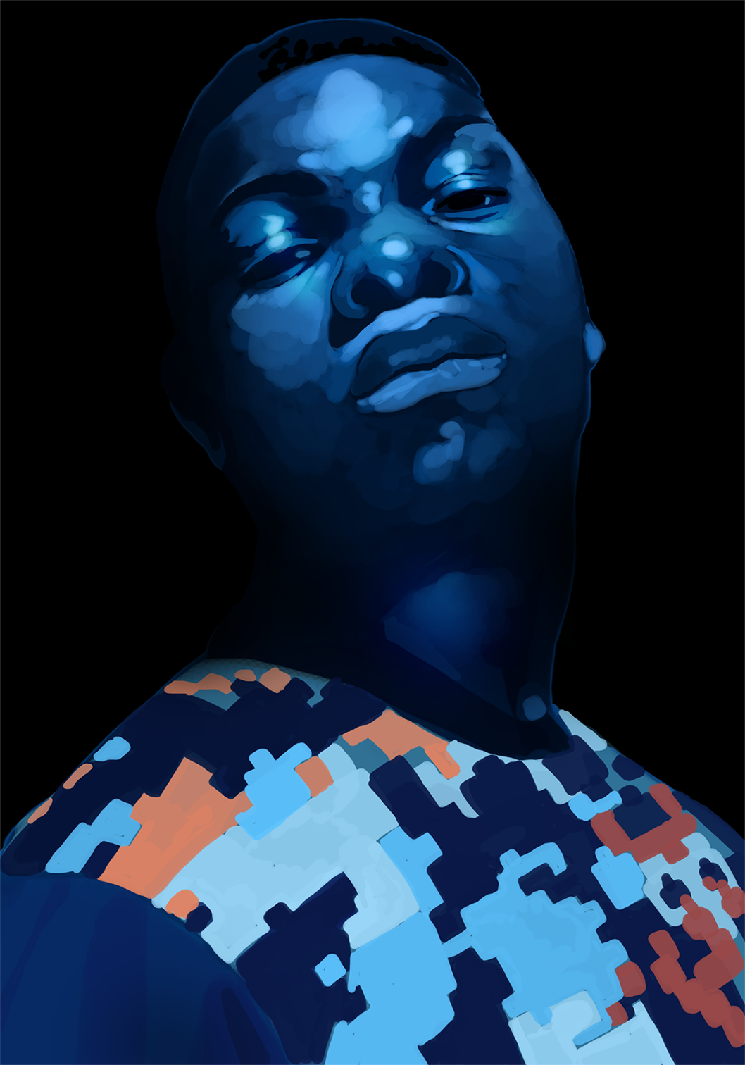 Check out the photoshoot here and get yourself hopped up on inspiration. You'll never know what your next favorite technique or visual shorthand could be until you try it out yourself. I have more step-by-step process posts and behind-the-scenes peeks on original work up next, so stay tuned!
Study what you like. Learn how it works through observation and action. Ask yourself why it resonates with you. There are a lot of WIPs and sketches I've uploaded to Twitter over the years that were, inevitably, eaten up by the site. After all, it is a social media platform meant to be consumed on the fly. Because of that, expect to see a lot of my work from 2015-2017 being uploaded in-between new pieces/studies. These are studies of John Boyega's British GQ shoot (shot by Daniel Sannwald) I did in 2017, the original project of which grabbed me by the neck and didn't let go. The bold colors! The splashy satin jacket! The shadowed, mysterious angle of his face! Oh, it was something I had to understand better. Thankfully, I saved some of the progress shots, which I will go into greater detail about below: 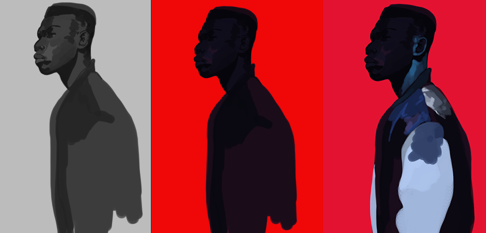 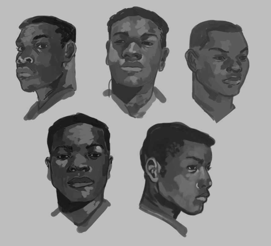 Don't be fooled by sped-up progress videos where incredible work seems to happen within seconds (and, yes, I have to remind myself, too). The final result took me a few hours to do -- including the quick portrait studies -- and remains an influence you can see in some of my original work. This is why you do studies: to learn through doing. To learn how to break down a seemingly complex subject into a series of bite-sized parts, then apply it to your work with meaning. Rather than mindless copying, you are having a deeper conversation with why you're an artist in the first place. The first is a basic grayscale sketch. Despite the fact my portfolio is very colorful, I actually prefer to start grayscale so I can nail light, shadow and form. For some artists this step is replaced by lineart or by flats. It's all good! I'm actually trying to get better at throwing down blobs of color and working from there, since it technically saves me a step. Studies are the perfect way to learn about your process because you are filtering a subject through your unique lens. How one artist gets from point A to point B is going to look different than another's...and that's brilliant. The second is both straightforward and a little exciting...because it sets me up for my absolute favorite part. Here I block in dark colors, which are admittedly hard to see here because of the harsh red backdrop. My preferred painting technique since, oh...2011 or 2012 has been painting dark-to-light. I will, however, switch to light-to-dark depending on the brightness of the final piece. This third part is where I can get lost for hours. There is nothing quite like painting. Not unlike fishing, painting is simultaneously relaxing and involving. This is actually why I'm trying to make my digital sketches more painterly, as I've found myself straying from lineart these past few years (with the exception of quick pen studies or pencil lineart). If this preliminary process sounds a little random, that's because...it is! A dynamic technique lets me tackle problems from several angles. Again: it works for me, and I answer a lot of personal questions through studies like this. Then we have the final version: 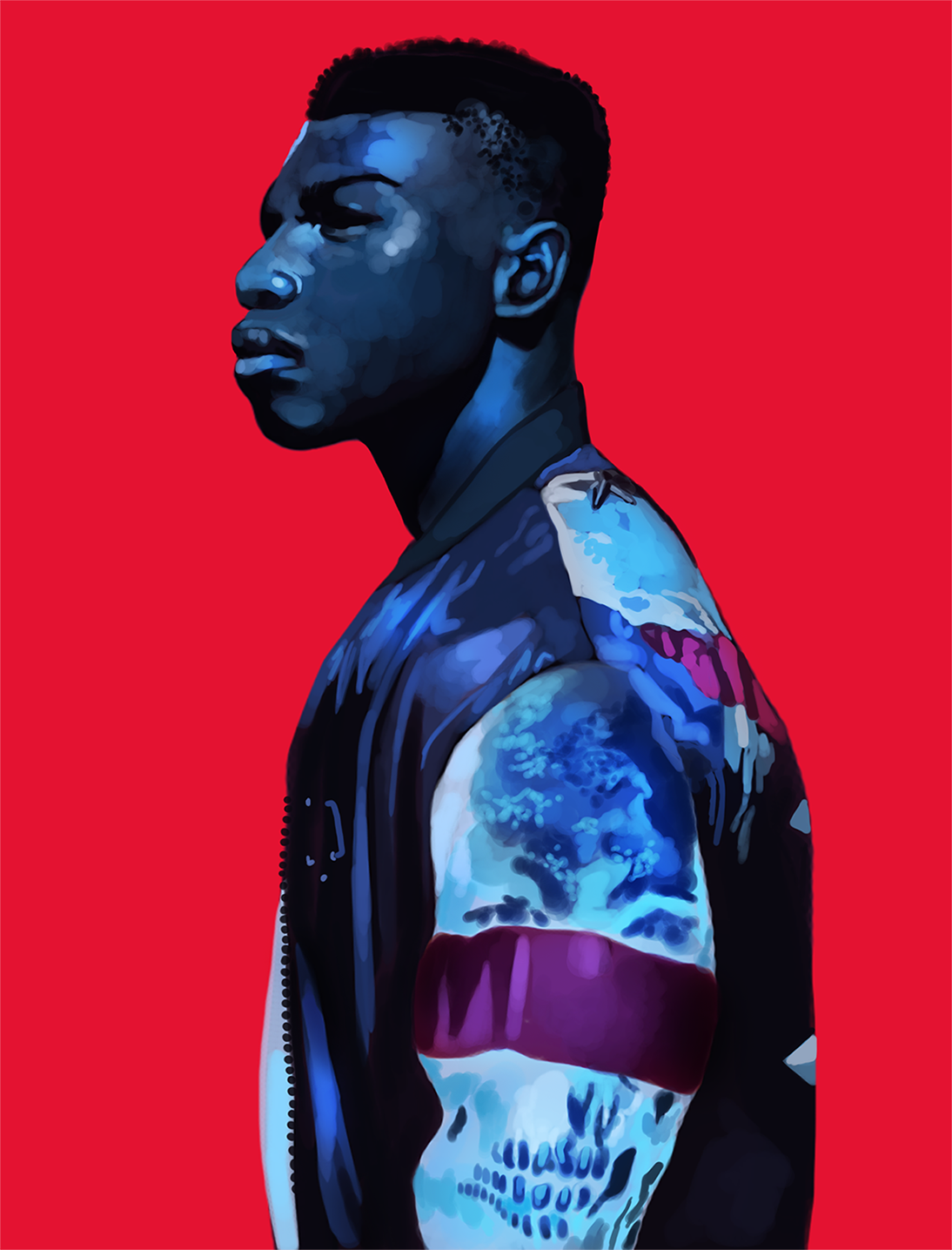 My goal with my work is to keep blurring all my influences together, subconsciously and consciously. Painterly realism inspired by the Romantic and Baroque periods of Western classical art, the boldness of pop art, the dreamlike nature of surrealism. Sometimes I'll lean just a little into my childhood sparkly anime influences (especially with my most recent pieces), then lean a little into impressionism. It's less juggling and more...leaning. Kind of like a dance, where the steps are known, but improv is key to letting the soul talk. You can find John Boyega's British GQ photoshoot here and over here. I highly recommend giving it a look. Daniel Sannwald really knows how to make a simple portrait seem almost alien. ...Wait, didn't I say studies? That I did. I'll be uploading part two in a few days, so stay tuned.
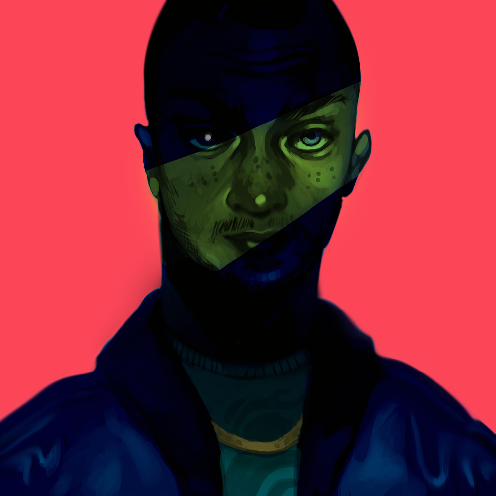
Boy, I sure do a lot of portraits! I wasn't crazy about how the one on the left turned out. I fiddled with it far too much trying to get the likeness accurate. The one on the right, by comparison, I painted while more relaxed, and it shows. It's amazing how much better art turns out when you're not twisting yourself up into knots. Believe it or not, some of these portraits are meant to be studies for full illustrations. It's just organizing myself to get them done that's the problem. I might need to meet myself halfway with a little mental trickery: start a portrait study, then beef it up with a background or some supplementary elements.
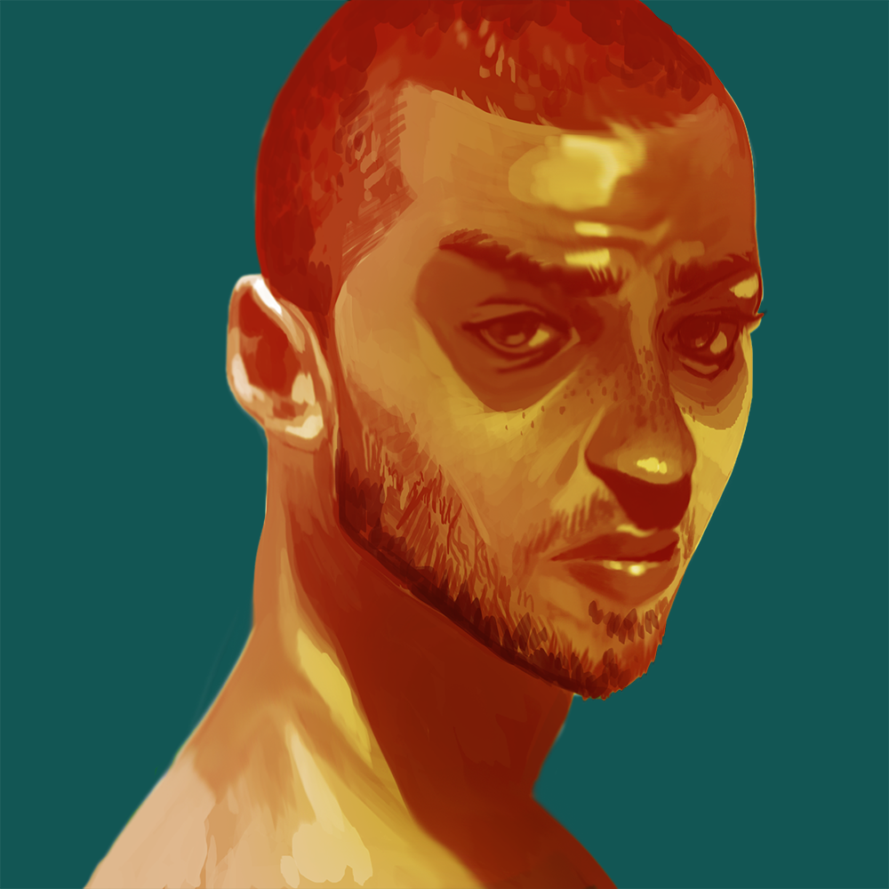
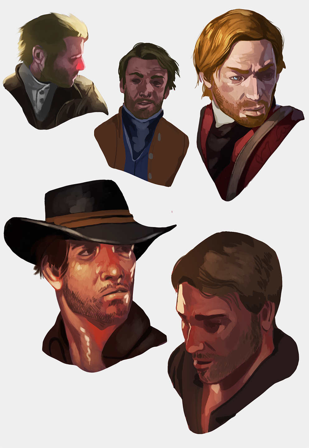
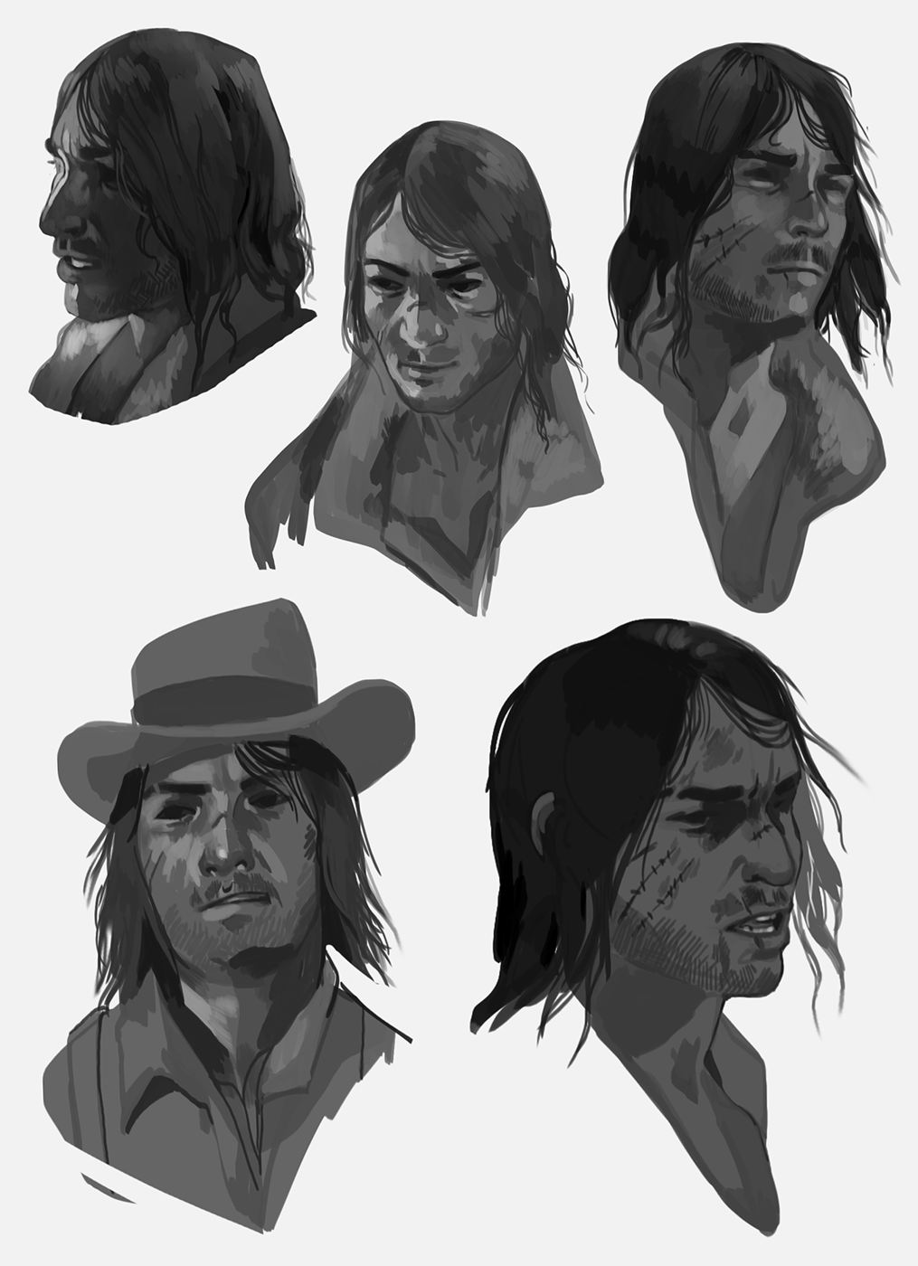
Got a new piece up! I'm happy with how it turned out, though I can't help but chuckle at the process. My painting methods are nothing if not dynamic; sometimes I spend hours painstakingly working my way through references, thumbnails and rough drafts before I hit that final sketch. Other times? I mess around with blobs and shapes until it starts to look like something in my head. ...So when you don't see any progress shots of a piece, assume that the piece came about the latter way. Honestly? I'm not complaining. Some of my best work has come about by just letting loose and following my intuition.  When I tell you Splatoon's one of my all-time favorite games, I mean all-time favorite. Nintendo really knows how to turn their games into some of the best therapy sessions around. One of these days I'm going to commit to an illustration rather than these fashion snippets. Until then...  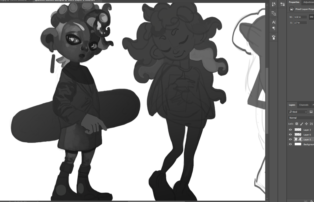 Now, I did these ones back in 2017, which I still like quite a bit. It was pretty neat how, not weeks after I drew the Inkling girl below, Splatoon 2 revealed a mascot that looks very similar. I'm here for it. 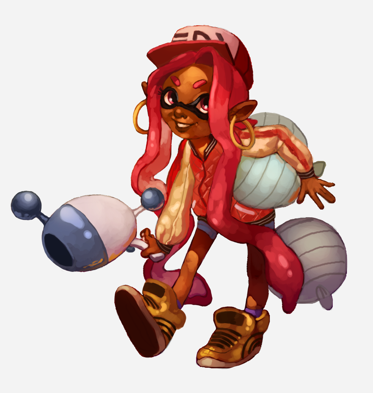 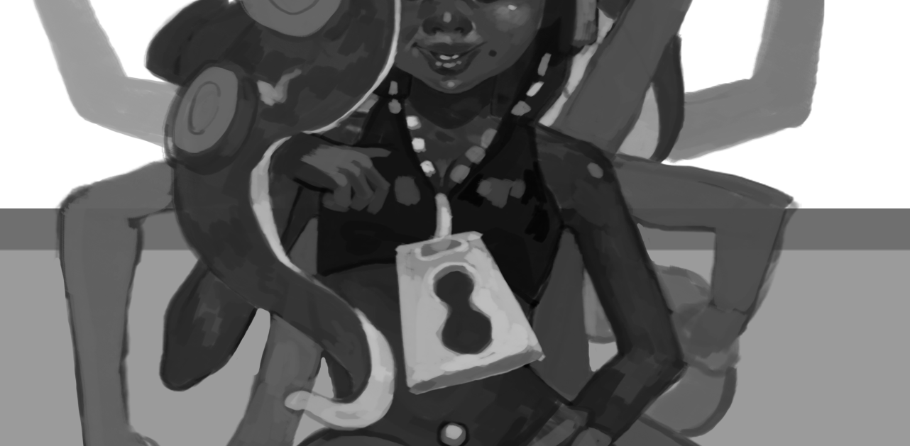 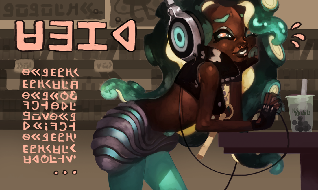 I paint a lot of portraits, so I figure it doesn't hurt to multitask and experiment with new techniques, too. In this case, using a combination of color burn and overlay layers to achieve a 'burnished' effect. I use color burn layers very rarely, but now I'm thinking of pulling them out more often... 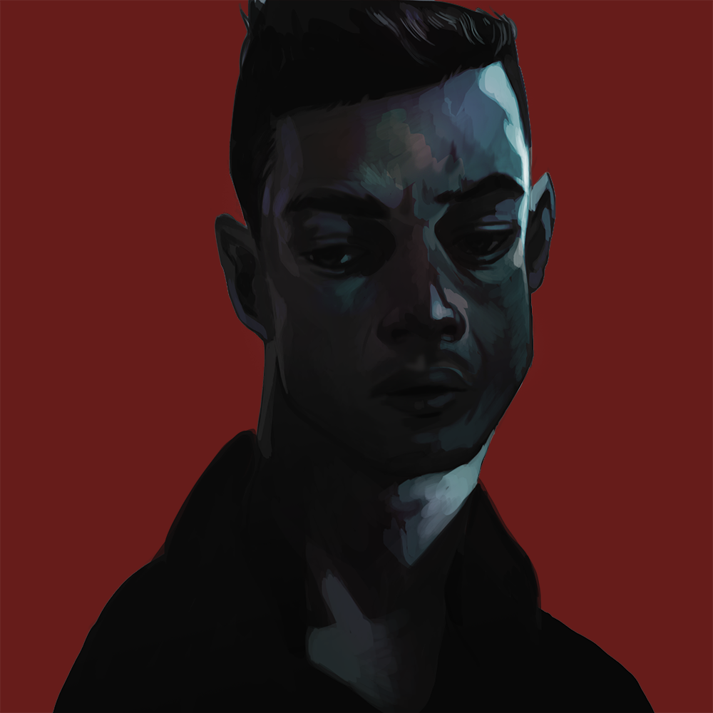 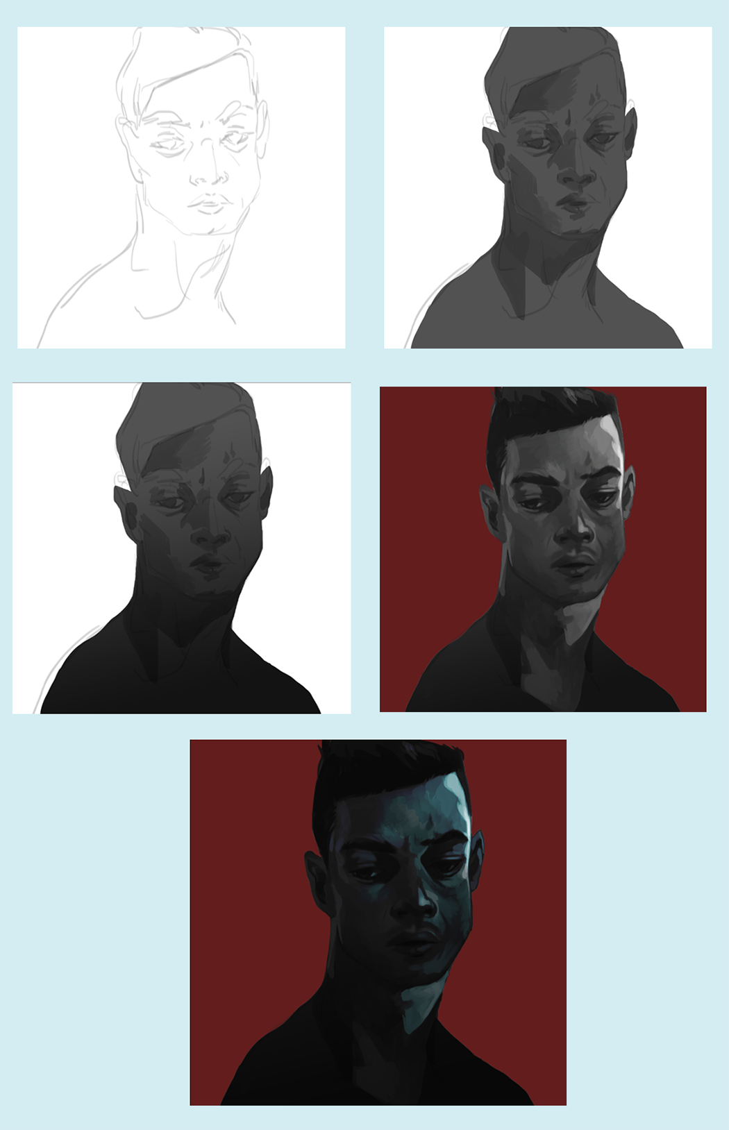 Before you know anything about me, know that I love Red Dead Redemption. Adore it. Married to it. I'm not even a fan of Westerns and this game has had me in a chokehold since 2010. Look. Give me a game with a compelling story, huge character cast and solid acting and I'm yours. a damn good soundtrack doesn't hurt either 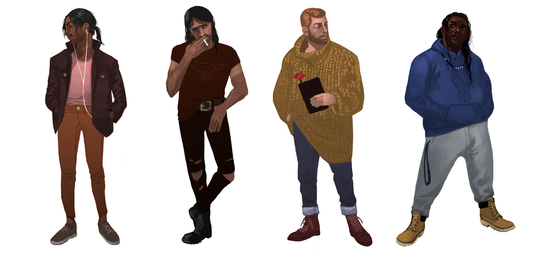 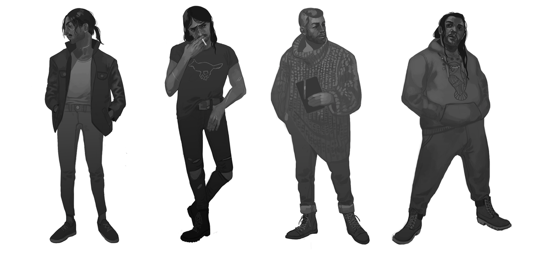 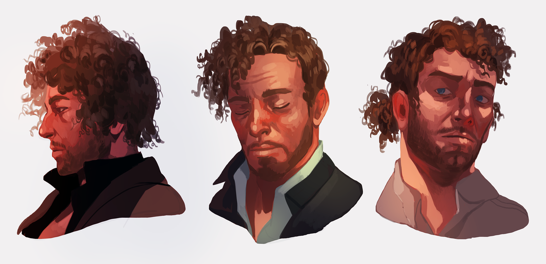
Whoops, forgot to post these on the site! These fashion doodles have been a little love letter to myself these past few weeks. I don't usually draw portraits and, to be honest, I'm thinking I might develop a new habit now. These are a handful of my favorite outfits from this year. Before you ask, yes. My closet is fit to bursting at the best of times. 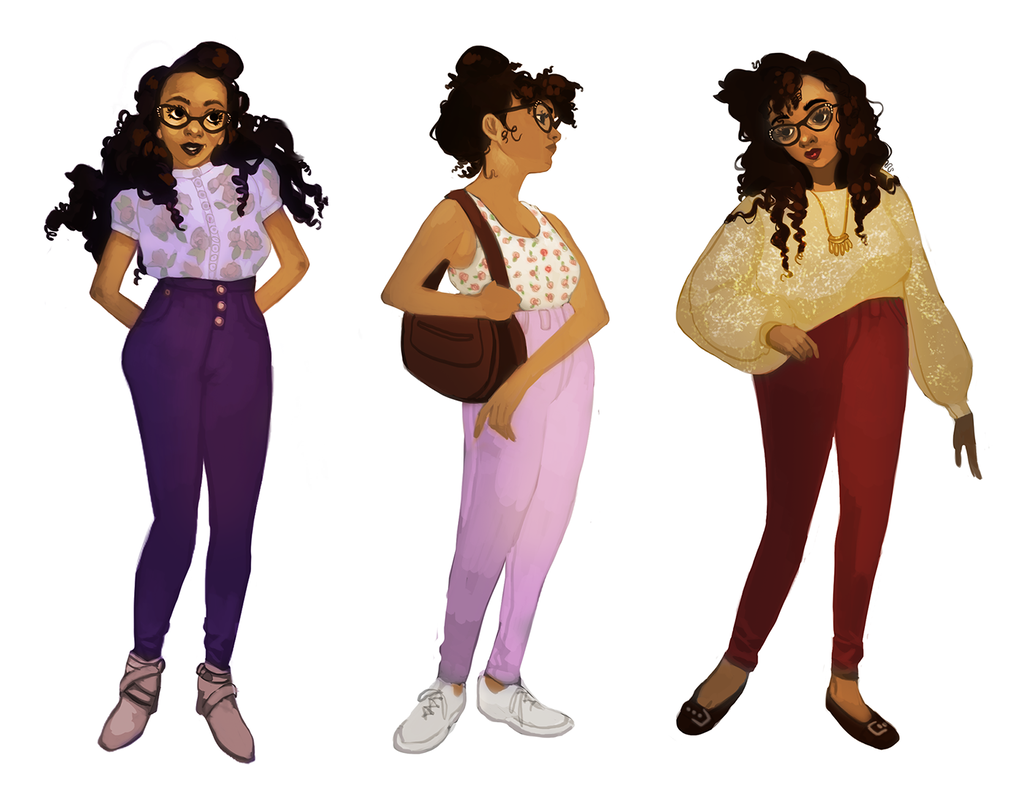 Summer and spring 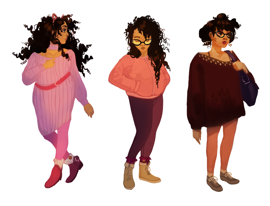 Winter and spring 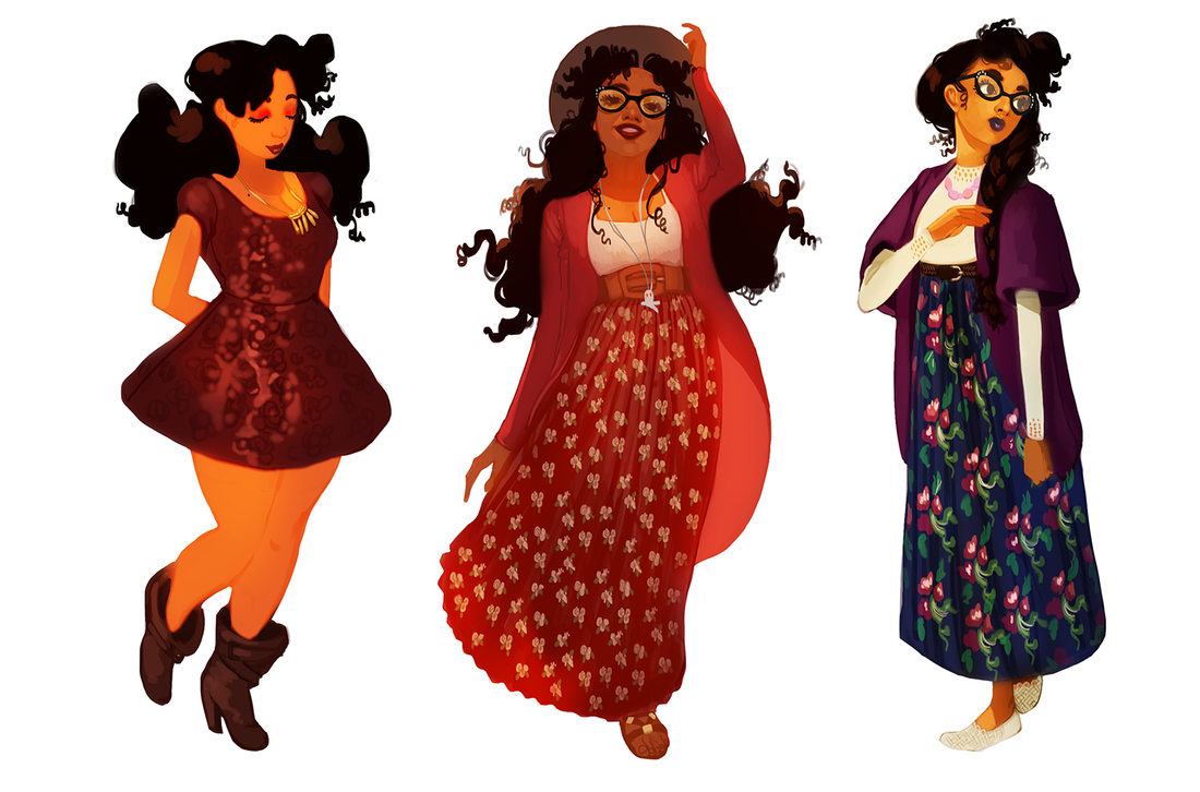 Summer and fall 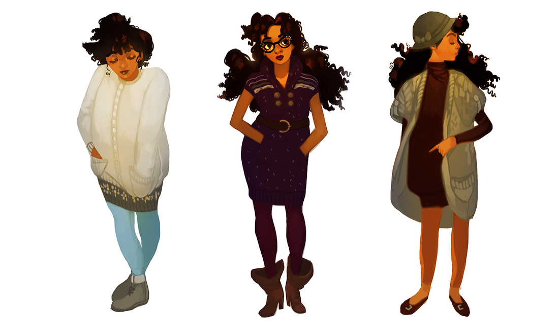 Fall and winter
|
AuthorHere I post WIPs, sketches, speedpaints, thumbnails and anything else thrown into the veritable stew of artistic process. Archives
January 2021
Categories
All
|
 RSS Feed