|
Tl;dr: fashion is life. Long version: sometimes it's hard to believe I went from a gangly kid who religiously wore the same grey hoodie, old sneakers and side-braid to a woman who experiments with nearly every look. It's like a Pokemon evolution, only a lot slower. When I really think about it, though? It makes perfect sense. I had my time to be awkward (and sometimes outright disdainful) of how I look. I had the space to explore what I liked, what I didn't like and what I didn't quite feel ready to try out. It's the same logic around any unpleasant or disappointing experience: as Ava DuVernay likes to say, "It's not happening to you, it's happening for you." That hurdle of mine is well over and done with. Life is just too short to not celebrate your appearance. In the future I might just do a fashion retrospect, with each drawing representing where I was at major turning points (young child, teenager, young adult). For now... I compose my looks not unlike how I compose my paintings. I take into account the theme, such as cute casual or 80's nostalgia. I make sure colors and patterns are balanced. Got a lot of warm? Contrast it with something cool. Got a patterned top or leggings? Pair it with something simpler. It's hard to even come up with a name for my style, because I love to dabble in everything. Magical chic? Contemporary nostalgia? Flowery fatale? These are starting to sound like music genres. I'm not complaining. the term boho can go to hell, though. even though many of my looks would technically fall under that category in fashion SEO, I hate that term with a fiery passion 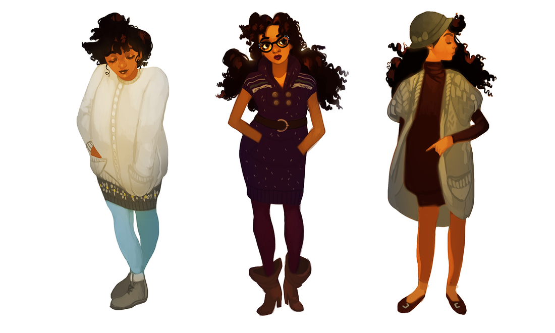 Why did it take me this long to embrace the utter power of the tunic dress? Seriously, come to my TED Talk. Let me tell you about how easy it is to mix and match these wonderful things, with the big fat bonus of skipping a step (shirt + pants). I had a tunic dress or two back in high school, but had no idea how to wear them. I'd actually tuck the damn things into my jeans so I wouldn't look 'weird'. There goes the point!!!
0 Comments
I figure now's a good time to talk about why I've learned not to make New Year's Resolutions. I understand the appeal. The desire to just...rinse off all the bad, keep the good and glide into the future with a lighter spirit. The socially acceptable ritual of drinking like crazy and waking up with a New Year hangover? I certainly feel the urge in my bones, and it's not even Thanksgiving yet! I won't be doing it, though. I haven't for several years, in fact! I've learned New Year's resolutions tend to be, at best, dramatic declarations with little (if any) long-term payoff. They feel great in the moment, but once it comes down to keeping pace with your ambitions? Resolutions are a recipe for failure that shows in every deadline missed, personal promise delayed and mediocre result gained. So I skip it...and instead focus on building good habits instead. This is a subtle, yet hugely life-changing mentality that I've picked up from B2B writing/content marketing spaces. It makes sense, since the nature of that skillset is about crafting progress in bite-sized increments. Whether or not you're a freelancer, I highly recommend checking out Ed Gandia and BlackFreelance. They have several wonderful pieces that explore the benefits of shifting your mentality with smaller gestures, rather than going for a 'cold turkey' approach that has you falling back on old habits. Good habits are just as hard to break as bad ones. For example, I brush, floss and rinse every single night, and missing just one night? It has me all out of sorts. I extend this same minimalist logic to other things, working backwards from the goal. Instead of just saying I want to lose a certain amount of pounds, I instead signed up at a local gym with my roommate for two sessions per week (as well as fewer sweets). Instead of just saying I want to wake up earlier, I instead push myself to go to bed an hour sooner. When it comes to art? Well, I want to improve my production, quality and outreach. But what do I have to do to get there...and will it be small enough to incorporate into my everyday life without a drastic overhaul? For now...I'm focusing on traditional sketches. They're the foundation of most of the work I do and take the most effort from me. All those big goals of a shinier portfolio and fleshed-out projects? Those come later.
Experimentation isn't always going to be social media ready. It shouldn't be, actually. How does an artist learn through mistakes...while being too afraid to make them? One of my favorite painting processes is just throwing whatever at the wall -- or canvas -- and seeing what sticks. Even that dynamic foundation can be shaken up a little. While playing around in Photoshop the other night I slapped down some complimentary colors and fooled around with the smudge tool. Didn't have anything in particular in my head. In doing so, I discovered something I've never seen before: an iridescent finish caused by the smudge tool's blurring effect. Frankly? It looks fucking awesome. The painting itself is...meh. That's fine! I learned a fun new way of creating a foundation in my speedpaintings and discovered some neat tricks to add more depth to my work. All with just a few smudges. That's more than enough success for an hour of fudging.
It's that time again. The autumn leaves are falling, our fingertips are freezing and the Inktober event is in full swing. ...Ish. I made a poll at the beginning of the month asking for thoughts on Inktober, the popular October art tradition: the consensus was non-committal, with the majority either being wishy-washy on the idea or outright refusing. Is it any surprise? Making art is already enough of a process without churning out daily pieces, which are disruptive by nature due to being free work sandwiched in-between jobs, school and life obligations. This response is on top of countless counterposts I've seen just browsing my feed. For health-related reasons or not having enough time, I'm really happy to see artists prioritizing other things, to be honest. Burnout is a pretty serious issue without adding FOMO to the mix. Burnout is so serious, in fact, it can literally make you sick. It's an easy trap to fall into as a freelancer, as well, since you're in the position of having to dictate your own hours and find your own work. Getting said work? Often means creating free work in the hopes of someday being paid for it. More than once I've found myself working ridiculously long days without a full break. I've even come down with illnesses that don't usually affect my age group (which I'll talk about in a later post). Does that mean I'm against the concept of Inktober or any variant thereof? Not at all! Daily art exercises have their time and place: 1. They're a smart way to nip overthinking in the bud (how many pieces lie unfinished because of too much prep work?). 2. They supplement portfolios with smaller pieces (great for blogging and/or Patreons). 3. They're great practice and, with the right mindset, a ton of fun. If you're feeling guilty for not participating, however...that's when you're deprioritizing artistic growth in favor of FOMO: a fluff goal for shallow social media attention that doesn't amount to anything substantial. Art deserves better than that, right?
I've been rifling through more of my old studies and personal thumbnails, analyzing what I've learned over the years with October right around the corner. These ones are all the way back from 2015, a little scratchier and more middle-of-the-road value-wise than I do now. Nonetheless, it's useful to analyze the areas where you've gotten stronger, as well as understanding where your skill starts to peter out and improve more slowly. Moving backwards is still movement! I've spoken about Frank Brangwyn before and how he's been a major fine art inspiration of mine. His ability to somehow create chaotic and extremely simple compositions is endlessly fascinating, which is to say nothing of his lighting. Buttery and bold, he's able to craft out a figure's weight, age and personality with just a few deceptively simple strokes. I've done enough traditional and digital studies over the years that I feel comfortable getting a lot down with very little. Silhouettes, in particular, are a very reliable way of carving out what you see. Moving forward I want to keep polishing up these areas. I want to paint faster, create more stunning compositions and improve my technical perspective. I also want to get comfortable all over again with being sloppy and loose.
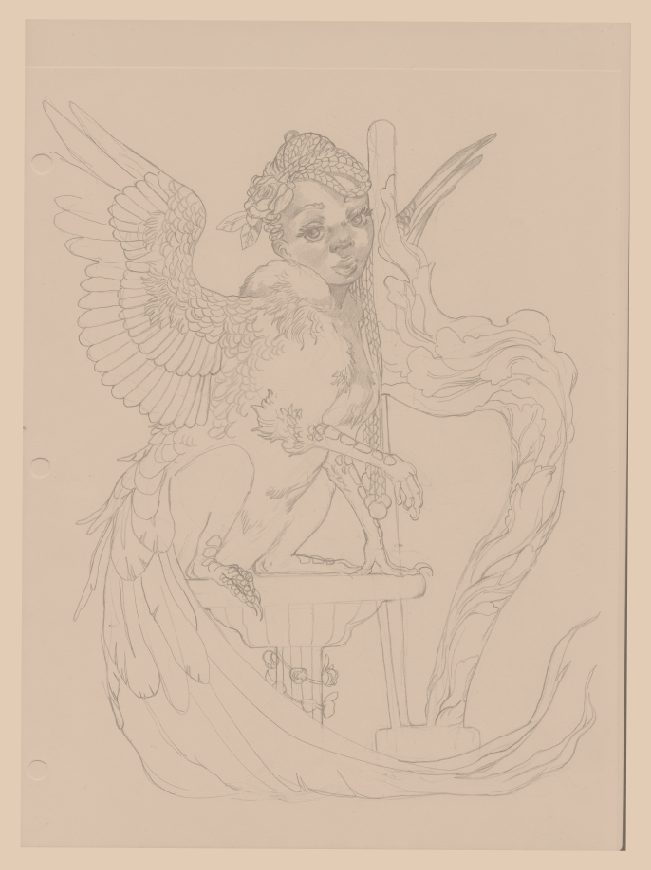
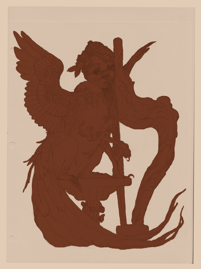
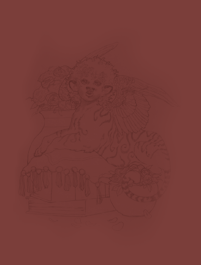
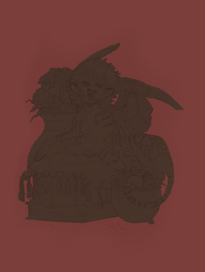
You want to be a character designer? Design characters. You want to be a concept artist? Create concepts for a hypothetical product or videogame. You want to be an animator? Animate. This advice may come across as intentionally obtuse, but so much of the narrative surrounding working artists is...convoluted. There are far too many art schools out there with archaic curriculums that exhaust rather than inspire. The amount of horror stories I hear from working professionals with degrees? It'd make your head spin (if you aren't one of those postgraduates already). Capitalism also has many of us afraid to specialize in one or two paths due to the inherent instability of the job market. Hell, just living your life and juggling time between kids, a part-time job and/or school? Underfed possibility will have you overwhelmed by the time you sit down to work on your art. I'm no stranger to it. Contrary to what you may hear, specializing is actually a good thing. A major reason I get work in fantasy illustration...is because I draw and paint a lot of fantasy. No attempts to be a jack-of-all-trades doing every last style under the sun, no self-flogging because I'm still weak in some areas (like urban cityscapes). I do what I like and I get hired to do what I like. Just like a gymnast has to do a set of repetitions thousands of times, so too do you need to draw something over and over before you get really good at it. All of this would've been harder if I spent a big chunk of time painting, say, cars (which I could really care less about). This isn't to say life experiences outside of art are unimportant, nor that variety is a waste of time. Far from it. The best art comes from a wealth of first-hand, lived experiences -- it's a reflection of life, after all, and art that lacks a healthy foundation will show its cracks. Over the past ten years I've gone from being an educational ASL interpreter to several barista positions to B2B writing. I've learned so much about myself and have drawn on these life experiences to improve my craft. All the while? I've drawn and painted what I wanted to. What made my mind, heart and soul sing. I sometimes wavered on this over the years, wondering if I was 'limiting myself' because I leaned toward a certain style and handful of genres. Whether you are leaning toward human subjects, a shoujo-esque style or wanting to commit to a sequential art major, you are limiting yourself...so you can specialize and become a master of one. Variety is important and specialization is not a curse. I've talked before about how language matters. The art industry is ever in need of nuance. Here we're going to take a look at another old character of mine, a pheasant-griffon sphinx that embodies so much of what I love to paint:
I'll never lose touch with my eight year-old self filling in a coloring book.
Sometimes you don't know how a piece is going to turn out. It's the eternal conundrum: do you keep going with a sketch that's quite not working...or start over? Then there are the times you don't know what the hell you're doing at all. I've gotten better at resolving this over the years. At this point I can tell when something isn't going to go where I want it to, no matter how hard I try. One common sign of this is when I rework a certain area of a painting over and over and over. Other times I'll notice something is wrong when there is an abnormally huge gap between the preliminary stages and the final sketch. Art is a conversation. It'll go in places you don't always expect and, just like any dialogue, you should take warning signs at face value. Sometimes, though...unpredictability is your friend. Sometimes you're not sure where your art is going...and that's the best part. The pieces are laid before you, the ideas and the mood are there, but you haven't arranged them into anything resembling sense yet. This is, honestly, one of my favorite ways to paint. This illustration below originally started out as a bunch of ovals and circles. No thumbnail. No rough draft or references. Just a mess of blobs I shuffled around until they gradually formed an image in my head. This tends to be what I do when I'm having a hard time creating work and want to push myself. As is my wont, I go for a half-human creature. What can I say? I know what I like. 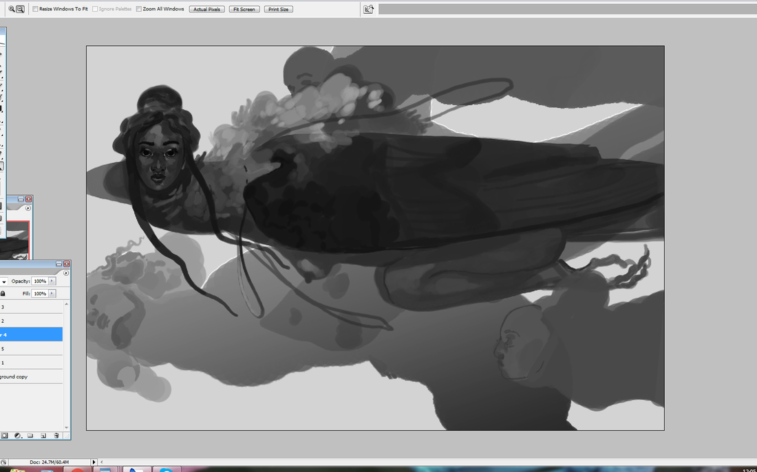 Like the sun rises and sets, there is always hubbub in the art community around copying...and rightfully so. No self-respecting artist wants to be a glorified scanner, nor should they want to make a mockery of another artist's work for short-term gain. Then there's the whole 'getting sued' thing. The word 'copying', however, should come with an asterisk: there's a big difference between mindless copying and studying. Any artist that wants to improve on a technical and personal level needs to know this. To study another's craft is to go in with the intent of bettering yourself. Of carving out your unique voice. This can be strengthening your composition by asking how, say, a commercial illustrator makes their work so readable. This can be improving your technique, such as figuring out a fine artist's strong grasp on light and shadow (though you should be studying from life, too). Perhaps your favorite artists have a certain style that just speaks to you. All are valid reasons to pick up a pen and do some homework. That doesn't mean mindlessly copy and hope for the best. Studying is a conscientious act, with a goal to achieve after a set of repetitions. Studying from just one artist can increase the risk of copying, too, which is an easy enough problem to fix: have more than one inspiration. Just like a healthy diet can't solely rely on carbs, so too does a healthy artistic foundation need a variety of sources to pull from. Growing up I was surrounded by inspiration. I was heavily influenced by Pokemon, Final Fantasy and more books than I could shake a stick at. Jerry Pinkney, Janell Cannon, Mary GrandPré, Yoshitaka Amano and Pete Lyon are all incredible illustrators who did so much to capture my imagination (and still do). To this day, I have more artistic inspirations than I can count. Commercial illustrators, fine artists, musicians, game designers, fashion designers. For now, I'm going to look at some studies I did in 2017 and 2018 of two of my favorite painting masters: Frank Brangwyn and Jeffrey Catherine Jones. 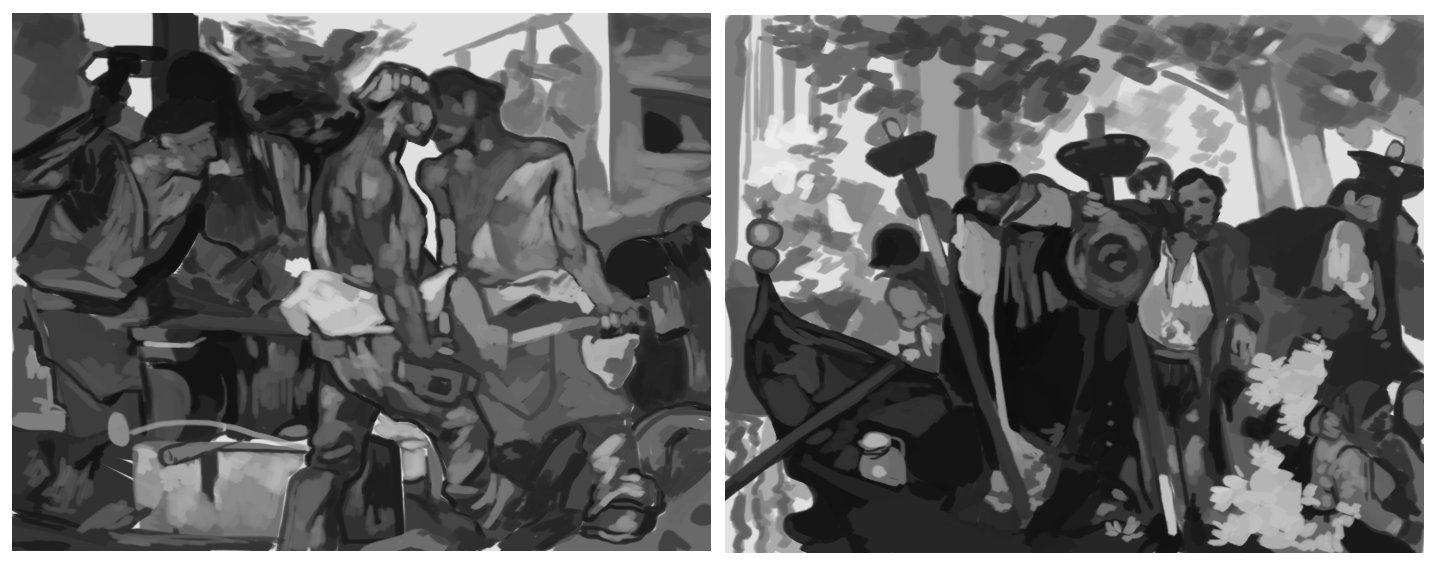 This is a piece of character art I did back in 2017, and one I'm still deeply proud of. It's a direction/technique I want to pick up again moving forward. I also figure it's time to talk about traditional and digital art, a juxtaposition that tends to get a lot of ire from gatekeeper blowhards. In my previous posts I talked about how I like to combine a little traditional art with digital, even though working 100% digital is often faster. There's a certain texture to pencil sketches that translates very well to digital painting. I took a wonderful general painting class back in high school -- alongside mentoring under an acrylic painting professor from a local university -- that helped set a strong foundation for my work today. Contrary to what some say (yes, sometimes to my face), traditional art is not better -- or more real -- than digital art. There's a pervasive -- and self-serving -- myth that a thing being harder automatically makes it better. Now, you won't get me saying traditional art doesn't have a steeper learning curve than digital. That is absolutely true. There are simply more steps involved. You have to prep the canvas (or wood or cardboard or-), create or transfer the sketch, mix your colors, protect your colors throughout several sessions, clean your brushes, preserve the final work, frame, package...yes. That is absolutely more work. But more work doesn't automatically mean better work. I've seen traditional art that's hardly moved me. I've seen digital art that's captured my imagination. This purity myth is steeped in gatekeeping attitudes that equate more difficulties with success...usually by those who don't face quite as many of those difficulties (such as having studio space or money for supplies) in the first place. I will not, however, create more myths around digital art. Digital art is easier than traditional. It's still not easy. If you're not familiar with layering, masking, color theory, light and shadow, design, mixing up your references...? Going digital is not suddenly going to fix that, no more than buying a fancy set of Copic markers and Bristol board will transform you into an overnight art master. In that regard...these two art forms are honestly not all that different. Digital art today is a brilliant tool to create art while saving space and money. It's painting without the mess. It's less costly. It's more flexible, especially if you're like me and constantly come up with new ideas on the fly. Already having a traditional art foundation just gives you a head start, as it makes the transition far smoother and gives your work a look that's not easily replicated. Doing a traditional sketch filled in with digital colors gives me the best of both worlds: the tight, grainy detail of pencil with the rich, sumptuous colors of a few Photoshop sessions.
No art is wasted. Yes, even the art that turned out so wonky you want to pretend it never happened.8/12/2019 I actually uploaded a few of these here back in 2017, but also left a few more buried in my art folders. For brevity's sake I'm going to dump all my studies of Donald's Glover's face (and one Bryan Tyree Henry) here. I've grown tired of being embarrassed about older work, studies that turned out funny or sketches that were wildly off-base from the original idea. What's the point? Take a look at these, where I go from really knowing how to draw faces to not having a damn clue all in the same session. You can see me studying the same angle several times, because sometimes you're just not getting the hang of the thing. Maybe it's a subtle expression, maybe you're just warming up and can't draw right yet. No matter what, you keep going until you push through that wall. Not giving up really is 90% of the artistic process. 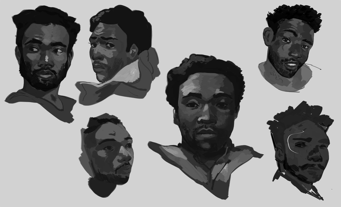 I watched a few clips from Atlanta (before watching full episodes with one of my Discord groups) to get more candid angles. A good exercise is to let a video play and pause at random. There's nothing wrong with studying your favorite angles, of course, but it can help to understand how the face works when it turns or stretches in ways you don't expect. Keep an eye on that wonky one in the bottom left... 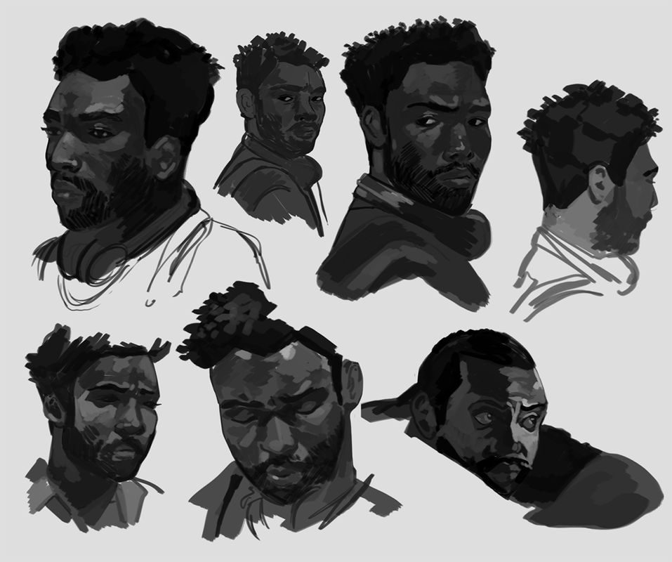 ...because you can see where I started having a little trouble. Donald Glover had such a simple 3/4th angle here, yet I had a tough time capturing the subtleties of his expression. Instead of deeming it a lost cause, though, I warmed up on some different faces, then returned to it. Eventually I got close enough to deem the study a success. 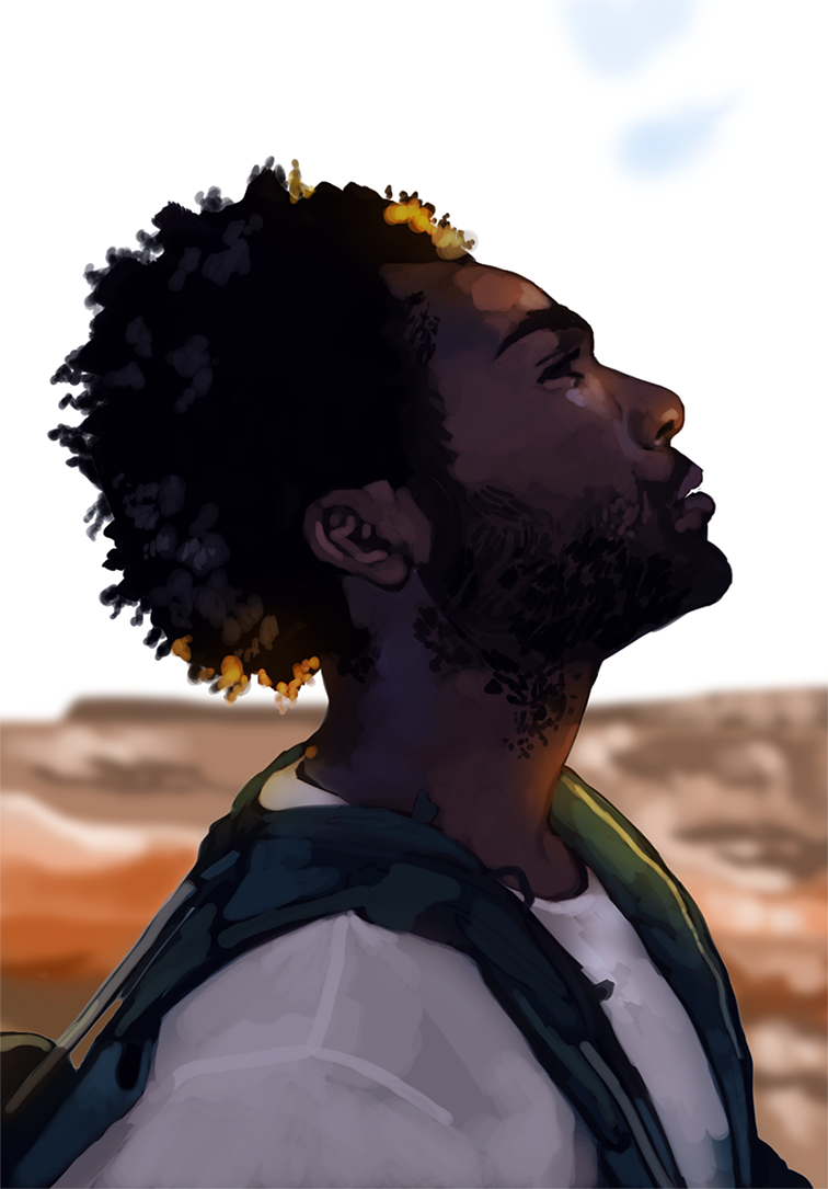 I then wrapped up the session with a color study based off one of his photoshoots. This one ended up looking a lot more 'marker-like' than most of my work, which I found interesting. It's not quite the finish I go for, but, eh. That's part of the process. You learn about what you want to do and what you don't want to do. Like fertilizer, art is never wasted. There's more behind-the-scenes material coming up. Stay tuned!
|
AuthorHere I post WIPs, sketches, speedpaints, thumbnails and anything else thrown into the veritable stew of artistic process. Archives
January 2021
Categories
All
|
 RSS Feed