|
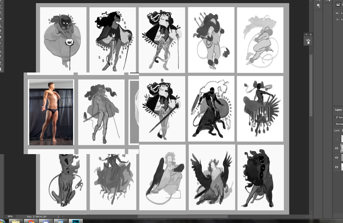
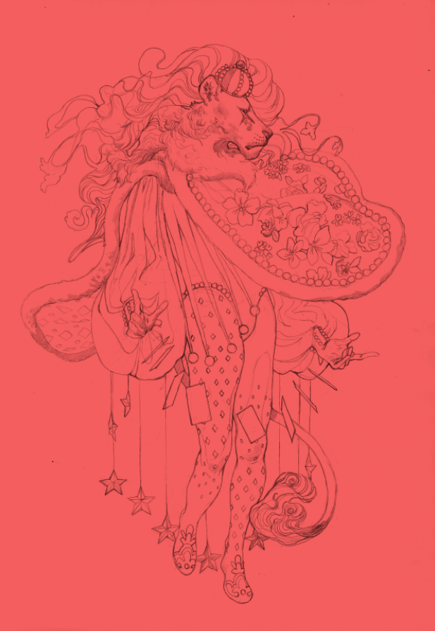
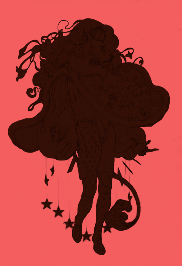
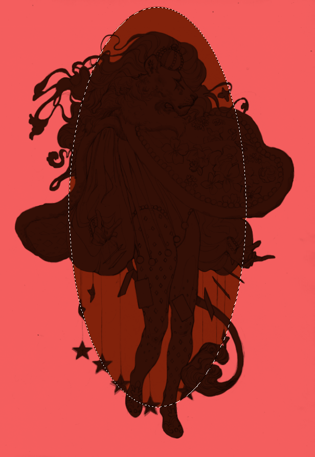
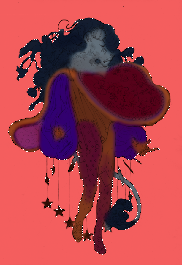
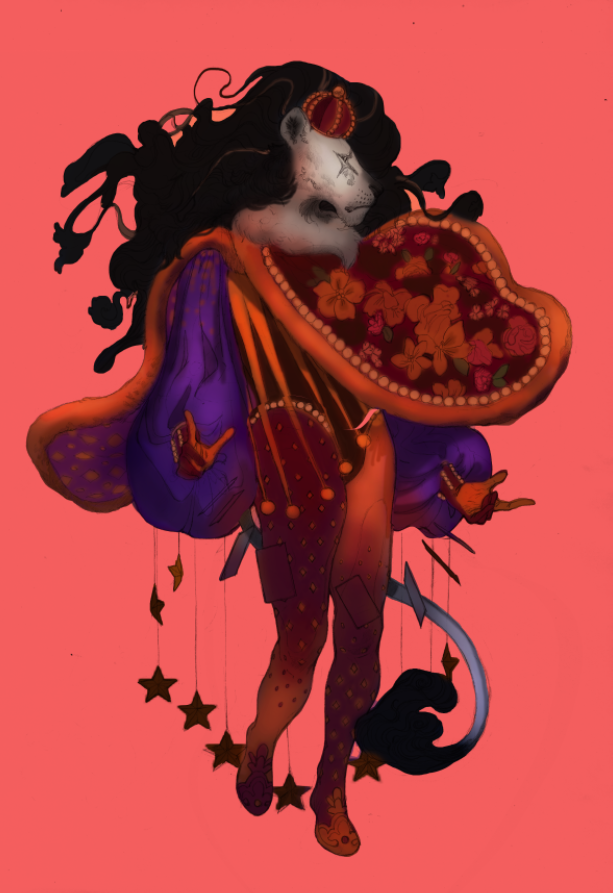
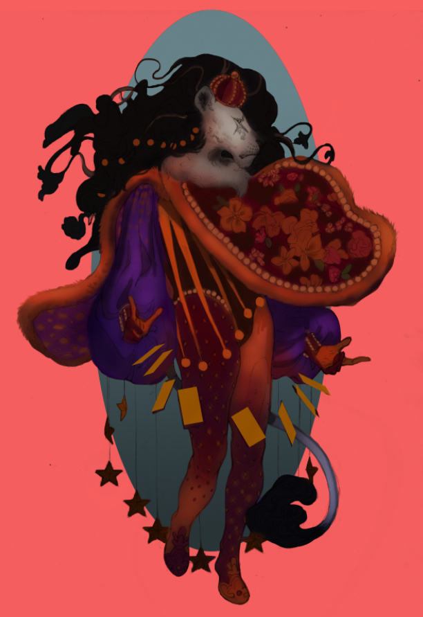
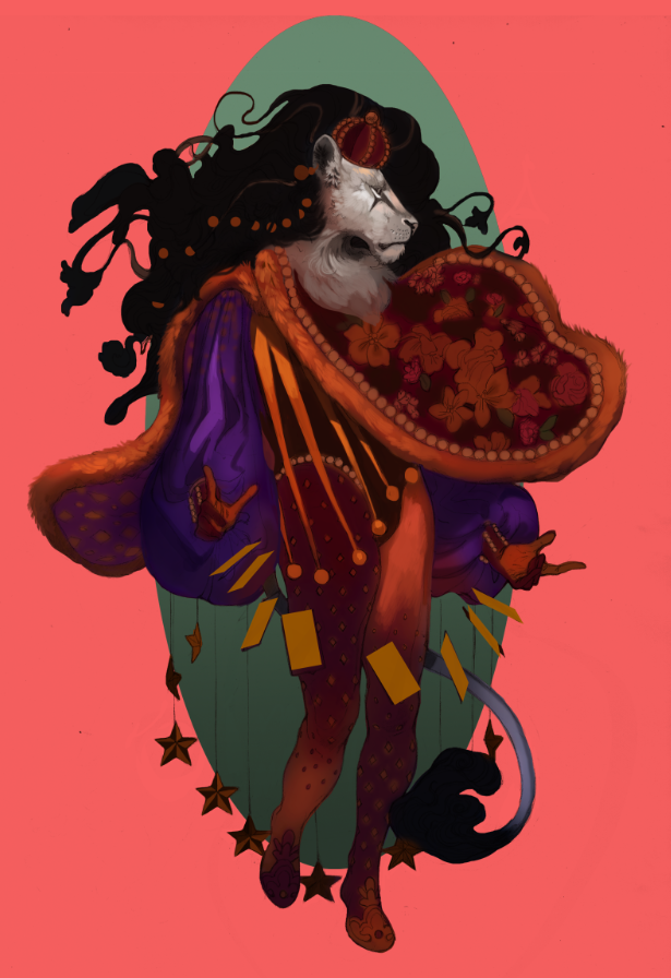
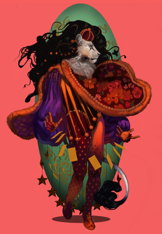
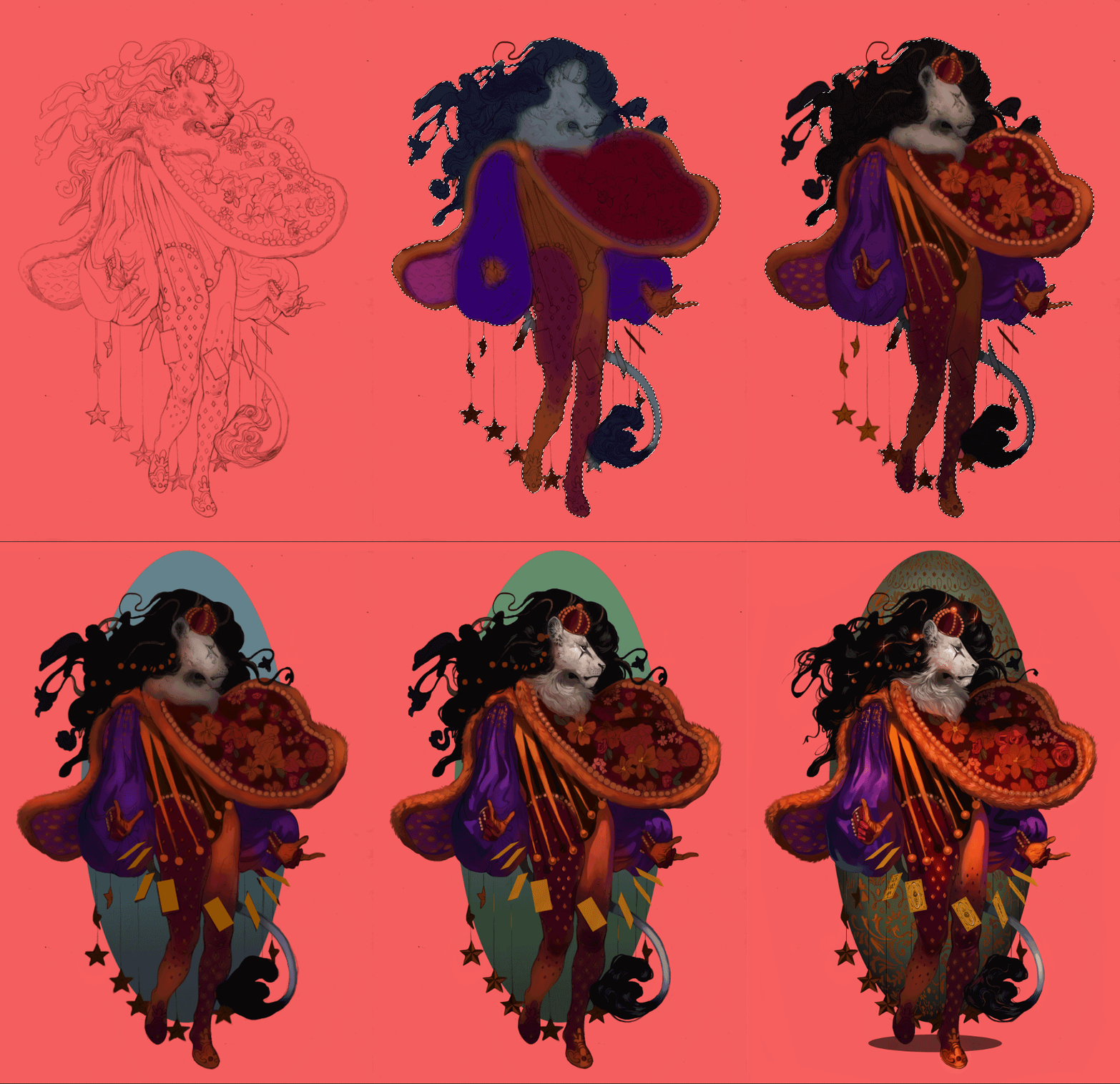
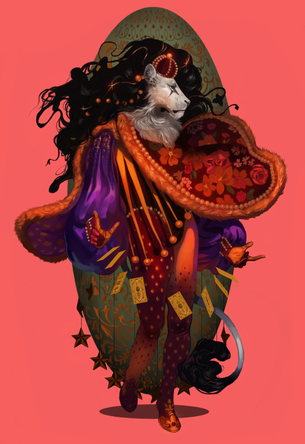
I have so many characters. Jesus Christ. It's to the point that even doing art of other characters I don't paint very often feels excessive. Like I'm choosing a favorite child. As it stands, I've only drawn Yasar a few times, despite the fact he's a prominent supporting character in a big (and very old) story of mine. I'd go into greater detail about his personality and history, but I'm viciously protective of my intellectual property. Maybe someday when I actually commit this story to a game or a book. I like to separate character art into three categories: simple, complex and illustrative. The first is exactly what it says on the tin, with no background or any supporting elements whatsoever. The middle adds a little more, such as an item or animal. The latter is an illustration in all but name, with the focus still heavily on the character themselves. I take a lot of inspiration from fashion magazines for that last one, since they tend to showcase models in all sorts of environments that play second-fiddle to the subject. This character art is somewhere between a simple and complex, as the giant gilded egg fills out the space without any additional interaction. Funny enough, even after extensive thumbnailing (see below), I still didn't have any idea what I was going to put behind him. Just...something. Something to round out that space! Throwing in a big fancy egg while painting ended up giving me an idea for one of his powers, since he's an illusionist that depends on sleight-of-hand and a jack-of-all-trades approach. ...Don't do what I did, though. Figure everything out in the draft stage. It'll save you so much more trouble. Thumbnailing my character art was something I did sparingly in the past. Mainly because I internalized some bullshit ideas about how fast my art should be. Thumbnails and rough drafts were for illustrations, right? The complex stuff. The ones with backgrounds and action poses. ...Yeah, that's not true at all. Literally everything can be thumbnailed, from the smallest sliver of concept art to the most elaborate multi-character tapestry. Since my designs tend to be pretty fanciful, this step is extra helpful, allowing me to work out everything before committing to a polished pencil sketch. also to the middle left you can see my main reference for the pose, particularly for the legs Sketches take me between three to five hours on average, maybe a little longer. Thumbnails, on the other hand, are whipped up in minutes. Sitting down for an hour and hashing out a dozen thumbnails is peak relaxation. Sometimes I get so addicted to it I don't want to move on to later stages, even though later stages are also my favorite. I've been working on a sketch buffer these past few weeks: painting is my greatest strength and it saves me time to have a bunch of pencil drawings ready to go. This was my favorite in the pile, so I decided to start off strong. To the right I added a flat to bring out the silhouette -- the key to any good character art -- and move from there. I've been falling in crazy love all over again with persian and baroque architecture, so you're going to be seeing a lot of inspiration stemming from there, pastels and acanthus and stars galore the egg begins The soft brush remains my go-to for creating base colors. I love everything bleeding into each other. It's a very traditionalist approach to digital art and something I want to keep pushing; see just how buttery and iridescent I can get. I've been experimenting quite a bit with color burn, overlay and soft light layers to add more subtlety. I want colors so rich you feel like you could bite into them like a ripe fruit. Remember: paintings are conversations. You learn as you go. I realized the legs looked kind of stringy, so I used the magic wand tool to thicken them. Also, I'm obsessed with this guy's pants. They are seriously satisfying to look at. It took a few passes for me to figure out the most appealing color balance between the character and the egg. The teal ended up being a really tasty contrast with the pink backdrop: almost like a sandwich between the equally warm dominant colors of the character's outfit. I also made the head a little smaller and the hands a little bigger. Probably a sign for me to not get too lost in all the extravagance and keep in mind basic proportions. A little progress .gif for your viewing pleasure. I need fifteen more hands. Worked on this on-and-off over four to five days. I need to start tallying up the hours, because I honestly don't remember how long it took me overall. I really wanted to push my painting abilities with this one. Interestingly, I feel more success not in the final result, but the process: of committing to a thumbnailing/rough draft stage, using references and getting back into traditional sketching. I also got to show off all my strengths in one place. Fashion design, color theory, character design, lighting, texture. I plan on getting more playful with my layouts, as well as focusing on dynamic poses. I've got a pile of great ideas sitting in Photoshop, so this is one challenge I'll be happily meeting head-on. There's nothing quite so intoxicating as having a goal and being like, "Yeah? No fucking problem." I have more character art on the way, which means more processes, more .gifs, more rambles. I'm also considering making the switch from Photoshop CC to a different digital art program. Stay tuned!
0 Comments
Your comment will be posted after it is approved.
Leave a Reply. |
AuthorHere I post WIPs, sketches, speedpaints, thumbnails and anything else thrown into the veritable stew of artistic process. Archives
January 2021
Categories
All
|
ServicesBook Covers
Illustration Character Art Portraits Packaging Art Concept Art |
AboutCommercial illustrator and designer currently available for short-term and long-term freelance work.
|
© COPYRIGHT 2015. ALL RIGHTS RESERVED.
|
 RSS Feed