|
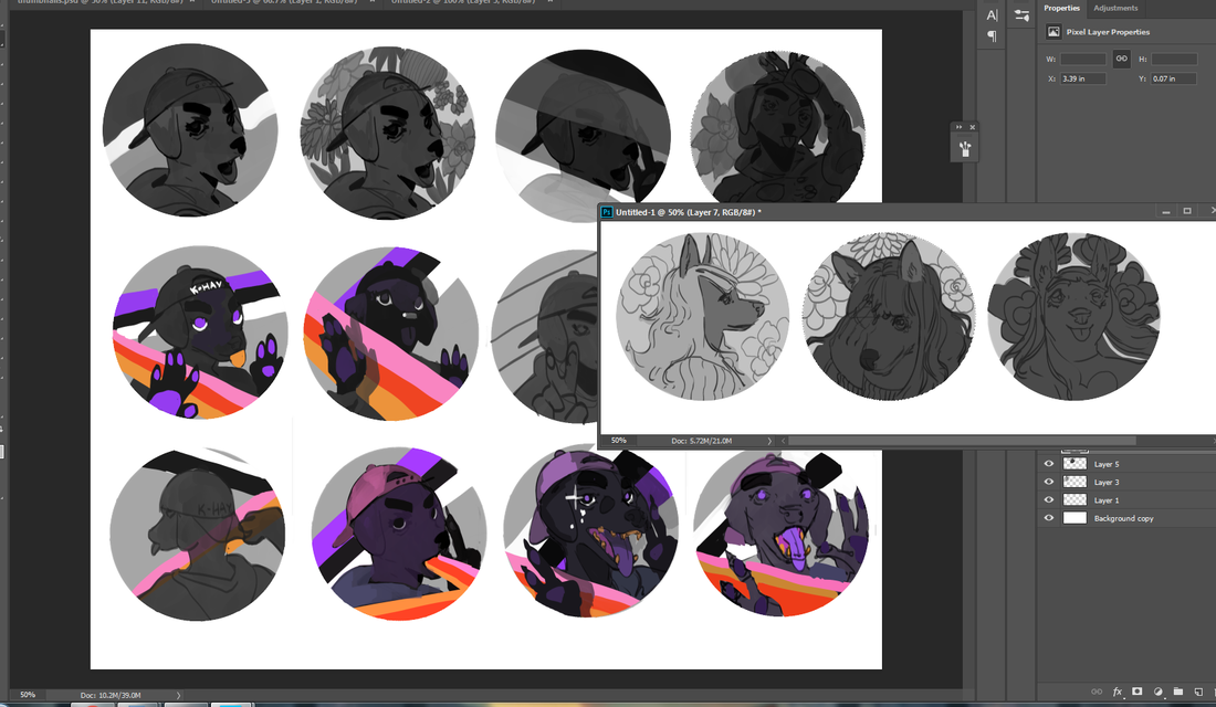
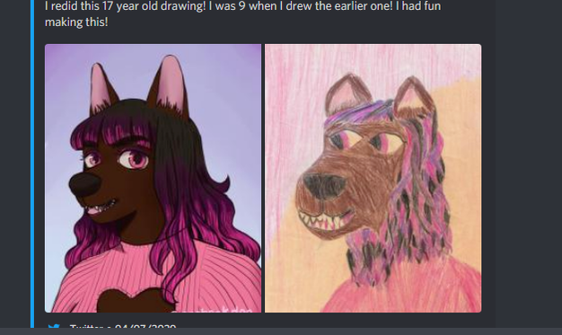
There's always a simpler way to do things. I firmly believe in working smarter, not harder. We turn to custom brushes to help us get down redundant elements like foliage or scales with half the effort. We buy or create stencils so we can get down more accurate shapes without burning out our already precarious energy. Following this logic, this second acrylic painting went by a little quicker than the first due to me already having some paints mixed up from the last one, as well as the thumbnails being done in advance. The composition is similar to the first painting, to boot, and it all whittled an hour or two out of the process. I like it. This is an aspect of the creation process I'm keeping in mind for future work. What are ways I can snip out a little of the grind? How can I reuse past thumbnails or similar ideas for new projects? I've got more .psd files than I'd like to admit stuffed to the brim with spontaneous painting concepts, which I...really should organize into their own folder. That's so much fertilizer for new work. If you've got some old, unfinished art lying around, consider pulling them back out again and giving them a review. You could just have a hidden gem languishing away unseen. If you haven't read my first post for the first acrylic painting, check it out here. This character belongs to Khailed, a fellow illustrator who is currently open for icon and portrait commissions. Without further ado! To the left are a few of the thumbnails I did while working on the first acrylic painting. I was already solidly in the groove and felt like trying my hand at their original character as I let the other thumbs simmer. I adored their character's rosy ombre hair and little heart sweater (already similar to my own fashion sense).
If you can't already tell, they have a knack for simple-and-striking designs. I've noticed how they tend to embody two or three poppy colors and a dominant fashion focal point, like a hat or a top. Really, they hearken to some of the best platformer characters of the 90's.
0 Comments
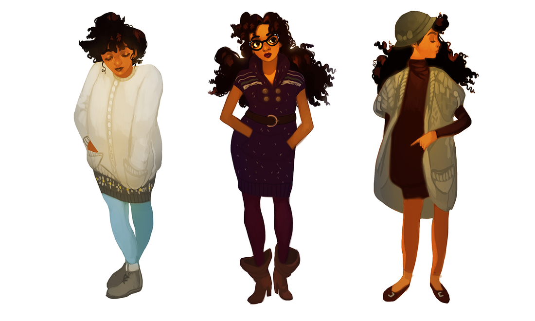
Tl;dr: fashion is life. Long version: sometimes it's hard to believe I went from a gangly kid who religiously wore the same grey hoodie, old sneakers and side-braid to a woman who experiments with nearly every look. It's like a Pokemon evolution, only a lot slower. When I really think about it, though? It makes perfect sense. I had my time to be awkward (and sometimes outright disdainful) of how I look. I had the space to explore what I liked, what I didn't like and what I didn't quite feel ready to try out. It's the same logic around any unpleasant or disappointing experience: as Ava DuVernay likes to say, "It's not happening to you, it's happening for you." That hurdle of mine is well over and done with. Life is just too short to not celebrate your appearance. In the future I might just do a fashion retrospect, with each drawing representing where I was at major turning points (young child, teenager, young adult). For now... I compose my looks not unlike how I compose my paintings. I take into account the theme, such as cute casual or 80's nostalgia. I make sure colors and patterns are balanced. Got a lot of warm? Contrast it with something cool. Got a patterned top or leggings? Pair it with something simpler. It's hard to even come up with a name for my style, because I love to dabble in everything. Magical chic? Contemporary nostalgia? Flowery fatale? These are starting to sound like music genres. I'm not complaining. the term boho can go to hell, though. even though many of my looks would technically fall under that category in fashion SEO, I hate that term with a fiery passion Why did it take me this long to embrace the utter power of the tunic dress? Seriously, come to my TED Talk. Let me tell you about how easy it is to mix and match these wonderful things, with the big fat bonus of skipping a step (shirt + pants). I had a tunic dress or two back in high school, but had no idea how to wear them. I'd actually tuck the damn things into my jeans so I wouldn't look 'weird'. There goes the point!!!
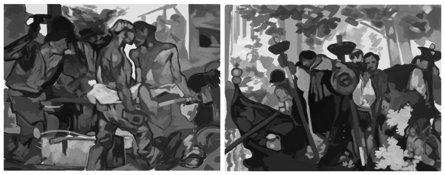
Like the sun rises and sets, there is always hubbub in the art community around copying...and rightfully so. No self-respecting artist wants to be a glorified scanner, nor should they want to make a mockery of another artist's work for short-term gain. Then there's the whole 'getting sued' thing. The word 'copying', however, should come with an asterisk: there's a big difference between mindless copying and studying. Any artist that wants to improve on a technical and personal level needs to know this. To study another's craft is to go in with the intent of bettering yourself. Of carving out your unique voice. This can be strengthening your composition by asking how, say, a commercial illustrator makes their work so readable. This can be improving your technique, such as figuring out a fine artist's strong grasp on light and shadow (though you should be studying from life, too). Perhaps your favorite artists have a certain style that just speaks to you. All are valid reasons to pick up a pen and do some homework. That doesn't mean mindlessly copy and hope for the best. Studying is a conscientious act, with a goal to achieve after a set of repetitions. Studying from just one artist can increase the risk of copying, too, which is an easy enough problem to fix: have more than one inspiration. Just like a healthy diet can't solely rely on carbs, so too does a healthy artistic foundation need a variety of sources to pull from. Growing up I was surrounded by inspiration. I was heavily influenced by Pokemon, Final Fantasy and more books than I could shake a stick at. Jerry Pinkney, Janell Cannon, Mary GrandPré, Yoshitaka Amano and Pete Lyon are all incredible illustrators who did so much to capture my imagination (and still do). To this day, I have more artistic inspirations than I can count. Commercial illustrators, fine artists, musicians, game designers, fashion designers. For now, I'm going to look at some studies I did in 2017 and 2018 of two of my favorite painting masters: Frank Brangwyn and Jeffrey Catherine Jones.
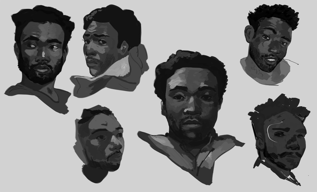
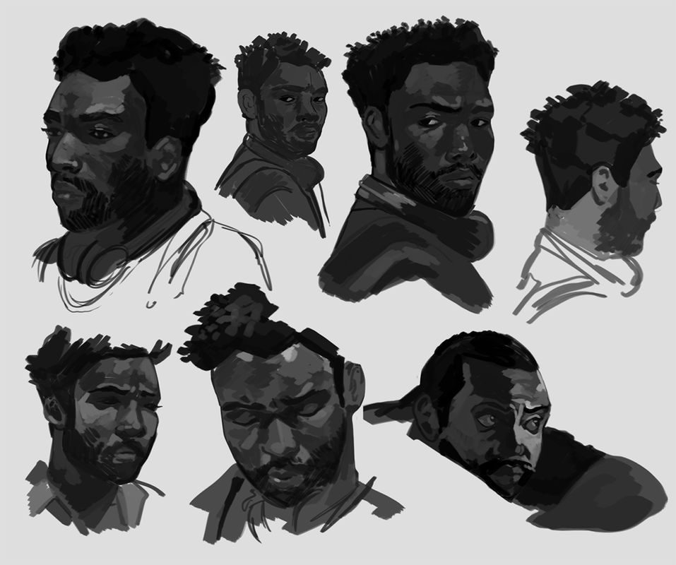
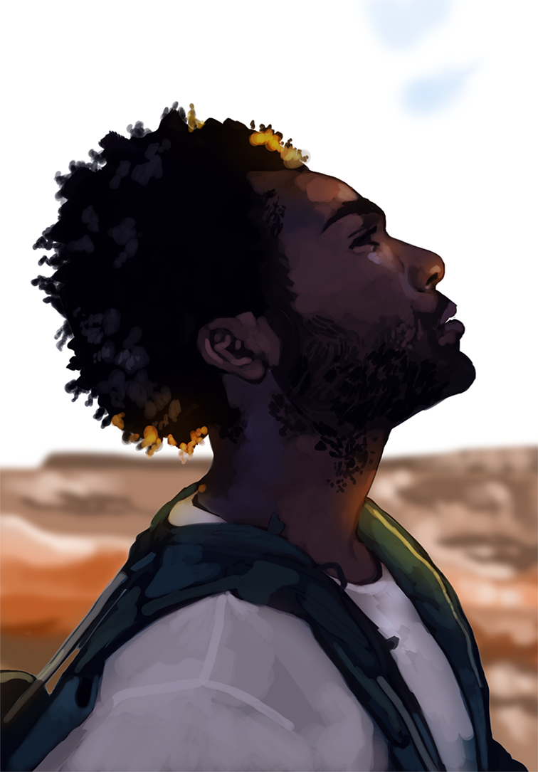
No art is wasted. Yes, even the art that turned out so wonky you want to pretend it never happened.8/12/2019 I actually uploaded a few of these here back in 2017, but also left a few more buried in my art folders. For brevity's sake I'm going to dump all my studies of Donald's Glover's face (and one Bryan Tyree Henry) here. I've grown tired of being embarrassed about older work, studies that turned out funny or sketches that were wildly off-base from the original idea. What's the point? Take a look at these, where I go from really knowing how to draw faces to not having a damn clue all in the same session. You can see me studying the same angle several times, because sometimes you're just not getting the hang of the thing. Maybe it's a subtle expression, maybe you're just warming up and can't draw right yet. No matter what, you keep going until you push through that wall. Not giving up really is 90% of the artistic process. I watched a few clips from Atlanta (before watching full episodes with one of my Discord groups) to get more candid angles. A good exercise is to let a video play and pause at random. There's nothing wrong with studying your favorite angles, of course, but it can help to understand how the face works when it turns or stretches in ways you don't expect. Keep an eye on that wonky one in the bottom left... ...because you can see where I started having a little trouble. Donald Glover had such a simple 3/4th angle here, yet I had a tough time capturing the subtleties of his expression. Instead of deeming it a lost cause, though, I warmed up on some different faces, then returned to it. Eventually I got close enough to deem the study a success. I then wrapped up the session with a color study based off one of his photoshoots. This one ended up looking a lot more 'marker-like' than most of my work, which I found interesting. It's not quite the finish I go for, but, eh. That's part of the process. You learn about what you want to do and what you don't want to do. Like fertilizer, art is never wasted. There's more behind-the-scenes material coming up. Stay tuned!
|
AuthorHere I post WIPs, sketches, speedpaints, thumbnails and anything else thrown into the veritable stew of artistic process. Archives
January 2021
Categories
All
|
ServicesBook Covers
Illustration Character Art Portraits Packaging Art Concept Art |
AboutCommercial illustrator and designer currently available for short-term and long-term freelance work.
|
© COPYRIGHT 2015. ALL RIGHTS RESERVED.
|
 RSS Feed