|
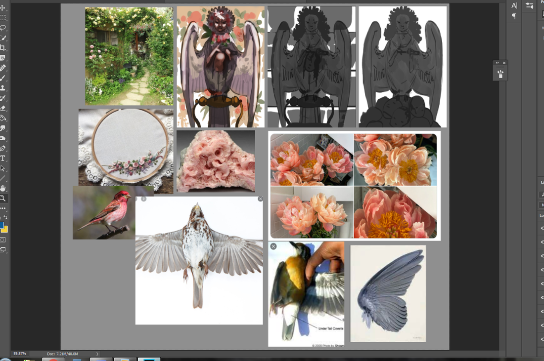
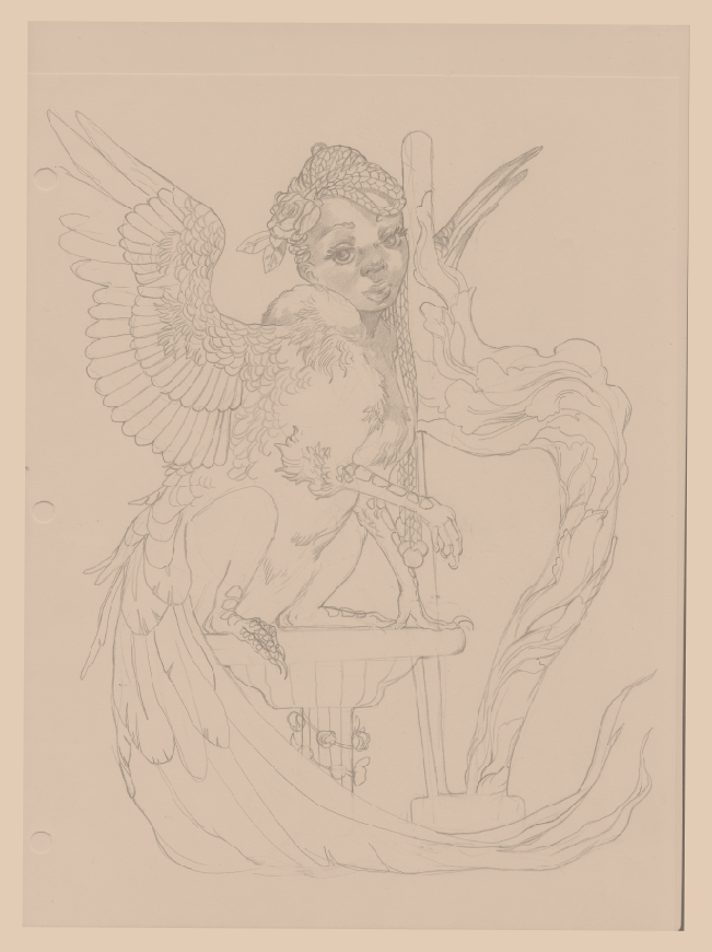
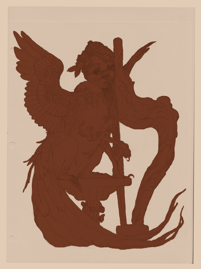
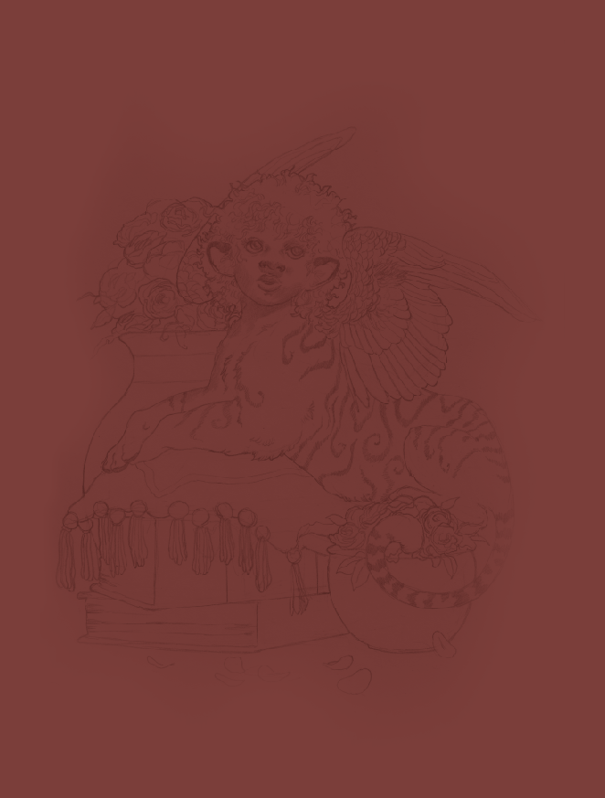
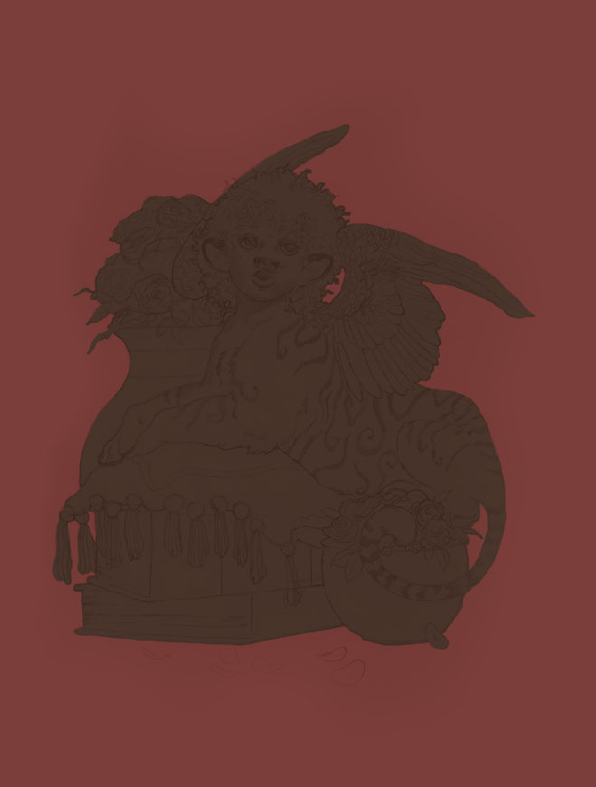
You just have to speak things into existence. I was contacted by Zero Issue Beer not too long ago -- a Canadian craft brewery -- and was asked if I was interested in doing an illustration for their new seasonal beer line-up. What a coincidence 2020 was the year I wanted to get into packaging design and illustration, particularly for beverages! Even better, the proceeds are going to Sankofa Arts & Music Foundation for black Canadian youth. As you can likely imagine, I was sold twenty times over. I have a short interview that will be appearing on their site here. For now? I'm going to share the creative process behind this piece, from the rough beginning stages to the inspiration behind it all. I'll share some tips I've learned about packaging design, too, for any of you who want to branch out your portfolio. Spoiler: there are harpies.
0 Comments
Been a while since I've done one of these! Indulgent art has always held a high priority for me. Why bother painting or drawing things I'm not invested in? Not to mention I need to show what I want to get hired for, so...kill two birds with one stone. This piece, however, was peak indulgence. Like, a dollop of whipped cream on top of whipped cream indulgence. You have a harpy. You have flowers. You have a ton of colors. Hell, there are even the mildest of vaporwave vibes (pink + blue surrealism) that snuck in without me realizing. Expect to see more of that. This year has been an absolute trainwreck and it's barely halfway over. Soaking in the subjects and styles I love to the nth degree is as self-care as it gets. As a side-note, I'm going to be keeping these progress posts a little brief from now on so I don't repeat myself. I mean, you know I love color. The part where I start phasing out the sketch and start rendering is orgasmic. Yadda yadda. I'll focus more on the unique challenges of each piece and what, exactly, was going on in my mind when making it. It's time to get indulgent.
Sometimes you need to start over fresh. There's no shame in it. Why waste effort picking away at something you could just re-do in half the time? Other times, though, you'll need to bite the bullet and push through. Knowing which one of these to commit to is part of being a productive artist. I've talked about it before and I'll repeat until I'm blue in the face. It's a gamechanger. Now that that's out of the way...let me start this by saying I wanted to drop this piece like a cheap vase. Even worse? This was one of my favorite sketches in my sketch batch. Talk about artistic whiplash. It didn't help I was winging the color scheme and many of the supporting details (a habit I've developed since color theory is one of my strongest skills). I had a vague idea I wanted blue and gold, that I wanted everything fancy and dream-like...and that was about it. For once, my guesswork backfired and made me fudge around more than normal. This doesn't happen often -- I've winged crazier pieces than this -- but it cost me several hours that could've been saved if I fleshed out the draft stages better. This was a good reminder of how badly a piece can backfire if you don't have the basics down. I thought of throwing my hands up in the air and outright moving on to another sketch, but something about this one told me to keep going. 'Make it work' is a phrase made famous from Project Runway and one I've adopted. It's a saying that tells you to work with your mistakes and find a way out of the hedgemaze you've built for yourself. I might just have to do a post on all my personal quotes one of these days. (If you're curious about other pieces I've done, check out my recent post on the progress of 'Yasar'.)
I have so many characters. Jesus Christ. It's to the point that even doing art of other characters I don't paint very often feels excessive. Like I'm choosing a favorite child. As it stands, I've only drawn Yasar a few times, despite the fact he's a prominent supporting character in a big (and very old) story of mine. I'd go into greater detail about his personality and history, but I'm viciously protective of my intellectual property. Maybe someday when I actually commit this story to a game or a book. I like to separate character art into three categories: simple, complex and illustrative. The first is exactly what it says on the tin, with no background or any supporting elements whatsoever. The middle adds a little more, such as an item or animal. The latter is an illustration in all but name, with the focus still heavily on the character themselves. I take a lot of inspiration from fashion magazines for that last one, since they tend to showcase models in all sorts of environments that play second-fiddle to the subject. This character art is somewhere between a simple and complex, as the giant gilded egg fills out the space without any additional interaction. Funny enough, even after extensive thumbnailing (see below), I still didn't have any idea what I was going to put behind him. Just...something. Something to round out that space! Throwing in a big fancy egg while painting ended up giving me an idea for one of his powers, since he's an illusionist that depends on sleight-of-hand and a jack-of-all-trades approach. ...Don't do what I did, though. Figure everything out in the draft stage. It'll save you so much more trouble.
You want to be a character designer? Design characters. You want to be a concept artist? Create concepts for a hypothetical product or videogame. You want to be an animator? Animate. This advice may come across as intentionally obtuse, but so much of the narrative surrounding working artists is...convoluted. There are far too many art schools out there with archaic curriculums that exhaust rather than inspire. The amount of horror stories I hear from working professionals with degrees? It'd make your head spin (if you aren't one of those postgraduates already). Capitalism also has many of us afraid to specialize in one or two paths due to the inherent instability of the job market. Hell, just living your life and juggling time between kids, a part-time job and/or school? Underfed possibility will have you overwhelmed by the time you sit down to work on your art. I'm no stranger to it. Contrary to what you may hear, specializing is actually a good thing. A major reason I get work in fantasy illustration...is because I draw and paint a lot of fantasy. No attempts to be a jack-of-all-trades doing every last style under the sun, no self-flogging because I'm still weak in some areas (like urban cityscapes). I do what I like and I get hired to do what I like. Just like a gymnast has to do a set of repetitions thousands of times, so too do you need to draw something over and over before you get really good at it. All of this would've been harder if I spent a big chunk of time painting, say, cars (which I could really care less about). This isn't to say life experiences outside of art are unimportant, nor that variety is a waste of time. Far from it. The best art comes from a wealth of first-hand, lived experiences -- it's a reflection of life, after all, and art that lacks a healthy foundation will show its cracks. Over the past ten years I've gone from being an educational ASL interpreter to several barista positions to B2B writing. I've learned so much about myself and have drawn on these life experiences to improve my craft. All the while? I've drawn and painted what I wanted to. What made my mind, heart and soul sing. I sometimes wavered on this over the years, wondering if I was 'limiting myself' because I leaned toward a certain style and handful of genres. Whether you are leaning toward human subjects, a shoujo-esque style or wanting to commit to a sequential art major, you are limiting yourself...so you can specialize and become a master of one. Variety is important and specialization is not a curse. I've talked before about how language matters. The art industry is ever in need of nuance. Here we're going to take a look at another old character of mine, a pheasant-griffon sphinx that embodies so much of what I love to paint: I'll never lose touch with my eight year-old self filling in a coloring book.
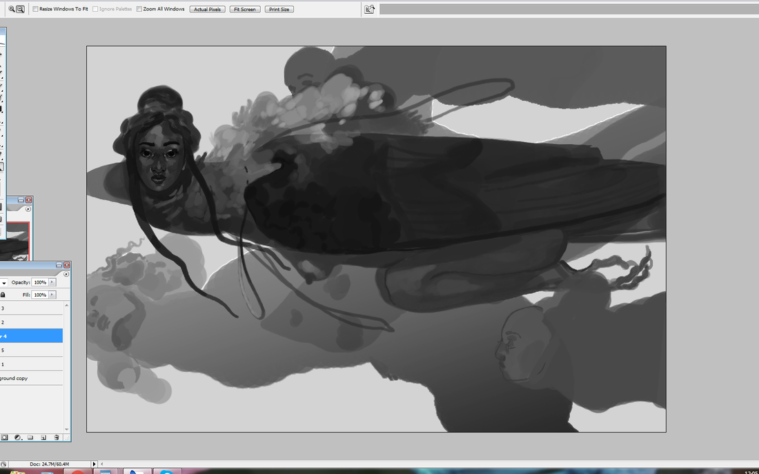
Sometimes you don't know how a piece is going to turn out. It's the eternal conundrum: do you keep going with a sketch that's quite not working...or start over? Then there are the times you don't know what the hell you're doing at all. I've gotten better at resolving this over the years. At this point I can tell when something isn't going to go where I want it to, no matter how hard I try. One common sign of this is when I rework a certain area of a painting over and over and over. Other times I'll notice something is wrong when there is an abnormally huge gap between the preliminary stages and the final sketch. Art is a conversation. It'll go in places you don't always expect and, just like any dialogue, you should take warning signs at face value. Sometimes, though...unpredictability is your friend. Sometimes you're not sure where your art is going...and that's the best part. The pieces are laid before you, the ideas and the mood are there, but you haven't arranged them into anything resembling sense yet. This is, honestly, one of my favorite ways to paint. This illustration below originally started out as a bunch of ovals and circles. No thumbnail. No rough draft or references. Just a mess of blobs I shuffled around until they gradually formed an image in my head. This tends to be what I do when I'm having a hard time creating work and want to push myself. As is my wont, I go for a half-human creature. What can I say? I know what I like.
This is a piece of character art I did back in 2017, and one I'm still deeply proud of. It's a direction/technique I want to pick up again moving forward. I also figure it's time to talk about traditional and digital art, a juxtaposition that tends to get a lot of ire from gatekeeper blowhards. In my previous posts I talked about how I like to combine a little traditional art with digital, even though working 100% digital is often faster. There's a certain texture to pencil sketches that translates very well to digital painting. I took a wonderful general painting class back in high school -- alongside mentoring under an acrylic painting professor from a local university -- that helped set a strong foundation for my work today. Contrary to what some say (yes, sometimes to my face), traditional art is not better -- or more real -- than digital art. There's a pervasive -- and self-serving -- myth that a thing being harder automatically makes it better. Now, you won't get me saying traditional art doesn't have a steeper learning curve than digital. That is absolutely true. There are simply more steps involved. You have to prep the canvas (or wood or cardboard or-), create or transfer the sketch, mix your colors, protect your colors throughout several sessions, clean your brushes, preserve the final work, frame, package...yes. That is absolutely more work. But more work doesn't automatically mean better work. I've seen traditional art that's hardly moved me. I've seen digital art that's captured my imagination. This purity myth is steeped in gatekeeping attitudes that equate more difficulties with success...usually by those who don't face quite as many of those difficulties (such as having studio space or money for supplies) in the first place. I will not, however, create more myths around digital art. Digital art is easier than traditional. It's still not easy. If you're not familiar with layering, masking, color theory, light and shadow, design, mixing up your references...? Going digital is not suddenly going to fix that, no more than buying a fancy set of Copic markers and Bristol board will transform you into an overnight art master. In that regard...these two art forms are honestly not all that different. Digital art today is a brilliant tool to create art while saving space and money. It's painting without the mess. It's less costly. It's more flexible, especially if you're like me and constantly come up with new ideas on the fly. Already having a traditional art foundation just gives you a head start, as it makes the transition far smoother and gives your work a look that's not easily replicated. Doing a traditional sketch filled in with digital colors gives me the best of both worlds: the tight, grainy detail of pencil with the rich, sumptuous colors of a few Photoshop sessions.
|
AuthorHere I post WIPs, sketches, speedpaints, thumbnails and anything else thrown into the veritable stew of artistic process. Archives
January 2021
Categories
All
|
ServicesBook Covers
Illustration Character Art Portraits Packaging Art Concept Art |
AboutCommercial illustrator and designer currently available for short-term and long-term freelance work.
|
© COPYRIGHT 2015. ALL RIGHTS RESERVED.
|
 RSS Feed